
Spring is that magical time when your home wakes up from its winter slumber and brims with fresh energy. Choosing the right colors can transform any room from dull to delightful. Believe me, after trying a few too many muddy hues last year, I learned that spring colors aren’t just pretty—they’re mood-lifters! Incorporating soft pastels or vibrant greens can really brighten your space and make you feel like you’re living in a fresh bloom.
This year’s trends blend classic spring hues with modern twists, making it easier than ever to refresh your decor while keeping things stylish. “Combining tradition with a modern vibe creates a timeless look that’s incredibly inviting,” interior designer Maria Lopez says. Expect cheerful palettes with uplifting shades like coral, muted yellows, and cool blues. So, get ready to have fun mixing and matching these fresh colors to welcome the season with open arms!
Soft Pastels with a Twist
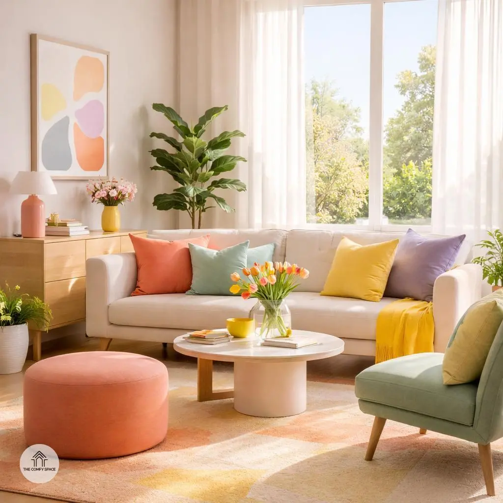
Soft pastels are comfort colors, but pairing muted pinks with gentle sage greens adds a fresh, unexpected vibe. Think of it as your favorite cozy sweater with a stylish twist. This combo creates a serene space, perfect for unwinding after a long day filled with endless to-do lists and questionable coffee runs.
Don’t just stop there! Sprinkle in some dusty blues to add depth without overpowering the calm. This trio fits perfectly in calming bedrooms or cozy reading nooks where you might find yourself losing track of time—and maybe even your phone. As designer Laura Finch puts it,
“Soft pastels with subtle color play bring both peace and personality to any space.”
Bold Yellows and Grays
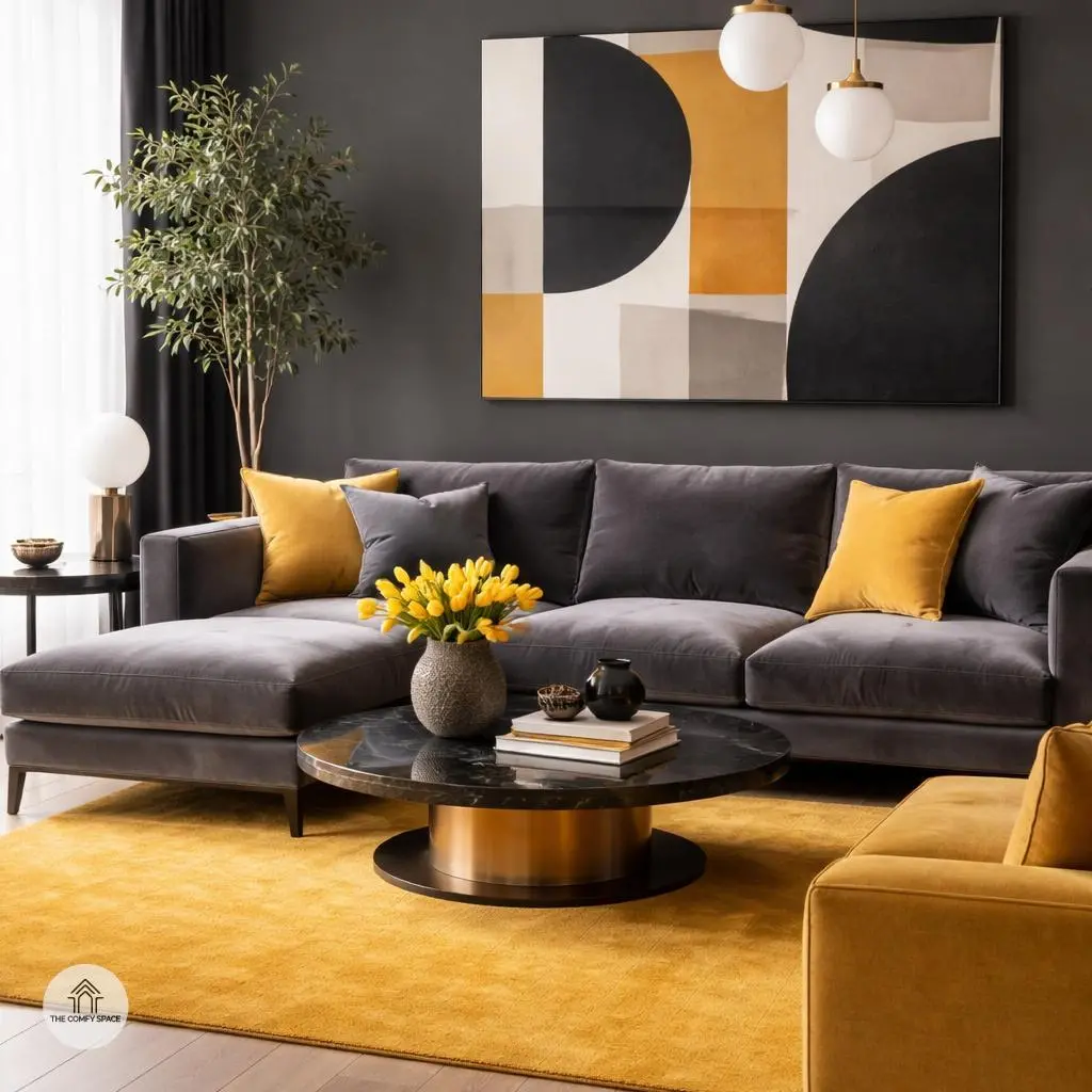
Bright mustard yellows paired with sleek charcoal grays create a stunning contrast that breathes life into any space. The trick is to let the yellow pop without overwhelming the room. Start with neutral gray walls or furniture as your base, then add splashes of mustard through cushions, rugs, or artwork. This combo works wonders in lively living rooms and chic office spaces, giving energy yet keeping things grounded.
Don’t be afraid to mix textures—smooth gray velvets, matte yellows, or glossy accents. As interior designer Ava Smith puts it,
“Balancing brightness with sophistication is all about layering and subtle touches.”
Just remember, too much yellow can feel like a bad sunburn, so keep it smart and playful. Trust me, I’ve learned the hard way after an overly yellow armchair that practically screamed in my tiny office!
Coral and Teal Harmony
Vivid coral paired with rich teal tones creates a striking harmony that’s perfect for energizing kitchens and dining areas. The vibrant coral brings warmth and fun, while the deep teal grounds the space with its calming, sophisticated vibe. Mixing these colors might seem tricky, but when done right, it breathes life into your room without overwhelming it. Think of coral accents like cushions, vases, or artwork contrasted against teal cabinets or chairs.
Texture plays a sneaky but super important role here. Try combining smooth, glossy surfaces with rougher, natural materials—like a sleek teal backsplash next to matte coral-painted walls or a coral linen runner on a teal wooden dining table. “Color is personality, but texture is the handshake,” says interior designer Anna Gomez. It’s a cheeky reminder that the feel of your space makes the look truly memorable. Plus, messy trips to stores hunting for the perfect combo? Totally worth it once you see the magic unfold!
Earthy Terracotta Meets Cream
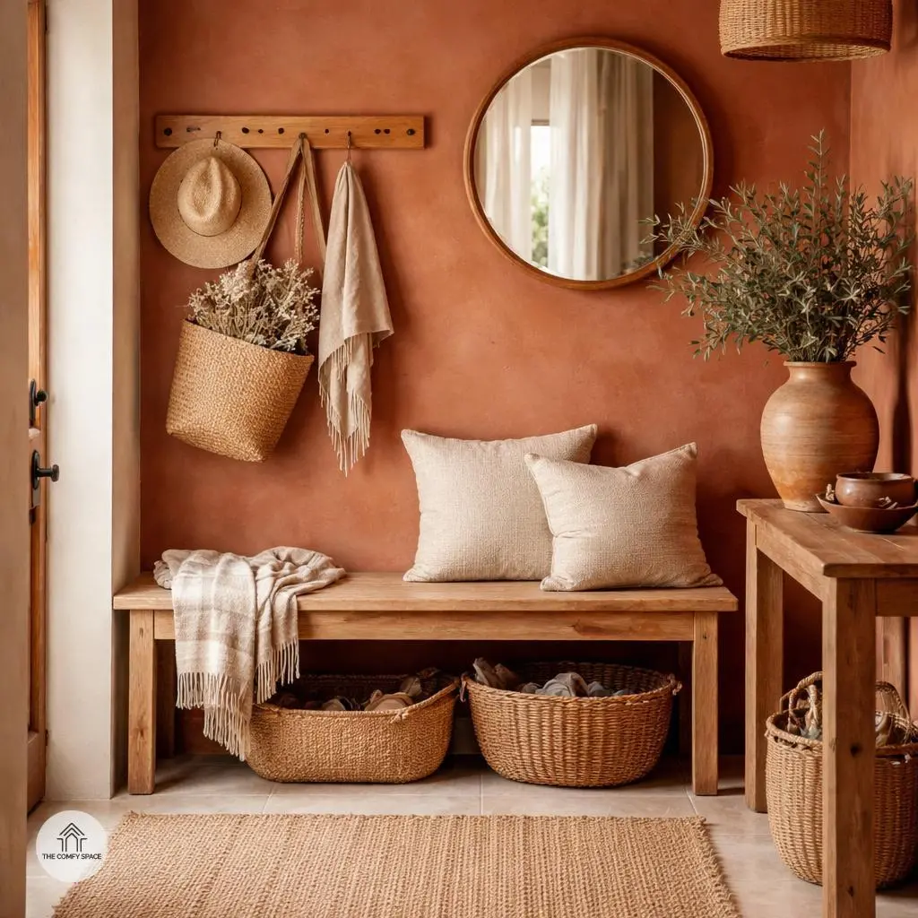
Imagine walking into a home where the walls greet you with the warm hug of terracotta, softened by creamy accents that feel like a cozy sweater on a chilly day. Earthy terracotta paired with gentle creams creates a welcoming vibe perfect for entryways and rustic spaces. This color combo isn’t just about looks—it’s a mood booster, making your space feel grounded and inviting. Think natural clay pots, woven baskets, and wooden furniture to echo the warmth in every corner.
Pro tip: When styling with terracotta and cream, mix in natural textures like linen cushions or jute rugs to anchor the look. I once tried this in my own home and learned the hard way not to overdo the terracotta—too much, and it felt like a brick wall was looming! As designer Jane Smith says,
“The beauty of terracotta lies in its ability to bring earthiness indoors without overpowering a space.”
So go easy and let your space breathe with creamy balance.
Lavender and Lemon Freshness
Imagine stepping into a bathroom that instantly wakes up your senses with a delightful mix of sweet lavender and zesty lemon. This combo isn’t just about color; it’s about mood. The soft lavender’s calming vibe meets the sunny punch of bright lemon yellow, creating a space that feels both refreshing and cozy. It’s perfect for bathrooms or sunrooms where we often want that clean, crisp feel but don’t want to lose warmth. Plus, using these colors can turn a mundane routine into a mini-vacation for your mind!
Here’s a tip from an interior designer I once chatted with: ‘Don’t be afraid to mix playful brightness with gentle charm—it makes the space feel lived-in and loved,’ she says. Practical advice? Start with lemon accents like candles or towels, then layer in lavender through plants or wall art. Trust me, this combo saved me from a ‘too-sour’ lemon overload in my own bathroom, and now every shower feels like a spa moment.
Navy Blue and Blush Pink Balance
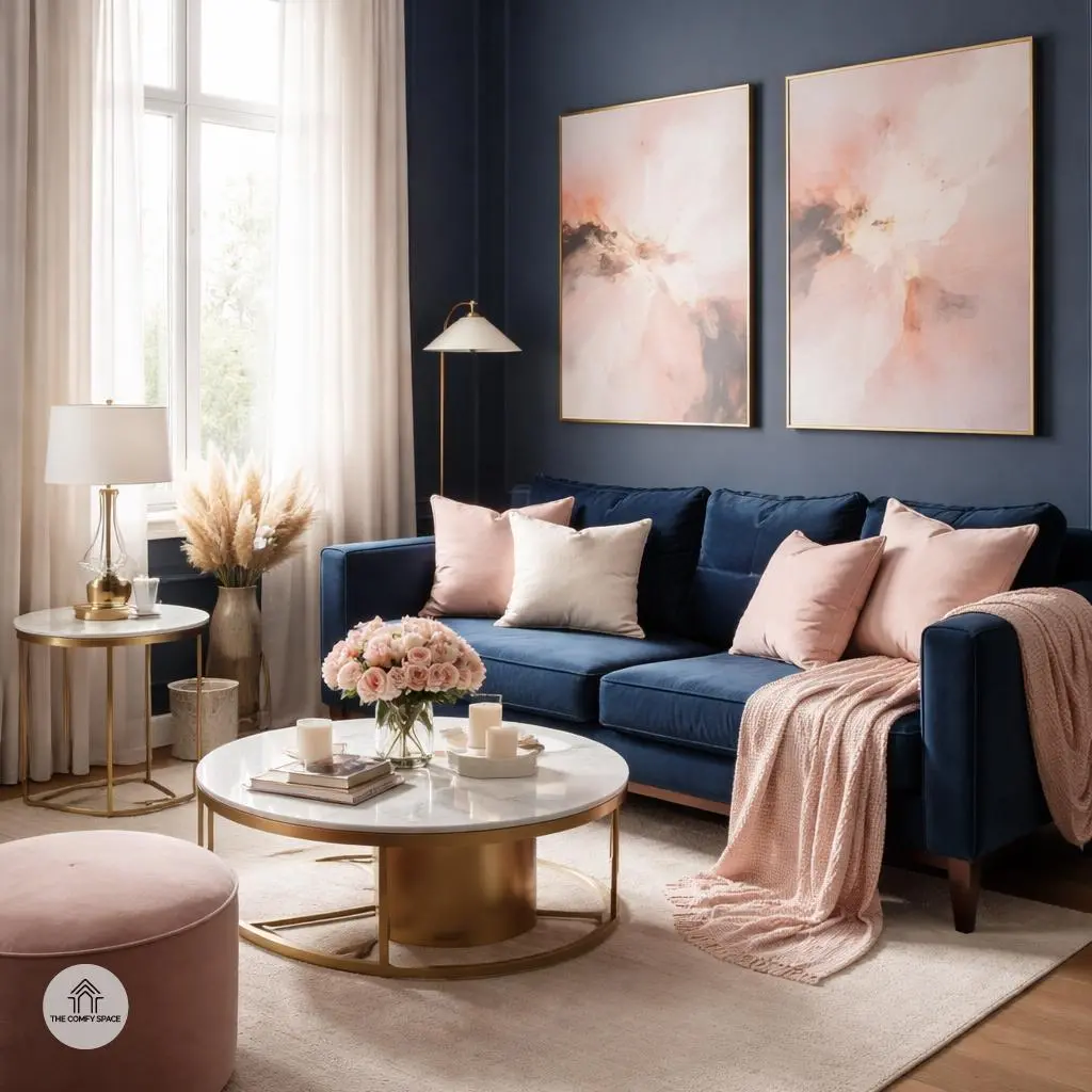
Navy blue and blush pink create a stunning duo that feels both bold and soft at the same time. Navy brings depth and calm, while blush pink adds a whisper of warmth and charm—it’s like pairing your favorite cozy sweater with a delicate silk scarf. When decorating your bedroom or a sophisticated lounge, balancing these colors can transform the space from dull to dynamic. Just remember, it’s easy to get carried away with navy’s darkness. I once painted an entire living room navy only to realize it felt more cave than chic!
One handy tip: use navy as the base color on walls or furniture, and blush pink on accessories like cushions, throws, or art pieces. This way, the pink injects just the right amount of brightness without overshadowing the navy’s elegance. In the wise words of interior designer Clara Benton,
“Balance is key; too much dark can swallow a room, but a splash of blush brings light back in.”
Embrace the learning curve—your perfect balance awaits!
Incorporating 2026 Trends into Your Home
Jumping on the 2026 home trends train doesn’t mean you need to overhaul your entire space overnight. Start small by swapping out accent pieces like cushions or throws. It’s an easy, budget-friendly way to keep your home feeling fresh. Plus, you get to play around with colors and textures without the commitment. Think of it as your trial run for bigger changes.
When it comes to painting, don’t rush in with a full wall of color. Grab some paint samples and test them out at home — walls can look totally different depending on the light and furniture. Trust me, I’ve painted a wall bright yellow only to regret it a week later! Also, embrace the quirks in your space. “Realistic styling beats perfection every time,” says interior designer Emily Walsh. Those little imperfections bring character and warmth, making your home genuinely inviting, not just showroom perfect.