
Ah, spring! That magical season when the air feels fresh, and everything around us seems to get a cheerful makeover. It’s the perfect time to breathe new life into your home, and trust me, nothing does that better than vibrant patterns. Whether it’s the soft bloom of floral prints or bold geometric shapes, patterns can transform a room instantly from drab to fab.
In this blog, we’re diving into the colorful world of spring patterns. Expect practical tips on mixing and matching, real-life decorating hiccups (because we’ve all made those whoops!), and inspiration to help you create spaces that bloom with personality and charm. Let’s ditch the winter blahs and invite that fresh vibe in!
Why Choose Patterns for Spring Refresh
Patterns are like the secret sauce of home decor, especially when you’re eyeing a spring refresh. They inject energy and personality into any room, transforming dull walls or plain furniture into vibrant focal points. It’s like giving your space a fresh outfit that matches your mood. And let’s be honest, who doesn’t want their living room to feel as lively as a spring garden?
One of the biggest perks? Patterns cleverly hide those annoying imperfections we all try to ignore, like scuffed walls or worn-out upholstery. Plus, they add depth, making rooms feel richer and cozier. Pro tip: switching up patterns each season is a game-changer. “Changing patterns is like updating your playlist — it keeps your space from becoming stale,” an interior designer says. So don’t hesitate to mix florals with geometrics or stripes with dots; your spring glow-up is just a pattern away!
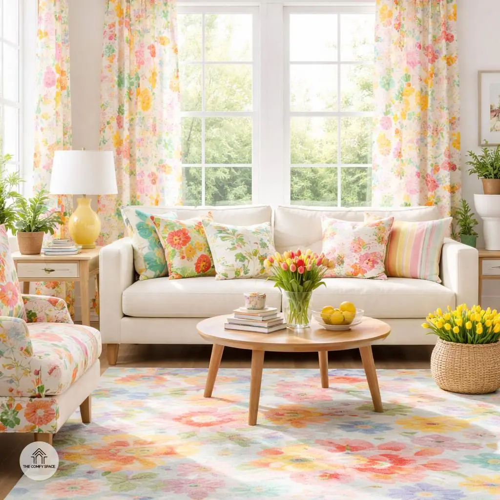
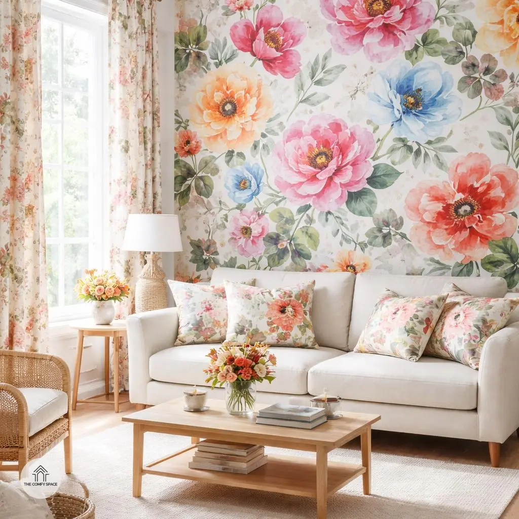
Bold Florals: Brighten Your Rooms with Nature-Inspired Motifs
Florals are a timeless classic that instantly breathe life into any room, especially during spring. Imagine walking into your living space and being greeted by vibrant petals and lush greenery – it’s like inviting nature right inside your home. When choosing floral designs, try mixing large blooms with subtle, muted backgrounds to strike the perfect balance. This approach keeps your space lively but not over-the-top, like that one time I went overboard with bright wallpapers and ended up feeling like I was stuck in a garden maze!
Small spaces can be tricky when decorating with bold florals. The trick is to use them thoughtfully: pick a single accent wall or incorporate floral cushions and curtains instead of covering every inch. Interior designer Lisa Grant says,
“Accent florals add personality without suffocating a room.”
So don’t fear the florals, just be selective, and your room will bloom beautifully without feeling crowded or cluttered.
Geometric Patterns: Modern Twist on Classic Designs
Geometric patterns are like the cool kids of the decor world—they bring a fresh, modern twist to classic designs without stealing the whole show. Imagine crisp lines and bold shapes popping with vibrant colors—it’s an instant mood-lifter. But heads up! Going overboard can make a room look like a chaotic math class. So, keep it simple by adding them on cushions or accent walls. These little pops of pattern bring energy while keeping your space balanced and inviting.
Pairing geometric patterns with plain furniture is a lifesaver. Trust me, trying to mix busy patterns with equally busy furniture was one of my rookie mistakes—my living room looked like an optical illusion! As designer Maria Johnson says,
“In decor, less is often more. Let your patterns speak by giving them room to breathe.”
Simple sofas or plain tables are the perfect blank canvas to let those sharp, clean shapes shine. Your guests will be impressed, and you get style points for ease and wow-factor.
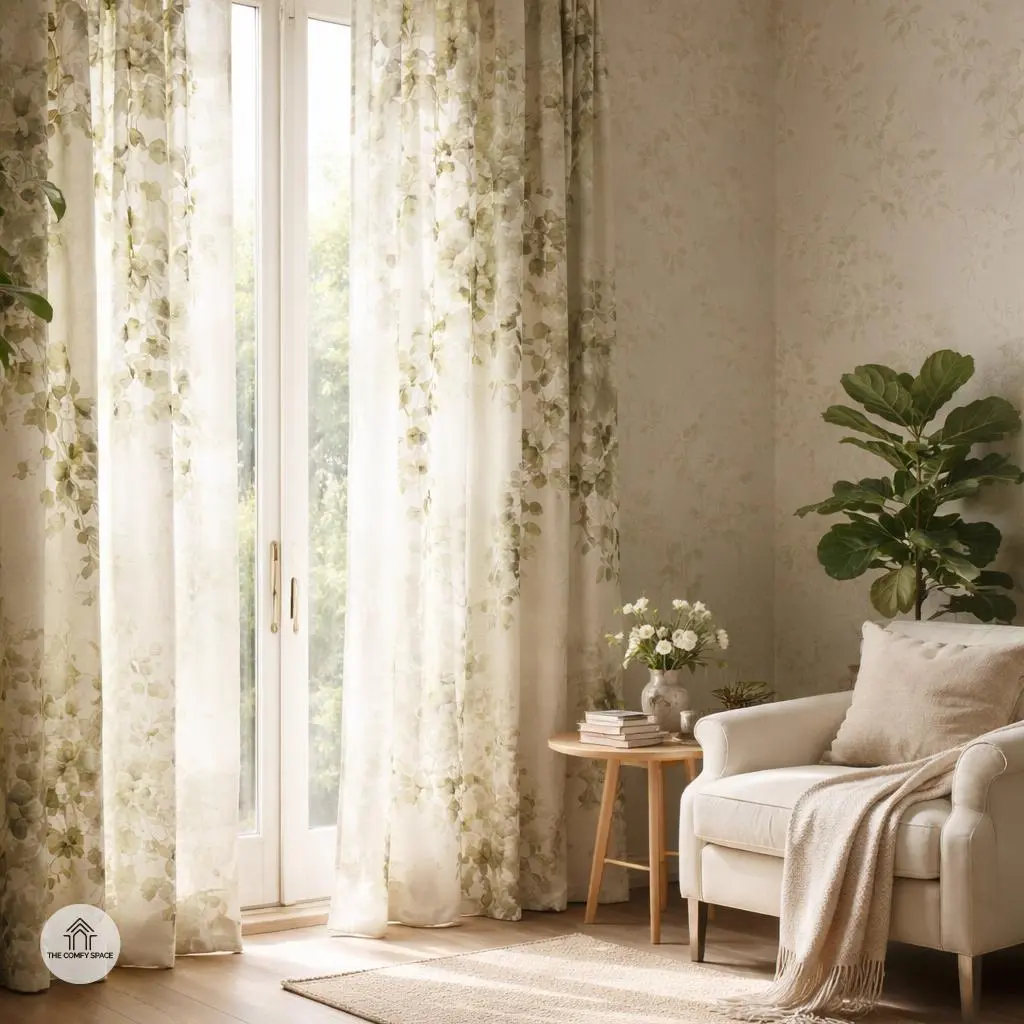
Botanical Prints: Bringing the Outdoors, Indoors
Bringing botanical prints into your home is like inviting a gentle breeze of nature indoors. Leaves and vines add a calming vibe that instantly transforms any space. I remember trying out botanical curtains in my own reading nook—at first, I thought it might overwhelm the small corner, but the result was pure magic. There’s something about surrounding yourself with natural patterns that eases the mind.
Trying this out is easier than you think. You can splash botanical prints on curtains or wallpaper for a fresh appeal that wards off boring walls. As interior designer Lisa Green says,
“Botanical prints create an endless conversation between your indoors and the great outdoors.”
Take the leap. Your home will thank you with a fresh, peaceful vibe.
Stripes and Checks: Timeless Patterns with a Spring Update
Stripes and checks have always been wardrobe and decor staples, but giving them a fresh spring update can breathe new life into your space. Pastel stripes, in particular, add a soft, inviting vibe that’s perfect after months of dull winter hues. Imagine a cozy nook with a pastel-striped rug that instantly brightens the room without overwhelming it. It’s like wearing your favorite comfy sweater but in decorative form!
Mixing checks of various sizes creates a playful yet balanced look. For example, pairing a large gingham tablecloth with smaller checked napkins adds depth and visual interest, making your dining area pop. “The key is to not be afraid of mixing scales,” one designer advises, reminding us that contrast keeps things fun. You’ll find this layering technique works wonders, especially in places like your kitchen or living room where rugs and linens get lots of love and use.
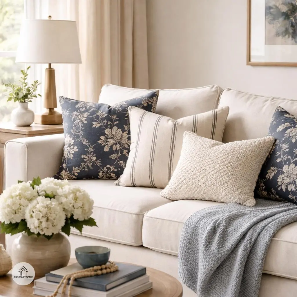
Mixing Patterns Like a Pro Without Overdoing It
Mixing patterns can be a game-changer for your home’s style, but it’s easy to go from chic to chaotic if you’re not careful. The trick? Sticking to a color palette. Think of it as your design’s secret handshake — patterns may seem wild individually, but when bound by a consistent color story, they play nicely together. Imagine navy florals chatting effortlessly with cream stripes over your cozy couch.
Another nugget to keep in mind is varying the scale and texture of your patterns. Pair big bold prints with something more subdued or mix smooth cotton stripes with nubby tweeds for depth. Trust me, after learning the hard way and accidentally pairing a loud paisley with clashing polka dots, I became a believer in this balanced approach. “Patience and a keen eye for pattern scale make all the difference,” my interior designer friend often reminds me.
Accessorizing with Patterned Items for a Quick Lift
Adding patterned accessories like throw pillows, lampshades, and art prints is a sneaky way to inject personality into your space without committing to bold wallpaper or furniture. These small touches can totally change the vibe, giving your room an instant lift that feels fresh and fun. It’s like giving your room a caffeine boost—quick, effective, and totally enjoyable. Plus, swapping out patterns seasonally is a breeze, letting you play with trends without breaking the bank or stressing over a full redesign.
But let’s be real, finding the right pattern can feel like searching for a needle in a haystack. Ever been stuck trying to match a lamp shade print with your pillows while wandering your favorite home store? Me too. The key is to remember “Less is more,” as interior designer Jane Smith says. Stick to two or three complementary patterns and mix in solid colors to keep things balanced. Trust me, the chaos of clashing prints is a hard lesson I learned after one too many mismatched shopping trips!