
Spring breathes new life into our homes, nudging us to shake off the winter blues and refresh our living spaces. It’s that magical season where colors bloom, moods lift, and a simple rearrangement or a splash of paint can transform everything. Imagine opening your curtains to a burst of soft pastels and vibrant greens that mirror the outdoors. Sounds delightful, right? The key is to let the season inspire you without overwhelming your space.
Start by experimenting with color palettes that set the mood you crave—maybe calming blues for a serene vibe or playful yellows for a cheerful boost. Remember, as interior designer Sarah Johnson says,
“Small changes in color can make a big emotional difference.”
So, try easy combos like mixing blush pinks with fresh greens or pairing sky blue with crisp whites. The best part? These combos are simple, budget-friendly, and fun to try!
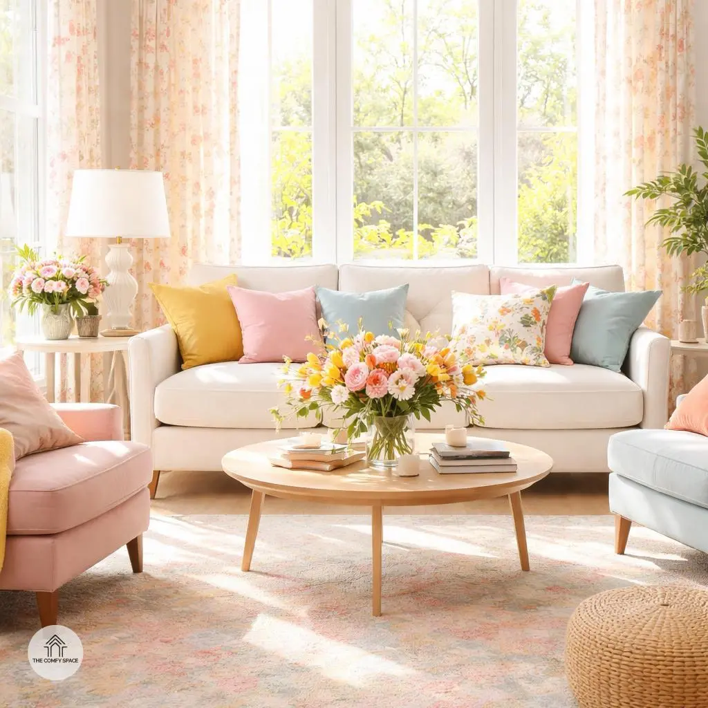
Embrace Pastel Perfection
Soft pinks, mint greens, and baby blues are like a gentle hug for your home. These pastel colors bring a light, airy feel that instantly freshens up any room. When I first tried using pastels, I was worried it might feel too girly or cold, but it turned out to be just the opposite — warm, welcoming, and surprisingly versatile. Designer Jane Smith sums it up perfectly:
“Pastels create a calm, cozy atmosphere that’s both timeless and trendy.”
Here are some quick tips to get pastel perfection right: pair pastel walls with white or cream furniture to keep things bright, and add textured fabrics like knit throws or fluffy rugs for interest. Pastels are especially great for bedrooms and living spaces where relaxation rules. Trust me, shopping for pastel decor at places like IKEA or Target might feel overwhelming, but once you find your perfect shades, the peaceful vibe is totally worth the hunt!
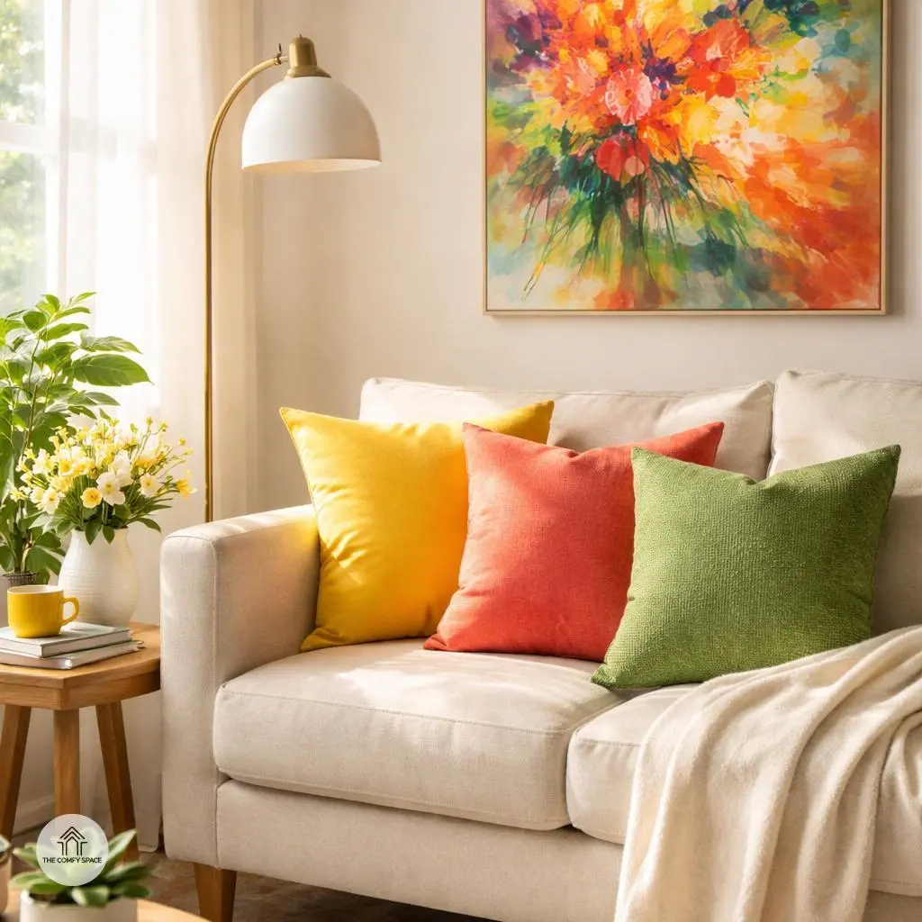
Bold and Bright Accents
If you want to wake up your space without a full makeover, bold and bright accents are your best friends. Think vibrant yellows, fiery corals, and fresh greens—they’re like a shot of espresso for your room. Adding pops of color through pillows or artwork instantly energizes your area without overwhelming your wallet or your patience. I’ve been there, terrified to paint or buy a whole new sofa, so I started small. Armchair renovations happen one pillow at a time!
Professional designer Lara Bennett once said,
“Bold colors bring personality to your home, making it uniquely yours.”
So, go ahead and play with contrasts. Mix and match your throw cushions or hang a bright art piece—small splashes can really wake up a tired corner. Just avoid going neon overload; balance is key, because nobody wants their living room to look like a carnival ride!
Nature-Inspired Neutrals
Nature-inspired neutrals like warm beiges, sandy tones, and olive greens bring the soothing vibes of the outdoors right into your living space. These colors create a calm, grounded atmosphere that feels like a breath of fresh air after a long day. Imagine sinking into a cozy beige sofa with olive green cushions that remind you of a peaceful forest walk. It’s all about inviting tranquility into your home while adding a touch of earthy warmth that’s easy on the eyes.
One tip? Pair these colors with wooden furniture to complete the natural feel. Think rustic oak tables or smooth walnut shelves—wood tones complement these neutrals perfectly. As interior designer Anna Behr suggests,
“Natural hues paired with wood bring balance and depth you can actually live with.”
I once tried this palette with crisp white walls and learned that too much white can steal the cozy effect, so balance is key. Shopping at local thrift stores for wooden pieces helped me find charming, unique furniture without breaking the bank—plus, it added character that store-bought items just can’t match.
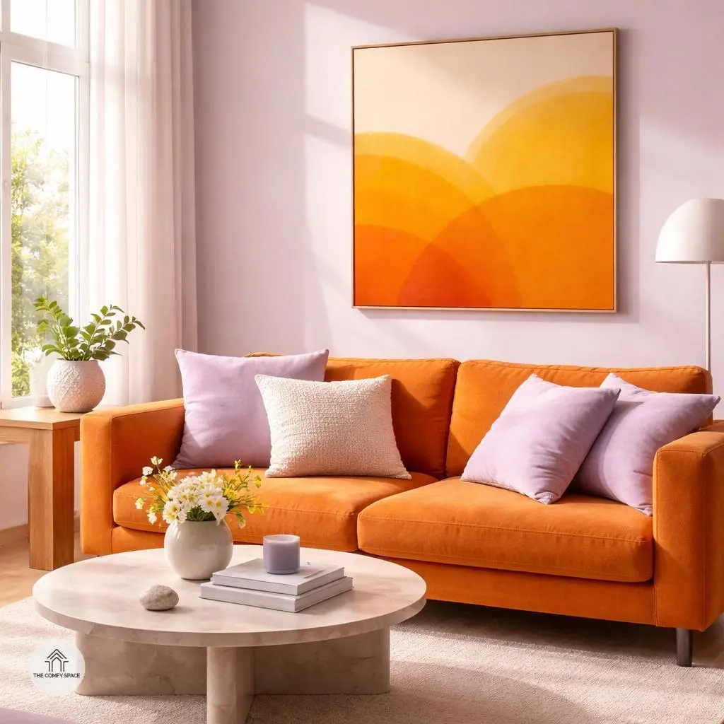
Mixing Warm and Cool Tones
Mixing warm and cool tones in your home decor is like blending your favorite playlist—each note brings out something special. Pairing soft lilacs with sunny oranges adds a delightful contrast that keeps the room lively but relaxed. It’s a dance between energy and calm, creating a space that feels both vibrant and inviting.
Designer Sarah Thompson once shared,
“Combining opposite tones can tell a story and express personality beautifully.”
Start small: try lilac cushions on an orange sofa or a sunny artwork in a lavender-themed room. Trust me, balancing this combo isn’t as tricky as it seems; just like mixing your favorite snacks—sweet meets tangy, and magic happens.
Refreshing Blues and Greens
Nothing says ‘refresh’ quite like the calming combo of blues and greens. Imagine sky blues mingling with fresh mint or sea foam—it’s like bringing the ocean breeze right into your home. These colors are champions for bathrooms and kitchens, where a touch of tranquility and freshness can totally change the vibe. I learned this the hard way after trying too many bold reds in my bathroom—talk about a mood swing!
When you’re sprucing up your space, think about layering shades instead of sticking to just one. Mix a soft sky blue with a pop of mint in towels or accessories. It’s a pro tip from interior designer Jenna Scott:
“Layering hues of blue and green creates a serene, spa-like atmosphere that feels effortless.”
Trust me, your morning routine will thank you.
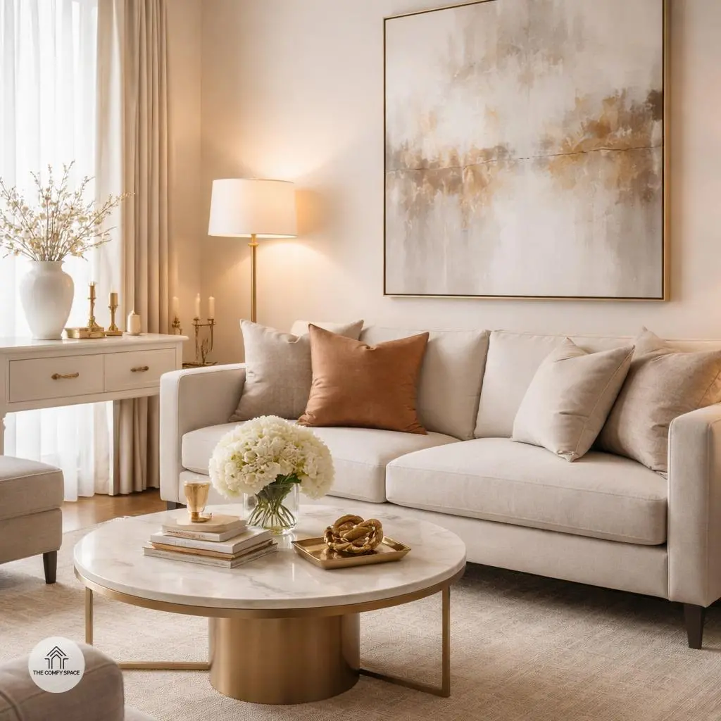
Incorporate Metallic Highlights
Adding metallic highlights like gold and brass accessories is a simple yet game-changing way to boost your space’s vibe. These touches bring warmth and a subtle sparkle that can instantly elevate any room, making it feel both cozy and chic. Think of it as adding that perfect dash of seasoning to your favorite dish—just the right amount makes all the difference.
Once, I tossed in a brass lamp into my living room and was amazed at how it brightened the entire space without clashing with my existing colors. It’s an easy upgrade that works wonderfully across all color schemes. As designer Anna Smith says,
“Metallics are the jewelry of the home—never underestimate their power!”
Here’s a quick tip: start small, like with drawer pulls or candle holders, and build your metallic collection to avoid it feeling overwhelming.
Tips for Choosing Your Perfect Palette
Choosing the perfect palette for your home can feel like choosing your outfit for the day—sometimes exciting, sometimes downright tricky. It’s important to see your colors in their true light, so always test samples during the day when natural light can show their real tones. I once picked a beautiful blue only to see it turn into a gloomy shade by afternoon—lesson learned! Try to experiment fearlessly; mixing unexpected colors might surprise you with a fresh, vibrant vibe.
Start small to avoid costly mistakes. Begin with accessories or just one painted wall before committing to an entire room. “Color is an adventure, not a blueprint,” design expert Lisa Simmons says. This approach keeps your space flexible and lets you evolve your style naturally while avoiding the panic of a whole-room repaint disaster. Trust me, I’ve been there!