
Spring is that magical time when homes wake up from their winter slumber, craving light, color, and fresh vibes. Walking into a space filled with soft pastels, bright greens, and sunny yellows feels like a breath of fresh air, even if you’re stuck indoors! Fun fact: coordinating colors isn’t just about looking pretty—it’s the secret sauce for a calm, balanced room where everything flows naturally. You know that feeling when your eyes don’t have to constantly jump around? That’s harmony in action.
Blending style and function in an open floor plan? It’s a bit like baking the perfect cake – you want beautiful layers but also a moist center that holds it all together. This spring, you’ll learn how to pick colors that tie different spaces together while keeping the layout practical and inviting. “Color coordination is the key that turns chaos into calm,” interior designer Jane Smith says. So, grab your color swatches and let’s get mixing!
Choosing a Spring Color Palette That Flows
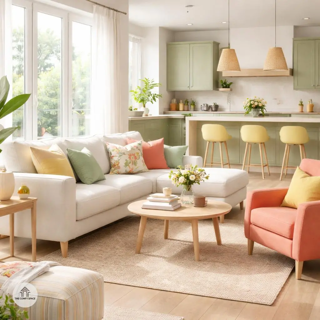
Spring is the perfect season to play with colors that breathe life into your home. Think soft greens inspired by fresh leaves and blooming pinks reminiscent of cherry blossoms. These nature-inspired hues bring calmness and a refreshing vibe indoors. When I first tried this, I made the mistake of going too bold without balance – the space felt like a party gone wild! Pro tip: combine these with neutral tones such as beige or soft grays to ground the palette and avoid overwhelming your senses.
Adding accent colors is like sprinkling personality throughout your room. A vibrant yellow pillow or a bold turquoise vase can turn heads without stealing the show. As interior designer Dana Johnson says,
“A well-placed pop of color is like a wink—fun, surprising, and completely charming.”
So, next time you’re shopping at your local home store, try mixing gentle hues with zesty accents to create a spring palette that flows smoothly and feels inviting!
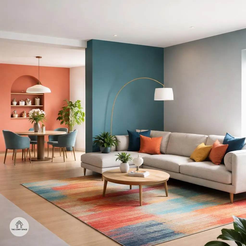
Using Color Zones to Define Spaces Without Walls
Defining spaces without walls can seem tricky, but using color zones is a game-changer! Imagine creating distinct areas with different complementary colors, like pairing teal with coral to separate your dining nook from the living area. It’s like telling your eye, “Hey, this is a new spot!” Adding rugs and coordinating furniture colors can truly highlight each section’s purpose. For instance, a vibrant rug under the coffee table paired with matching cushions can instantly set the lounge apart.
Want a smooth, graceful transition? Blend your zones with subtle color shifts, like gradually moving from a deep navy into a soft gray. This technique avoids harsh lines and keeps your space feeling cohesive and welcoming. “Using color to define spaces is like creating a visual journey,” interior designer Ana Lopez says. Trust me, after some trial and error shopping at that giant home store (you know the one we love and dread), I’ve learned these tricks make open spaces feel organized and, best of all, fun.
Balancing Bold and Soft Colors for a Relaxed Vibe
Finding the sweet spot between bold and soft colors can turn your space into a relaxing haven without feeling dull or chaotic. Think of pairing vivid spring shades like sunny yellows or lively corals with muted pastels such as dusty pinks or gentle blues. This combo creates a refreshing balance, brightening your room while keeping things mellow.
A pro tip? Avoid bombarding your eyes by spacing out these colorful accents thoughtfully. Add soft textures like plush cushions or cozy throws to mellow the intensity of vibrant hues. “Color impacts mood deeply; pairing it well is an art,” an interior designer says. Trust me, after trying too many clashing colors from those big-box stores, spacing and texture saved my sanity and my walls!
Incorporating Natural Elements to Enhance Spring Colors
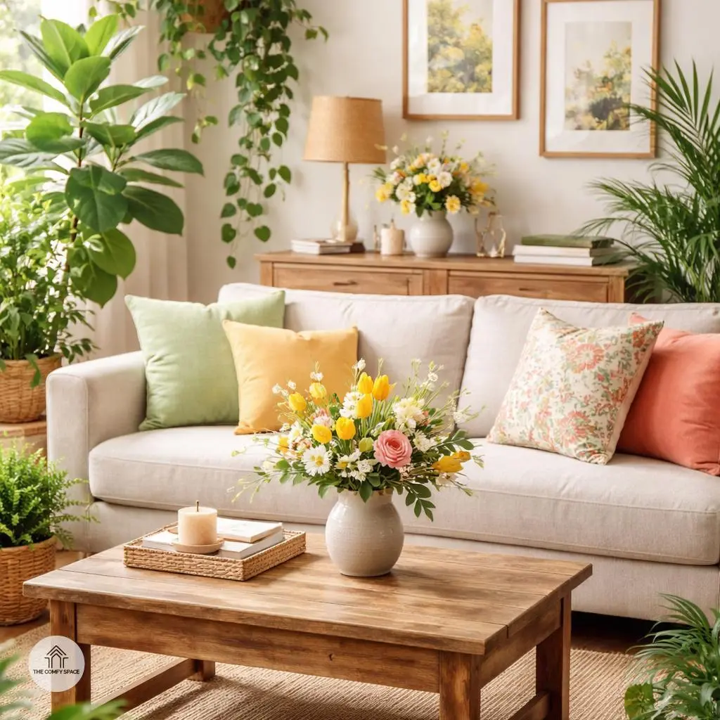
Bringing spring indoors is easier than you think! Adding indoor plants is a fantastic way to inject fresh greenery into your space. Not only do they purify the air, but they also create a calming vibe that instantly livens up any room. I once forgot to water my succulents, and believe me, watching them perk up after some TLC was worth every brown leaf. Plus, shopping for plants at local markets feels like a fun treasure hunt and less like a chore.
Wooden finishes are a clever trick to warm up those cooler spring hues. Try incorporating wooden picture frames, coffee tables, or even a rustic shelf. Seasonal floral decor and pottery can add that authentic spring feel that really ties your look together. Like designer Jane Doe says,
“Natural elements ground your design and make seasonal colors pop.”
Mixing these touches will have your home singing spring’s song in no time!
Selecting Furniture That Complements Your Color Scheme
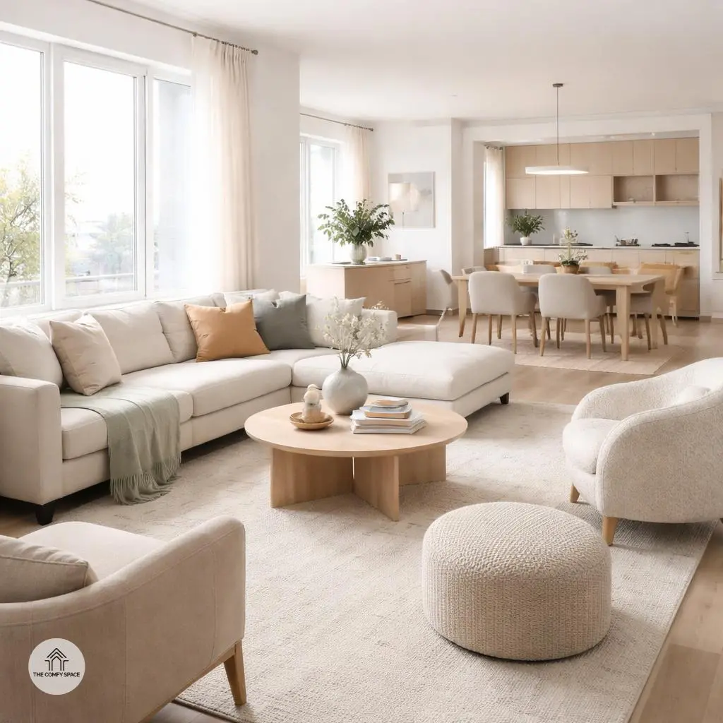
Picking furniture that perfectly complements your color scheme is like putting together the ultimate outfit – everything needs to flow effortlessly. Start by choosing upholstery in coordinating colors that either match or nicely contrast with your walls. For example, if your room is painted in soft pastels, a pop of deeper blue or emerald sofa can add just the right amount of oomph without overwhelming the space. “Matching colors is about balance, not exact replication,” interior designer Sarah Linton says, reminding us that variety keeps things lively.
Don’t shy away from mixing and matching materials either. Combining a sleek leather chair with a plush velvet ottoman can make your room visually interesting. And if you’re like me, constantly battling tiny apartments, consider lightweight furniture pieces that keep the area open and airy. I learned this the hard way after buying a beast of a couch that practically ate my living room – lesson learned!
Tips for Missteps to Avoid When Decorating Open Floor Plans
Decorating an open floor plan can feel like walking a tightrope, right? One tiny misstep and suddenly your space looks like a chaotic color explosion. A golden rule is to avoid overloading the room with too many bright colors. Instead, choose a dominant shade and sprinkle in accents thoughtfully. It’s tempting to go wild with every hue, but trust me, less is more. As designer Lara Fields says,
“Balancing colors in open spaces is key to creating harmony, not havoc.”
Another classic pitfall is mixing styles that don’t vibe well together—especially during spring, when light and airy themes are all the rage. Resist the urge to cram grandma’s heavy antique alongside sleek modern furniture; unless your goal is a decorating disaster, avoid clashing styles. And please, pay attention to the flow between zones. It’s not just about how each area looks separately, but how they dance together. Ever tried carrying snacks through a maze of awkward layout? Yeah, not fun. Keep pathways clear and vision consistent for easy, breezy living.
Bringing It All Together with Accessories and Art
Bringing your room to life with accessories is where the magic happens. Cushions, throws, and curtains in your chosen palette don’t just add color—they add personality and coziness. I learned the hard way that mismatched shades can make a room feel chaotic, so stick with your palette to keep things harmonious. Changing these small textiles seasonally is a simple trick to refresh your space without a full overhaul.
Artwork is your chance to play with contrasts or complements. Hanging a bold, colorful piece against soft-toned walls creates a fun focal point, while more subtle art can calm a busy space. As interior designer Jane Doe says,
“Art transforms a room from bare to beautiful.”
And don’t forget to swap out small items like vases or scented candles with the seasons to keep your room feeling fresh and alive.