
Spring is that magical season when everything feels fresh and full of life, making it the perfect opportunity to give your entryway a colorful makeover. Swapping out dull, tired tones for lively hues can instantly brighten the mood as soon as you walk through the door. Imagine stepping into a space that greets you with cheerful vibes, setting a happy tone for the rest of your home. I’ve done this myself after many grey winters, and let’s just say, even my cat seemed perkier!
Start simple by picking a vibrant accent color—think sunny yellows, soft corals, or lively greens. You don’t have to go all out at once; sometimes a splash on the door, a fresh coat on trim, or a colorful runner rug does the trick. “An entryway is your home’s first impression,” interior designer Lisa Monroe says, “so don’t be shy about using bold colors to make it pop.” A little paint and a positive attitude go a long way to welcome guests warmly and refresh your own spirits.
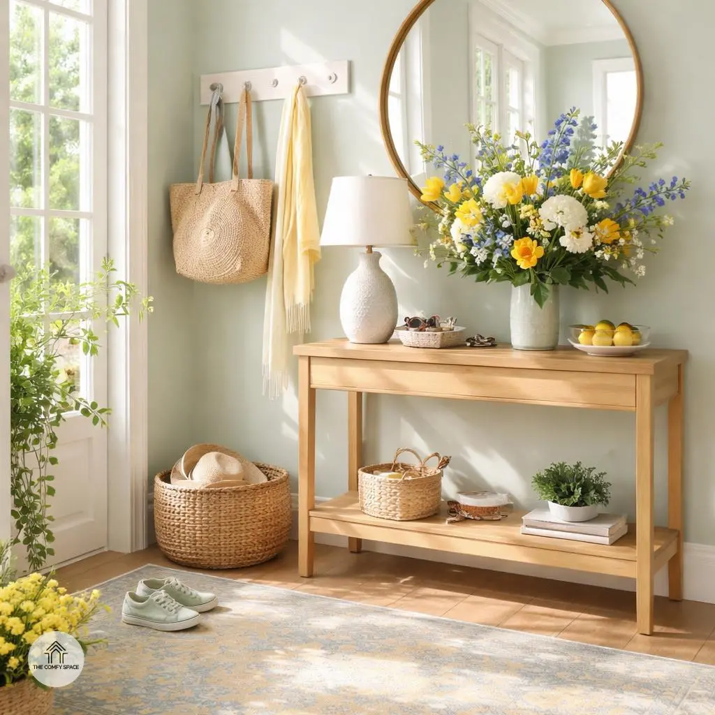
Embrace Soft Pastels for a Gentle Welcome
When it comes to welcoming guests, soft pastels like gentle pinks, minty greens, and serene baby blues work wonders. These hues aren’t just pretty—they bring a soothing, fresh vibe right to your doorstep. I’ve learned the hard way that overdoing bright colors in a small entryway can feel like walking into a candy store gone wrong!
One trick? Let natural light team up with your pastels. Together, they create an airy, open atmosphere that makes even the tiniest foyers feel like a breath of fresh air. As interior designer Jane Smith says,
“Pastels have this magical way of expanding space without shouting for attention.”
So, don’t hesitate to embrace these subtle shades to brighten your entryway beautifully.
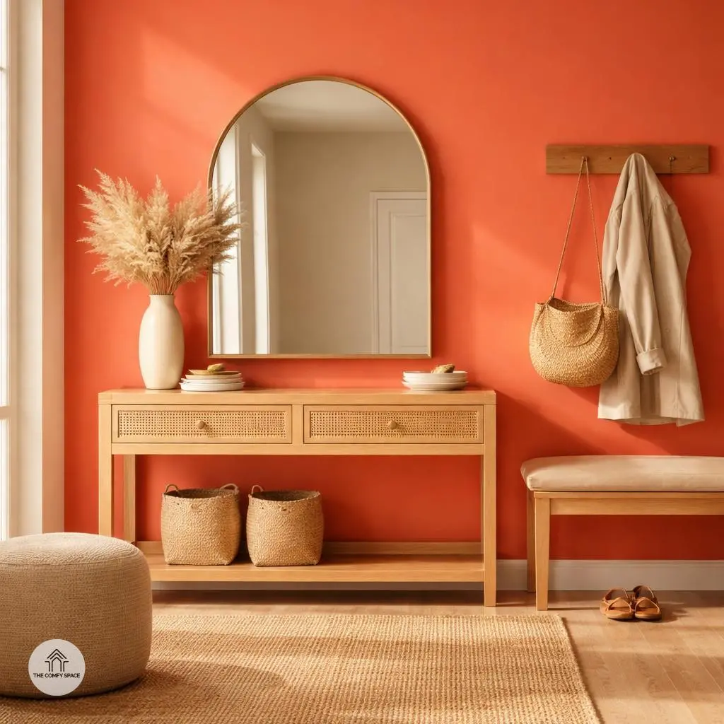
Bold & Bright: Energize with Vibrant Shades
Trying to breathe life into your entryway? Bold, bright shades like daring oranges, sunny yellows, and lively corals do wonders in injecting energy and a playful vibe. Imagine walking into a space that instantly lifts your mood — it’s like a daily vitamin boost for your home. I once painted my entry wall a fiery coral, and wow, guests still talk about it! Just a heads-up: balance is key. Too much can overwhelm, so think of using these hues on accent walls or the front door instead of slathering every surface.
Professional designer Sarah Klein wisely says,
“Bold colors aren’t just daring—they’re conversation starters.”
To get the best bang for your buck, paint your entryway wall or the front door and accessorize with neutral furnishings nearby. This way, you avoid the all-too-common mistake of turning your home into a neon jungle. It’s all about creating that ‘wow’ factor on first glance without making your eyes scream!
Neutral Tones with a Spring Twist
Neutral tones like warm greiges, buttery creams, and soft taupes bring a cozy, understated charm to any room. They’re like that reliable friend who never steals the spotlight but always makes things feel just right. These hues add subtle sophistication without overwhelming the space, making your home a calming oasis.
Pairing neutrals with bright spring accents is a game-changer. Neutrals provide a perfect backdrop for pops of color, helping those cheerful florals or pastel accessories shine without chaos. As interior designer Anna Smith says,
“Neutrals are your best friend when balancing vibrant colors — they keep everything feeling harmonious and grounded.”
Plus, when you’ve ever struggled with bright walls clashing, you know this subtle grounding makes decorating so much easier!
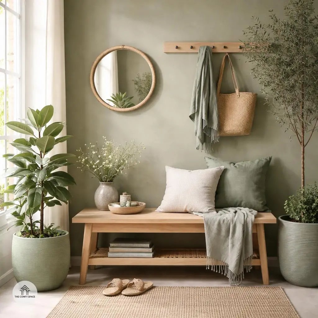
Nature Inspired Greens for Tranquility
Welcome the soothing embrace of nature right into your home with greens inspired by the great outdoors. Shades like sage, eucalyptus, and olive aren’t just colors; they’re little doses of calm that make a space feel grounded and peaceful. Imagine walking into your entryway and being greeted by these tranquil hues that instantly ease the rush of everyday life. “Using nature-inspired greens in interiors creates a calming sanctuary, connecting the indoors with the outdoors,” designer Ava Martinez says.
Don’t be shy about mixing it up—these shades work wonders on walls, but they also shine through in accessories like cozy rugs and playful planters. I once painted an accent wall in olivine green and paired it with matching pots and cushions; it was like bringing to life a tiny indoor garden. The vibrant freshness instantly lifted the mood, proving how versatile and rewarding these greens can be in making your home feel fresh and inviting.
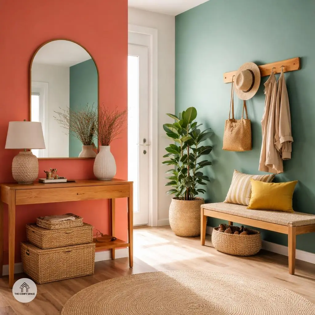
Mix and Match: Combining Colors Effortlessly
Mixing and matching colors in your home doesn’t have to be a headache. Start by pairing soft pastel walls with bold, surprising door colors—think blush pink walls complemented by a deep navy door. It’s a simple trick to add a pop of personality without going overboard. Remember, “Colors should comfort, not confuse,” interior designer Jamie Lee says, highlighting that your home should feel inviting, not chaotic.
If you’re more into calm vibes, build a neutral base with whites, beiges, or light grays and sprinkle in nature-inspired greens through plants or textiles. This creates a soothing harmony that feels fresh and intentional. And when painting isn’t an option, colorful rugs and vibrant artwork can introduce layers of interest without repainting—great for renters or the indecisive! I learned the hard way that stickers on walls don’t blend well with bold rugs, so be cautious when mixing textures!
Textures and Finishes to Complement Your Colors
When rocking bright or bold colors, matte paints are your best friend. They soften the punchy tones and give your space a more sophisticated vibe. I once tried a shiny finish on my living room wall, and let’s just say, the glare was distracting during movie nights. Going matte was a game-changer—”Matte finishes create depth without the glare,” a design pro notes.
On the flip side, glossy finishes are perfect for naturally lit entryways—they bounce light around, making the space feel bigger and welcoming. And don’t forget about textures! Adding woven baskets or wooden furniture not only looks great but offers cozy tactile warmth, balancing the sleek finishes and colorful walls. Trust me, mixing these elements saves a room from feeling like a flat poster.
Common Mistakes to Avoid When Choosing Entryway Colors
Choosing entryway colors sounds fun until you realize you’re knee-deep in swatches, and nothing looks like you imagined. One classic blunder is grabbing bright colors on a whim without testing how they appear in various lights. Just because that sunshine yellow looks dazzling in the store doesn’t mean your hallway won’t resemble a spotlight stage. Always test samples at different times of day; natural light changes everything. “Lighting can make or break a space,” architect Emma Collins reminds us.
Next, resist the urge to turn your entryway into a carnival by mixing every bold pattern and color you fancy. Overloading the space leads to visual chaos rather than charm. Instead, aim for a harmonious flow that ties your entryway palette with the rest of your home. Ignoring this harmony can make guests feel like they’ve stepped into a totally different house, and frankly, it’s disorienting! Small tweaks that promote color continuity make a BIG difference.