
Spring breathes new life into everything, making it the perfect moment to give your bedroom a fresh, calming makeover. Imagine waking up in a space painted with soothing hues that not only brighten your room but lift your spirits too. Many people don’t realize that color can influence mood and sleep, turning your bedroom into a personal sanctuary. If you’ve ever ended up with a paint color you actually dislike (guilty here!), this guide will help you avoid those common pitfalls.
We’re diving into easy, practical color ideas that anyone can tackle without stress. Whether you’re a seasoned DIYer or someone who loves shopping for decor at your local stores and getting accidentally overwhelmed, these tips will keep things simple and fun. Remember, as the renowned interior designer Emily Henderson says,
“Color is the quickest way to make a big impact, no matter your style.”
Let’s turn your bedroom into a peaceful haven this spring!
Why Choose Soothing Colors for Your Bedroom
Choosing soothing colors for your bedroom is like giving your space a gentle hug after a long day. Colors like soft blues, muted greens, and warm neutrals naturally calm the mind and help you unwind effortlessly. I once painted my bedroom a soft lavender, thinking it’d be just a simple change, but it honestly transformed my sleep quality. It feels like a mini spa retreat right at home!
Experts often say,
“Soothing hues reduce stress and promote deeper, more restful sleep,” interior designer Emma Collins says.
Plus, these colors create a peaceful retreat vibe, making it easier to shut the world out and just relax. If you’re like me and tend to stress about what paint to pick, start with a sample patch and live with it for a few days—trust me, that little step saves a ton of headaches.
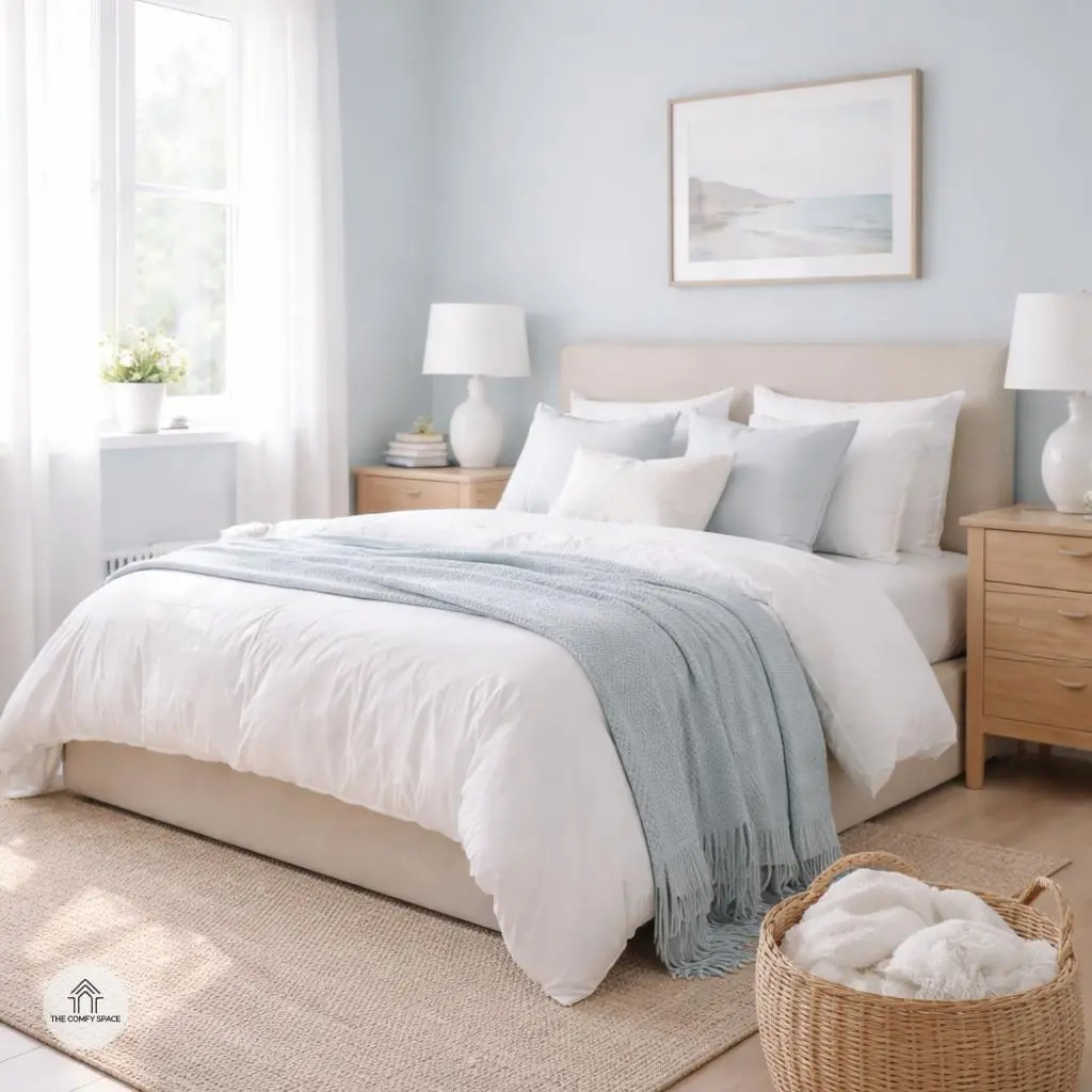
Soft Pastel Blues: Calm and Inviting
Soft pastel blues are like a gentle breeze on a lazy Sunday morning—instantly calming and effortlessly inviting. These shades carry a subtle tranquility that can instantly transform a chaotic bedroom into a peaceful sanctuary. Pairing pastel blues with crisp whites and light woods adds an airy freshness that’s hard to beat. I remember painting my own bedroom walls a soft blue after a hectic week, and the soothing vibe was immediate—I could finally relax and actually sleep!
To get this look right, choose accessories like fluffy white pillows or a wicker basket for a natural touch. Architect and designer Lisa Monroe says,
“Pastel blues bring a peaceful energy that invites you to slow down and breathe.”
So if your bedroom feels like a storm of clutter, try soft blues and light accents—they’ll help you drift off with a smile.
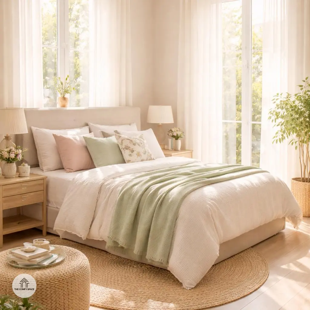
Gentle Greens: A Touch of Nature Indoors
Bringing gentle greens into your bedroom is like inviting a little piece of the outdoors inside. These soft green tones instantly create a calm vibe, making your space feel like a peaceful retreat. Imagine waking up surrounded by colors that remind you of a quiet garden or a breezy forest walk—sounds dreamy, right? To make this natural look even cozier, pair your greens with textures like rattan furniture or linen curtains. Trust me, these textures add warmth and a down-to-earth charm that’s hard to beat.
One lesson I learned the hard way? Don’t overdo the green. Too much can feel a bit like spending the whole day inside a mossy cave. Instead, sprinkle in green hues through pillows, throws, or a fresh plant in the corner. It’s a simple trick that keeps your room feeling fresh but far from overwhelming. Interior designer Amy Collins says,
“Soft greens gently calm the mind, making them perfect for sleeping spaces.”
So, ease into the trend and let your room breathe with the subtle touch of nature.
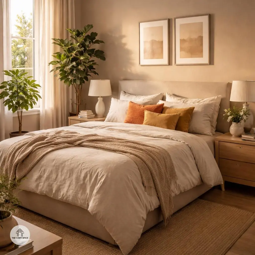
Warm Neutrals: Cozy Yet Chic
Warm neutrals like beige and taupe are the unsung heroes of interior design. These shades effortlessly create a cozy, welcoming vibe that feels like a soft hug after a long day. When you’re refreshing your bedroom for spring, they offer a perfect base that’s both chic and snug. Think of them as the calm background to your colorful accents—such as throw pillows or art pieces—which get to shine without the room screaming for attention.
Here’s a pro tip from interior designer Mia Clark:
“Warm neutrals are the quiet champions of style—they invite comfort without sacrificing elegance.”
Try mixing warm taupe walls with soft beige bedding and then toss in a few bright cushions or plants. It’s like giving your room a fresh outfit that feels as cozy as your favorite sweater. Plus, shopping for those shades is easy—stores like IKEA or HomeGoods offer plenty of budget-friendly finds that won’t break the bank or your sanity.
Blush Pinks: Softness with a Modern Twist
Blush pink is like the cozy hug your bedroom never knew it needed. It brings a soft warmth that’s both elegant and inviting without feeling overly sweet. Pairing it with shades of grey or cream can create a stunning balance—imagine a dusty blush wall with creamy curtains or soft grey bedding. It instantly gives your space a modern twist while still keeping things gentle and approachable.
I once tried blush pink in my own bedroom and quickly learned it’s trickier than it looks! Too much and it veers into bubblegum territory, too little and it feels lost. The secret is layering textures and tones—velvet pillows, woven throws, and matte finishes all help keep blush fresh and sophisticated. As interior expert Jane Doe notes,
“Blush pink is subtle power—a gentle statement that adds personality without overwhelming.”
It’s a color that’s feminine yet totally contemporary, perfect for a stylish sanctuary that’s easy to live in.
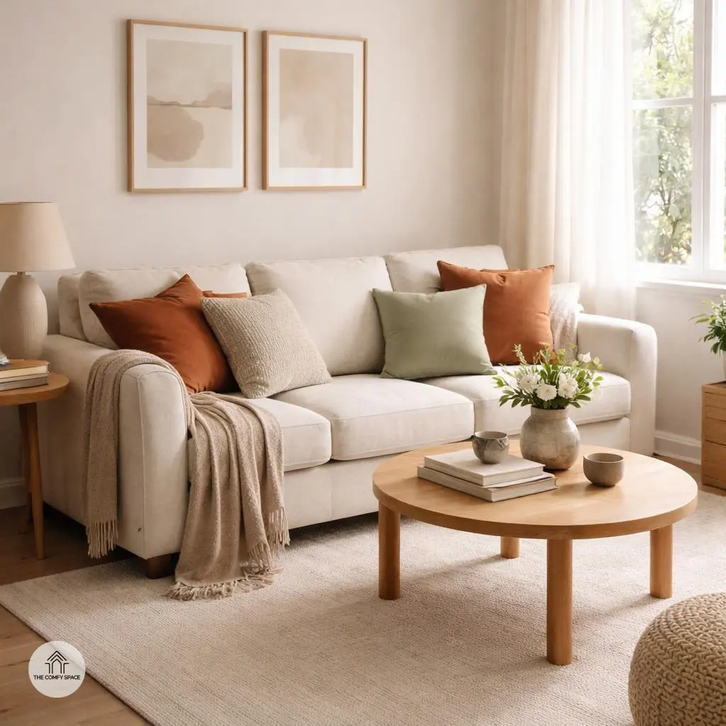
Tips for Combining Colors Without Overdoing It
Mixing colors can be a thrilling adventure or a total nightmare — trust me, I’ve had my share of both! The magic trick? Stick to two or three main color tones to keep things balanced and pleasing to the eye. Too many colors can turn your serene space into a chaotic circus. Think of it like making a smoothie: you want a few tasty ingredients that blend well, not a dozen random flavors clashing!
Adding accent pillows and throws is a fun and fuss-free way to sprinkle in pops of color without overdoing it. These small touches let you experiment without wrecking your walls or furniture. And before you commit to that paint shade you fell in love with at the store (we’ve all bought paint that looked totally different once dried!), test samples on your walls. “Taking that extra step saves you heartbreak and costly fixes,” a seasoned interior designer advises.
Personalizing Your Spring Refresh
Spring cleaning doesn’t mean tossing everything out and starting fresh—it’s about breathing new life into your space. One fun way to personalize your spring refresh is by incorporating your favorite art or meaningful accessories. Those little treasures tell your story and instantly make your room feel like ‘you.’ Plus, mixing textures, like soft linens with cozy rugs, adds depth and invites comfort, which is perfect for that unpredictable spring weather.
Here’s a tip I learned the hard way: don’t overwhelm yourself by changing everything at once. I once ditched my old setup entirely, only to regret losing those cozy elements I loved. As the interior designer Sarah Greene says,
“Cherish what works, and build around it.”
So keep what feels right and freshen up the rest. Your space—and your sanity—will thank you!