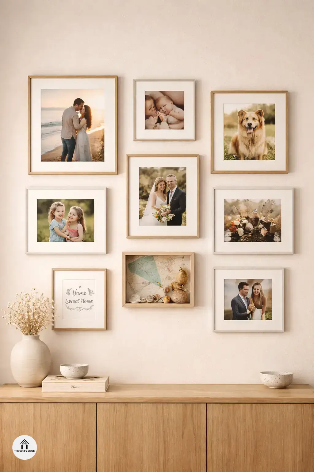
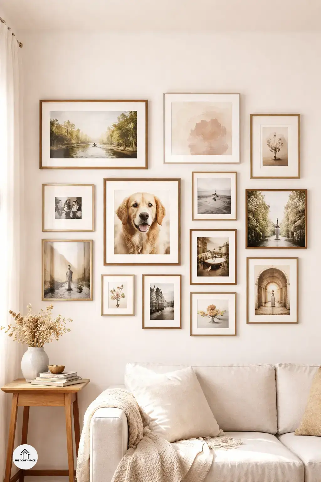
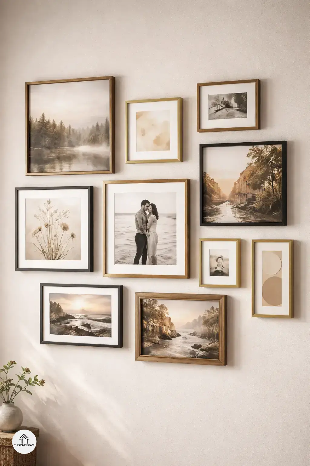
Gallery walls are a fantastic way to showcase your personality and tell your unique story through art and photos. Instead of a single piece dominating your space, a gallery wall creates a dynamic mix that draws the eye and sparks conversations. It’s like a curated collection of your life’s best moments and inspirations all in one spot. As designer Anna Lee says,
“A gallery wall makes a room feel truly lived in and loved.”
But let’s be real — mixing different art and photos can be both joyful and tricky. Finding the balance between style, theme, and frame choices sometimes feels like assembling a puzzle with too many pieces. Later in this post, we’ll share some practical tips and tricks to nail the perfect layout and pick frames that sync effortlessly. Trust me, after a few trial-and-error attempts (and a handful of leftover nail holes), you’ll be a pro in no time!
Planning Your Gallery Wall Layout
Planning your gallery wall layout can be both exciting and a bit intimidating. Start with a theme or color palette to create a cohesive look that reflects your personal style. For example, you might choose vintage black-and-white photos or bright, colorful abstracts that pop against a neutral wall. “A well-thought-out theme is like the backbone of a stunning gallery wall,” interior designer Mia Thomson says.
Before hammering nails into your wall, try arranging your frames on the floor. This hands-on approach helps you find the perfect balance without damaging your walls. Also, consider using paper cutouts taped to the wall to visualize the final arrangement—it’s a trick that preps you for the real deal and saves headaches later. I remember smashing a few frames in my first attempt; lesson learned!
Choosing the Right Frames for a Cohesive Look
Choosing the right frames is where your gallery wall really starts to shine. The secret? Mix and match frame styles and materials to add texture and depth. Think about combining sleek black metal with rustic wood, or even a flash of metallic for glamour. Don’t stress over being too matchy-matchy—”Don’t be afraid of mismatched frames—they add character,” says interior designer Jamie Lee. It’s this playful mix that keeps things interesting and personal.
Color tone is another game changer. Whether you lean towards classic black and white, warm wood tones, or shiny metallics, sticking to a palette helps your gallery look cohesive. The real trick is to imagine your wall as a story—each frame a chapter. And yes, learning from your own frame-shopping adventures (hello, multiple trips to familiar stores!) is all part of the fun and learning curve.
Tips for Hanging and Spacing
When it comes to hanging your personalized gallery wall, maintaining consistent spacing is key to achieving a polished look. Think of it like baking cookies; if you cluster them all, some burn while others stay doughy. The same goes for frames! Using a level and measuring tape isn’t just geeky—it’s essential. I learned this the hard way after a tilted frame haunted my living room for weeks. As interior designer Emma Thomson says,
“Accuracy turns chaos into art.”
Start hanging your pieces from the center and work outward to keep your layout balanced and intentional. It feels like piecing together a puzzle, sometimes frustrating but oh so rewarding when it all comes together. Pro tip: lay your frames on the floor and experiment before making those dreaded nail holes!
Personal Touches and Mistakes to Avoid
Adding personal photos and meaningful objects to your gallery wall truly makes it your own. It’s like telling a story that only you and your loved ones understand. Remember when I tried to cram every single souvenir from my travels onto one wall? Big mistake! It ended up looking cluttered and chaotic. To avoid this,
“Less is more when it comes to personalization,”
says interior designer Emma Collins. Pick a few cherished pieces and let them shine.
Another rookie error is overcrowding or going too big too soon. Start small and test your layout on the floor first before hammering nails into the wall. Uneven spacing and mismatched frame themes can also throw off the whole vibe. Consistency isn’t about being boring—it’s about harmony. So, keep spacing even and frames complementary for a polished look. Remember, mistakes are just part of the fun learning process!