Spring cleaning isn’t just about dusting shelves or decluttering your closet. It’s that magical time when you can literally refresh your space with a splash of color. A fresh coat of paint can instantly lift your mood, turning your home into a sunny retreat. As color expert Jane Doe says,
“The right hues can brighten not just walls, but your outlook on life.”
And seriously, nothing beats walking into a room that feels like a breath of fresh air.
Now, let me share a little secret — my first attempt at DIY painting was a total disaster. Picture roller marks everywhere and a color that screamed ‘what was I thinking?!’ Thankfully, switching to a spring palette of breezy blues and soft greens saved the day. Spring is perfect for experimenting with cheerful, light colors that echo nature’s rebirth. So don’t be afraid to have fun with it — your walls are your canvas for a happier, brighter home.
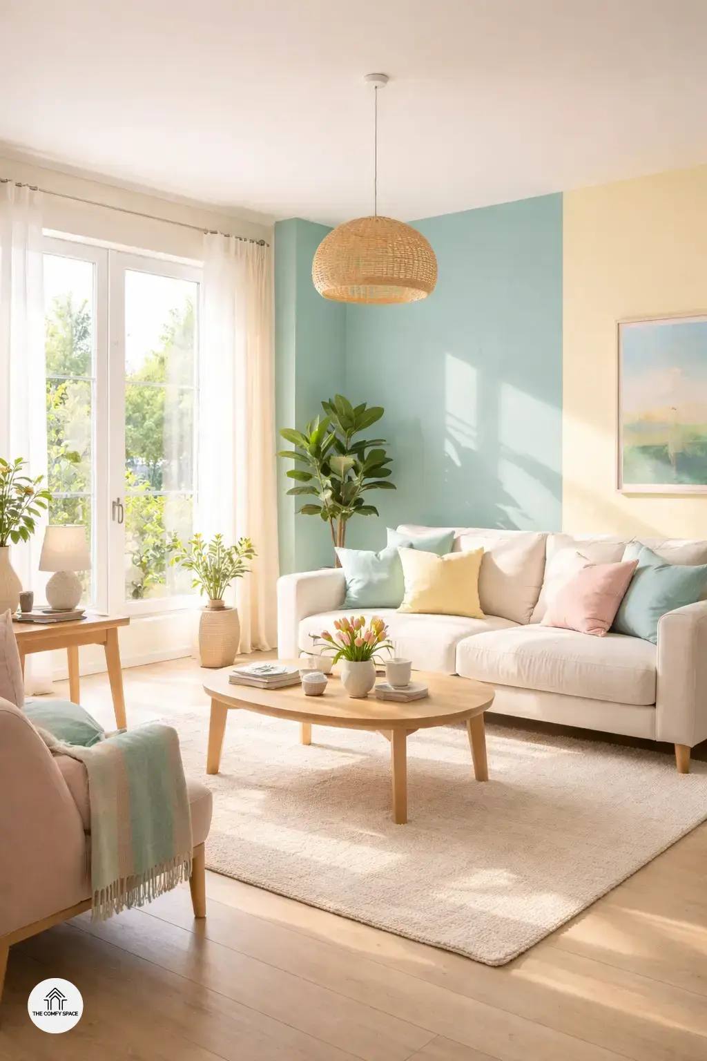
Soft Pastels: The Go-To for a Calm, Airy Feel
Soft pastels are the unsung heroes of spring paint palettes. Lavender and mint green create a peaceful vibe that makes any room feel like a gentle hug. I remember attempting to use these colors in my living room—only to initially pick a shade of lavender that was too bold. Lesson learned: always test paint samples on your walls for a few days before committing. “Pastels, when chosen right, bring a calm atmosphere that invites relaxation,” an interior designer once shared with me.
Pairing pale peach with creamy whites gives your space a warm glow, perfect for those cozy spring mornings. And for an airy touch, misty blue can mimic the clear spring skies, which instantly lifts the spirit. Shopping for the perfect soft pastel can be tricky—think about visiting your local paint store, armed with photos of your space, so you avoid that all-too-familiar return trip to exchange an ‘off’ shade. Small tweaks like these make a world of difference!
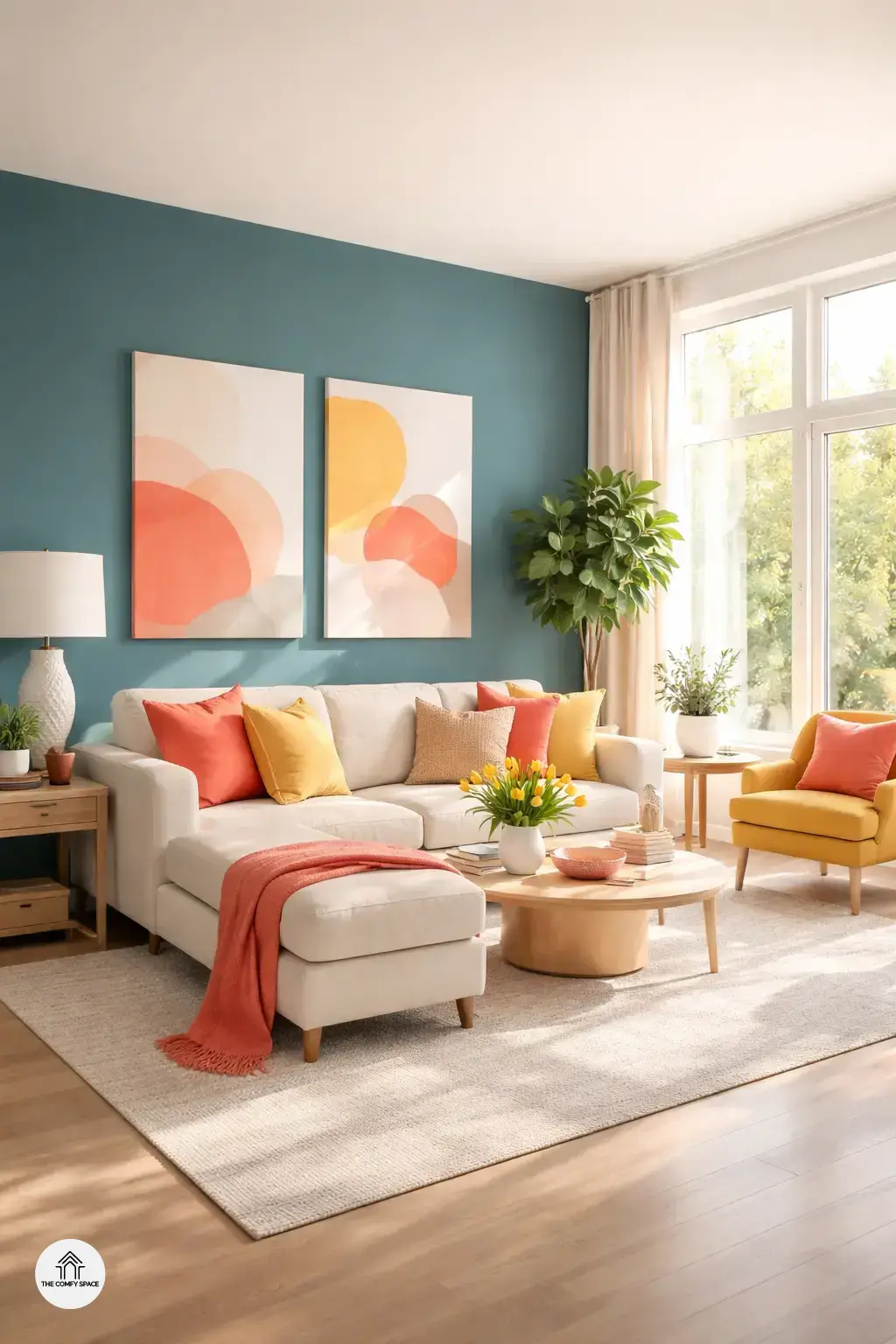
Bold Accent Walls to Make a Statement
Bold accent walls are all the rage this spring 2026, perfect for making a statement without overwhelming your entire room. A deep teal accent wall is fantastic for adding depth and a touch of sophistication. I remember struggling to choose the right shade, wandering through paint aisles at Home Depot, only to discover that teal comes in a million shades. My advice: test samples on large poster boards before committing!
Vibrant coral instantly energizes any space, bringing warmth and fun vibes. Pairing it with neutral furnishings creates a balanced look that’s playful yet chic. And if you’re feeling adventurous, mustard yellow offers a trendy, retro pop that adds personality without shouting. As interior designer Jane Smith says,
“Accent walls are your playground – don’t be afraid to play with color.”
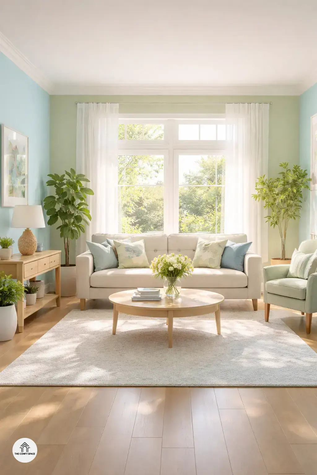
Earthy Neutrals that Bring Nature Indoors
Earthy neutrals are the unsung heroes of spring 2026 paint trends. They bring that calm, grounding vibe straight from nature into your home. Think warm beige with a whisper of pink—that’s perfect for keeping things soft and natural. I once tried a bold beige in my living room and ended up with a dull space until I added a pinkish hue. “A gentle touch of pink turns beige from boring to inviting,” a color expert shares. It’s like hugging your walls with a cozy blanket.
Now, for those craving a bit more life, olive green is your go-to. It feels fresh, like stepping into a garden after rain. Pair it wisely with earthy tones to keep it balanced. And oh, terracotta! It adds this rich, warm depth without screaming for attention. Just remember, a little goes a long way to avoid overwhelming your space. Pro tip: sample these colors in natural light before committing—trust me, shopping for paint isn’t always as fun as IKEA runs.
Tips for Choosing the Right Palette for Your Home
Choosing the right paint palette can feel like a puzzle, especially when the goal is to brighten your space for spring 2026. First, consider your lighting — natural vs artificial. Natural light can make colors look vibrant and true, while artificial lighting may change the hue completely. I once picked a gorgeous sky blue that turned into a gloomy teal under my kitchen’s warm lights. A pro tip? Test samples on different walls before committing. It’s surprising how the same color can look totally different depending on the room and light angle.
And here’s a little secret: don’t be afraid to mix and match colors! Pairing unexpected shades can add personality and dynamism. “Bold combinations create lively, inviting spaces,” interior designer Jane Smith says. Think of your walls like a fun canvas—sometimes the quirkiest mixes become the most loved. Remember, picking paint is all about experimentation and finding what truly makes your home shine.