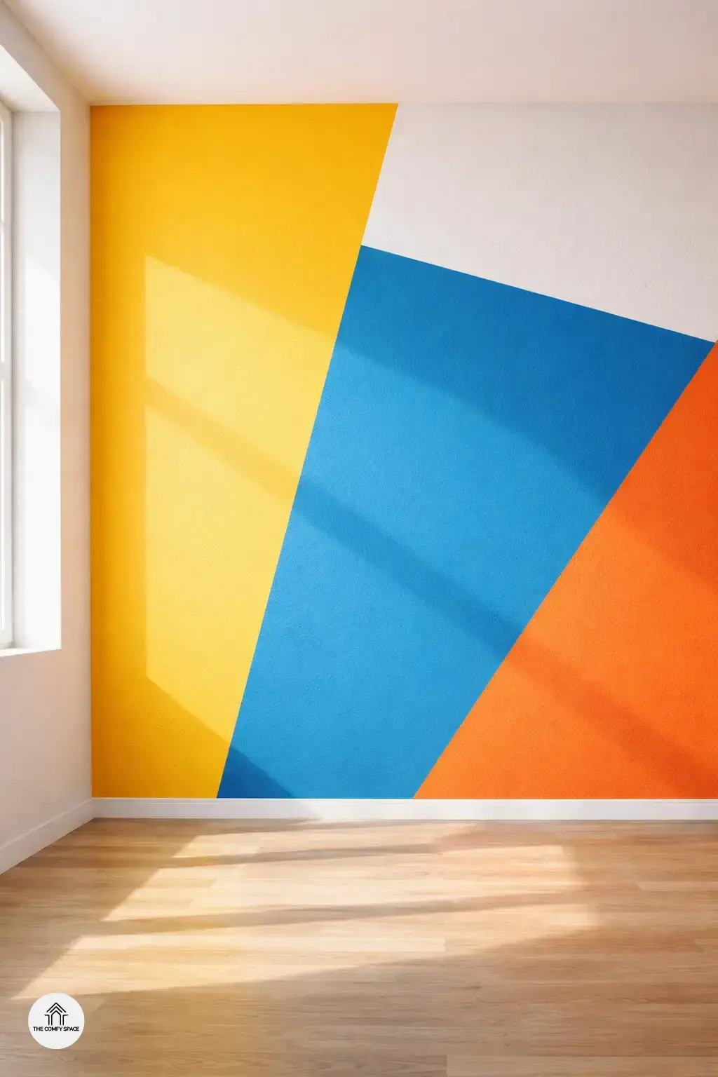
Color-blocking is basically the art of pairing bold, solid colors right next to each other for a striking look. It’s like giving your walls a fresh outfit that screams spring vibes. Think bright yellows, lively blues, or zesty oranges all vibing together. This trend is perfect for spring when we all crave that extra pop of sunshine indoors. According to interior stylist Megan Lane,
“Color-blocking breathes new life into a room without the headache of major renovations.”
What’s great? You don’t need to be a pro or spend loads of cash. Just grab some painter’s tape and a few paint samples from your local store—yes, sometimes I get overwhelmed there too!—and start playing. It’s a fun way to experiment and brighten up any space instantly, with minimal commitment and maximum cheer.
Choosing the Right Colors for Your Walls
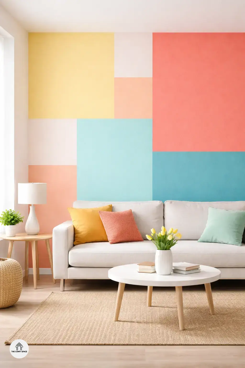
Picking spring-inspired hues like pastels and bold pops can truly transform your space. When I first tried color-blocking, I went with soft mint green paired with a wild coral. It was a bit daring but totally worth it! “Choosing colors that resonate with the season can instantly refresh your mood,” design expert Lisa Monroe says. The key is to balance those contrasting shades without making the room feel too chaotic. Think of your walls as a canvas; you want them to sing, not shout.
To keep your color blocks harmonious, here are some quick tips:
- Match one dominant color with one or two accent hues.
- Consider your existing decor — like furniture and curtains — to avoid clashing.
- Test samples on small patches first; indoor lighting changes everything.
Remember, color-blocking is playful but needs a bit of planning so your walls feel joyful, not overwhelming.
Simple Techniques to Start Your Color-Blocking Project
Embarking on your color-blocking adventure can feel a bit overwhelming, but simple techniques can make it fun and stress-free. One pro tip? Using painter’s tape for clean lines is a game-changer. It helps you create crisp, professional-looking edges without turning your walls into a paint playground. “Clean lines can transform a wild idea into a stunning statement,” design expert Jamie Lee says.
Testing paint samples on small sections first is another smart move. It saves you from the heartbreak of realizing your bright yellow looks more like neon in your living room. Plus, layering colors can add surprising depth and interest—think of it as storytelling on your walls. Start light, then add bolder hues. Just be ready for some trial and error; trust me, I once ended up with more tape than paint on a wall!
- Using painter’s tape for clean lines
- Testing paint samples on small sections first
- Layering colors for depth and interest
Common Mistakes and How to Avoid Them
Diving into color-blocking walls sounds fun, but let’s face it, mistakes happen. One common slip is overcomplicating the design. Sometimes less is more – keep your color blocks simple and bold to avoid turning your walls into a chaotic mess. Remember, as interior designer Lucy Green says,
“The beauty of color-blocking lies in clean, confident shapes.”
Picking colors that clash can turn your cheerful spring vibe into a headache. Stick to a palette that complements rather than competes. And please, don’t rush! Skipping wall prep, like cleaning or priming, can cause paint to peel or flake. From personal experience, patience in prep saves you from ugly touch-ups later – trust me, that last-minute rush at Home Depot is all too real!
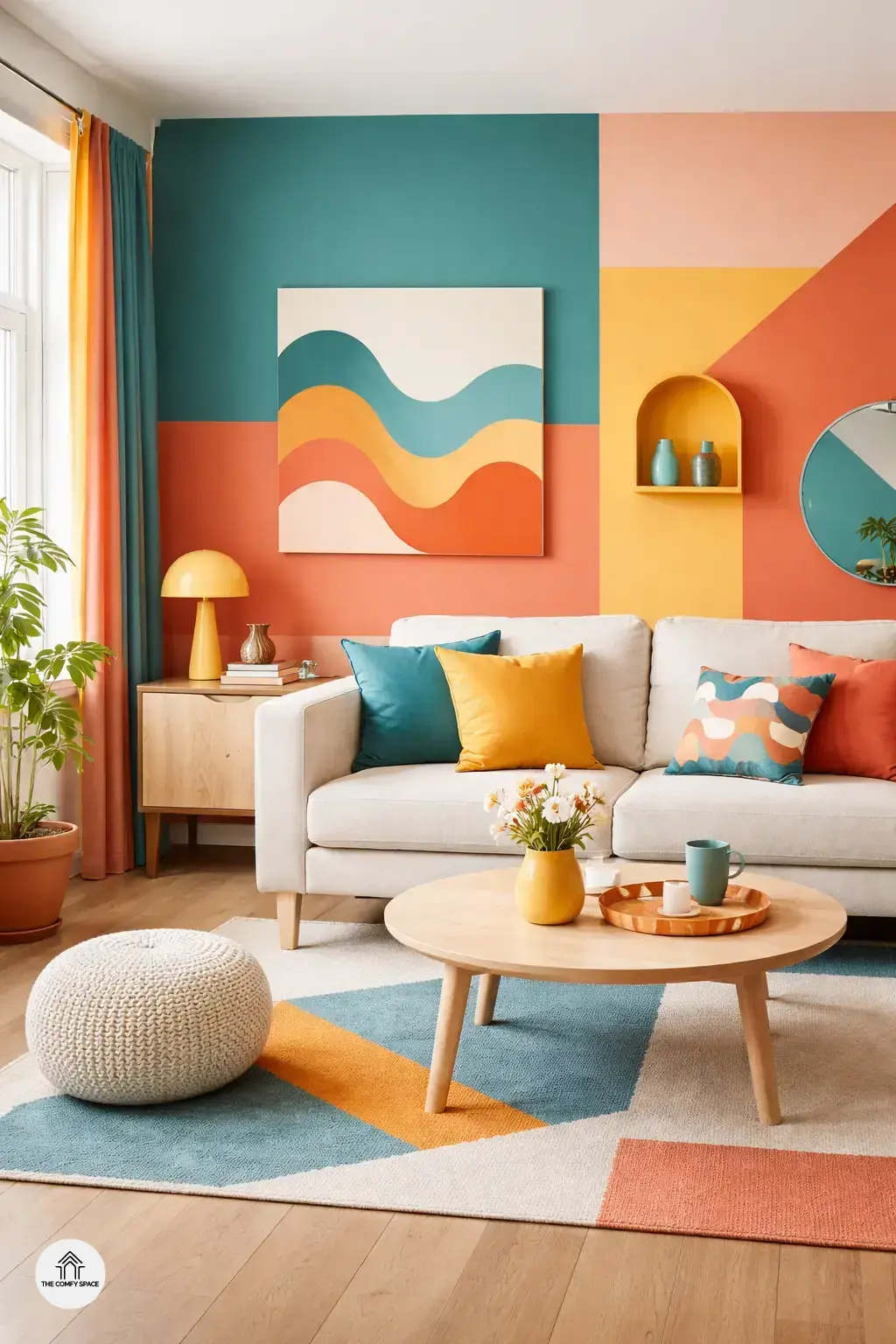
Bringing Personality to Your Space with Accessories
When color-blocking your walls, accessories are the secret sauce that ties the whole look together. Coordinating pillows and curtains with your bold wall colors can make your space feel polished rather than chaotic. I once tried pairing a bright teal wall with random red pillows—let’s just say, it felt like a circus. Lesson learned: opt for tones that echo your walls or provide a subtle contrast. Adding playful art and quirky decor pieces can also enhance the vibe without overwhelming the room. It’s about balance and a sprinkle of personality.
Here’s a pro tip from interior designer Maya Lin:
“Accessories are the punctuation marks of your room—they complete the story.”
I struggled for weeks with mismatched colors until I embraced this advice. Shopping for accessories at favorite stores like Target or thrift shops can be an adventure, but keeping a color palette in mind helps avoid those “uh-oh” moments. So, don’t hesitate to mix fun textures and patterns that speak to your style!