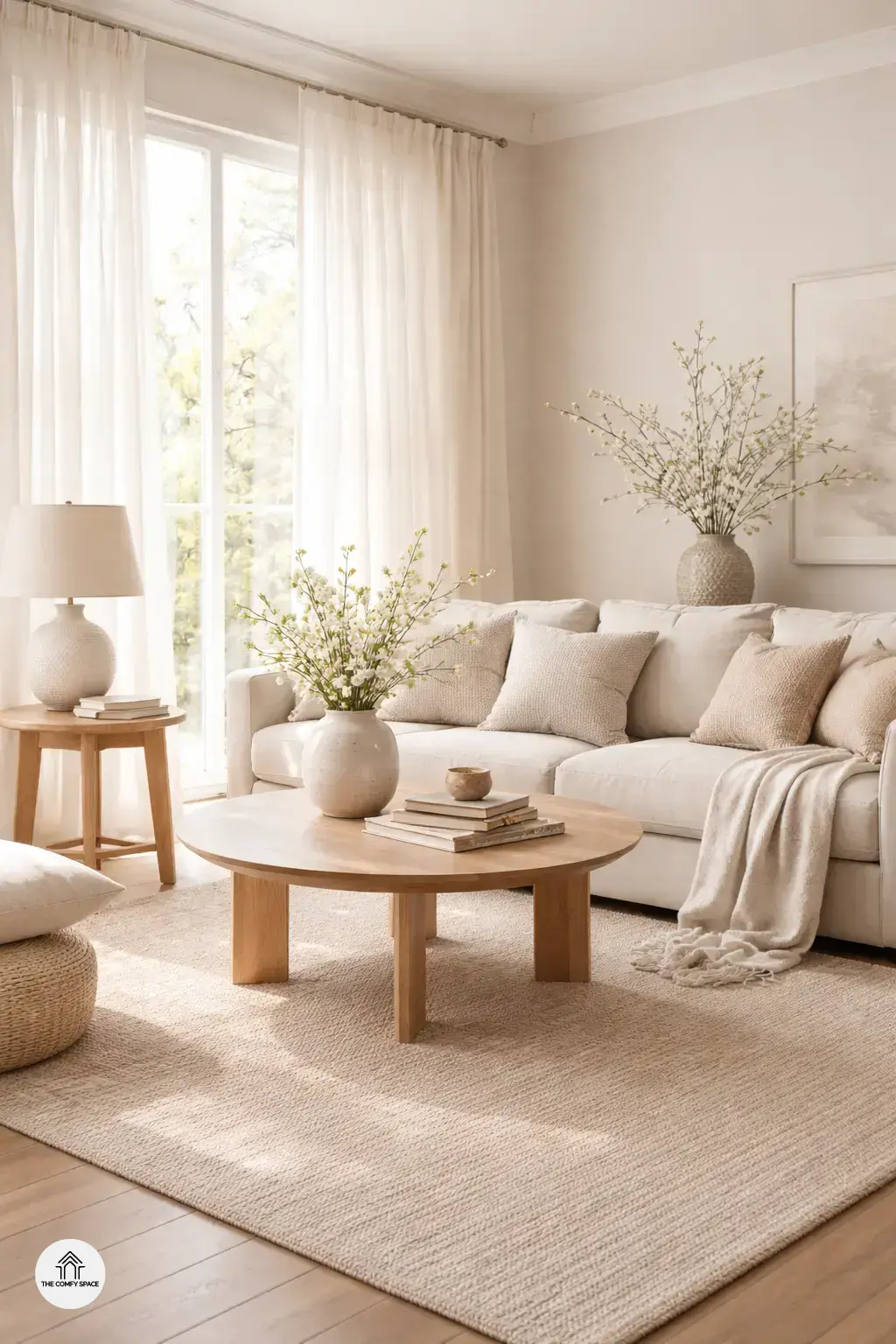
Welcome to the world of neutral tones, where calmness meets style! Neutral tones create a calming backdrop that instantly soothes and prepares your space for the fresh vibes of spring. These shades aren’t just about beige and gray—they’re the gentle whisper of peace and simplicity that a hectic world desperately needs. Neutral tones evoke a sense of peace and simplicity, making them perfect for anyone who wants to breathe new life into their home without going overboard.
Think of it like this: refreshing your space with neutral colors is like putting on your favorite comfy sweater after a long day—effortless and always comforting. “Neutral hues bring balance without stealing the spotlight,” design expert Amy Caldwell says. So if you’ve ever felt overwhelmed staring at endless paint swatches at your local store, remember, neutrals are your easy button. They allow your personality and accents to shine, making spring refreshes chill and chic.
Choosing the Right Neutrals: Warm vs. Cool Shades
Choosing the right neutrals is like picking your mood for the day—warm or cool? Warm neutrals like beige, caramel, and soft browns add coziness and depth to any room. They invite you to curl up with a good book or enjoy a quiet coffee moment. But beware, I once painted my living room in what I thought was ‘warm cream,’ only to find it leaned more yellow than I expected. Lesson learned: test swatches in different lighting before committing!
On the flip side, cool neutrals—think soft grays and icy blues—bring a crisp, airy vibe that’s perfect for spring. Mixing both warm and cool tones can create a balanced and inviting space. Pro tip from designer Emma Fields:
“A blend of warm and cool neutrals keeps spaces feeling fresh yet grounded.”
Don’t hesitate to layer textures and finishes to avoid a flat look. Happy decorating!
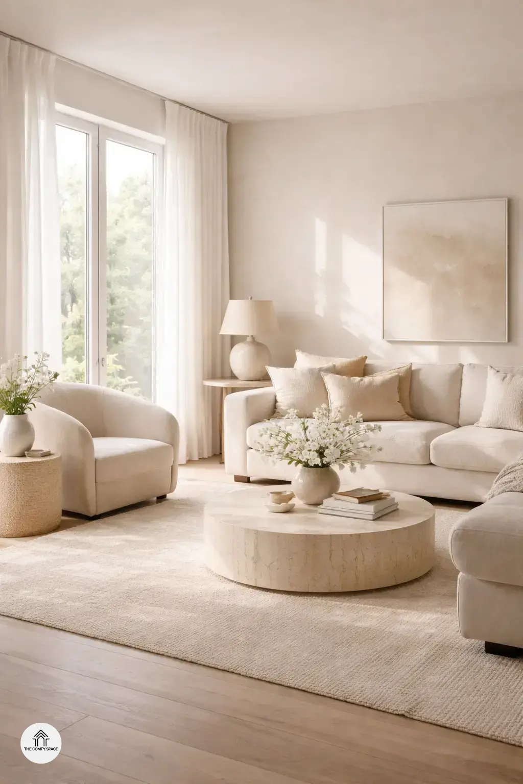
Textural Layering: Adding Interest Without Overdoing It
Textural layering is the secret sauce for making neutral tones pop without overwhelming your space. Combining soft linens with smooth woods can create a cozy yet modern vibe. I remember trying to mix fabrics once, ending up with a clash that looked more chaotic than calming. Lesson learned: balance is key! The key tip? Start with one dominant texture and sprinkle in another for contrast.
Try using chunky knits alongside sleek ceramics to add warmth and shine. Velvet cushions paired with woven baskets bring in subtle depth and personality, making rooms feel lived-in and loved. As interior designer Emma says,
“Texture invites the senses and makes minimalism feel rich, not boring.”
Give it a go—your calm, chic spring space will thank you!
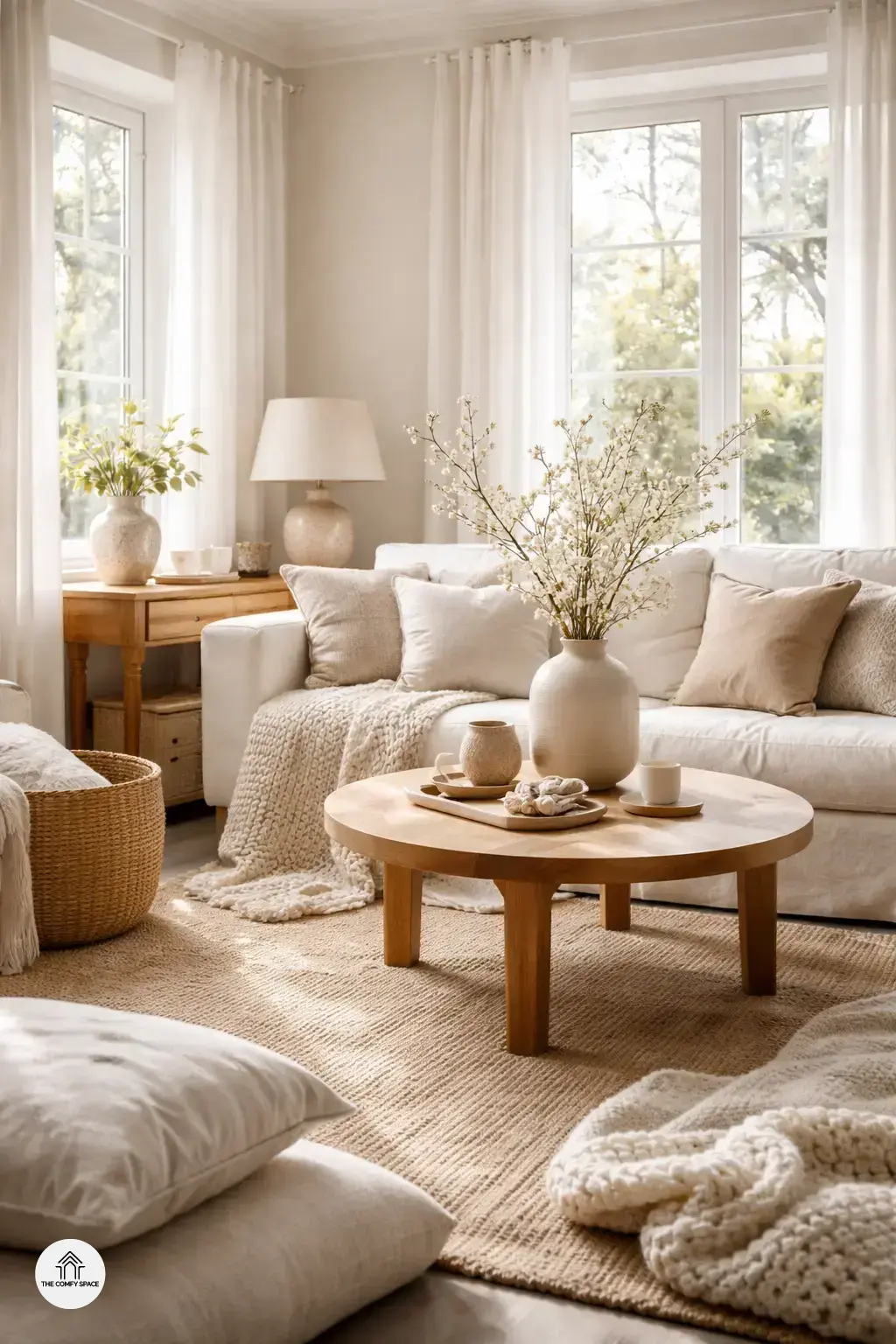
Personal Touches: Infusing Character into Neutral Layers
Layering neutral tones can risk feeling a bit bland if you don’t add your own personal touch. That’s where vintage finds and family heirlooms come in. These pieces tell a story and bring warmth to your serene space. I once struggled to make a neutral room feel inviting until I added an old wooden chair from my grandma’s collection – instant character! “Personal elements breathe life into calm spaces,” interior designer Jane Doe says.
To keep things fresh, small hints of pastel accents work wonders. Think throw pillows or delicate vases in soft blush, mint, or lavender. And don’t forget the power of greenery! Natural elements like potted plants add both color and crisp energy. Shopping for these at your favorite local store makes the space feel truly yours.
Mistakes to Avoid: Lessons from My Own Neutral Home Makeover
When I first dove into layering neutral tones for my spring refresh, I quickly learned that going too monotone can make your space feel a bit bland. Trust me, all-beige living rooms are a thing, but they don’t always scream ‘serene’—sometimes they just whisper ‘meh.’ Mixing in subtle variations prevents that flat vibe and keeps things visually interesting.
Avoiding too many similar textures is another game-changer. I once bought several pieces from the same comfy store, expecting harmony, but ended up with a flat, uninspired room. Balancing neutrals with light and shadow can effortlessly lift your decor. As design expert Jane Smith says,
“Texture and contrast are what bring neutral palettes to life.”