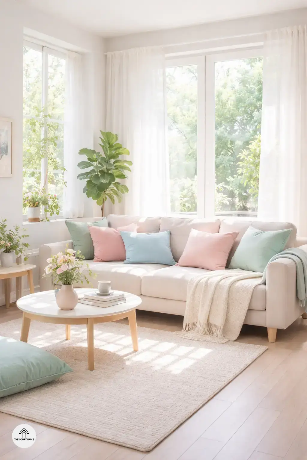
Spring is all about fresh starts, and what better way to welcome the season than with soft pastel hues? These gentle shades instantly create an inviting, calming atmosphere that feels like a breathe of fresh air after the long, dark winter months. I remember last year, struggling to find the right color to lift my mood without overwhelming my small living space. Pastels were my lifesaver! They made my home feel brighter and more cheerful without shouting for attention.
Pastel colors are perfect for revamping your home after a long winter. You can mix and match soft pinks, mint greens, or baby blues to create a peaceful vibe. What worked best for me was starting small — like pillows or a cozy throw — then slowly expanding my palette when I felt confident. As interior designer Emma Green says,
“Pastels aren’t just cute; they bring balance and serenity to any room.”
So, don’t be afraid to experiment and let spring’s freshness inspire your space!
Classic Pink and Mint: A Timeless Duo
Pink adds warmth and charm to any room, making it feel cozy and inviting. Mint, on the other hand, brings a cool, fresh touch that instantly lifts the mood. When you combine these two, you get a balanced, cheerful environment that’s perfect for spring. I remember trying this combo in my living room—initially, I thought the pink might feel too girly, but the mint really toned it down, creating a fresh yet comforting space.
Here are some quick tips if you want to try this classic duo:
- Use soft pink on cushions or throws to add warmth.
- Mint walls or vases can bring that refreshing vibe.
- Mix in white or cream for added balance.
As interior designer Lucy Maxwell says,
“The trick is to let pink invite you in, while mint keeps the space light and airy.”
It’s all about playful balance—don’t stress if it takes a couple of tries to get it just right!
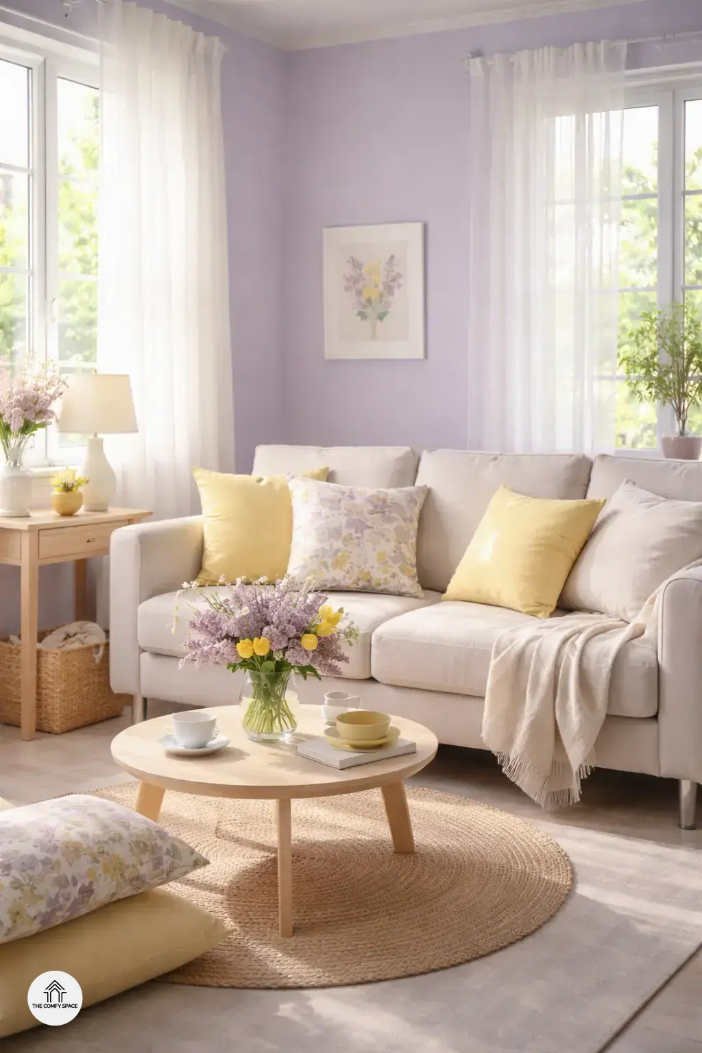
Lavender and Pale Yellow for a Cheerful Glow
Lavender offers a soothing, floral vibe that instantly calms the mind. Pairing it with pale yellow dresses up the space with sunshine warmth, creating a cheerful glow that’s impossible to resist. This combo brightens any room effortlessly, making it perfect for spring refreshes. I once struggled with making lavender look lively – it felt too cold until I added a splash of pale yellow, which completely transformed the space! “Pastel pairs like these bring both calm and joy, a balance every home needs,” an interior designer notes.
For a practical touch, use lavender on walls or larger fabrics, then add pale yellow through cushions or accessories. It’s an easy way to play with color without overwhelming your space. Trust me, shopping for these at familiar stores like IKEA or HomeGoods makes finding the right shades fun and affordable—though, I did learn the hard way that not all yellows are created equal! Keep it soft and sunny to nail this look.
Peach and Soft Blue: Calm Meets Cozy
Peach creates a soft warmth reminiscent of sunsets, making any room feel inviting and cozy without overpowering the senses. Pairing it with soft blue, which evokes tranquility and peace, strikes a perfect balance between calm and comfort. I once tried this combo in my bedroom, hoping for a calming vibe but ended up making it feel too cold initially. A quick fix? Adding some peach-toned accessories instantly warmed things up—lesson learned!
For those thinking about where to use this duo, think bedrooms or relaxation areas where you want to unwind. Imagine curling up with a book as the soft blue walls soothe your mind while peach cushions add that gentle glow. As interior designer Clara Dawson says,
“Peach and soft blue together invite calmness without sacrificing that cozy feel.”
Not to mention, stores like HomeGoods have plenty of affordable decor pieces in these shades, making it easy to experiment without breaking the bank.
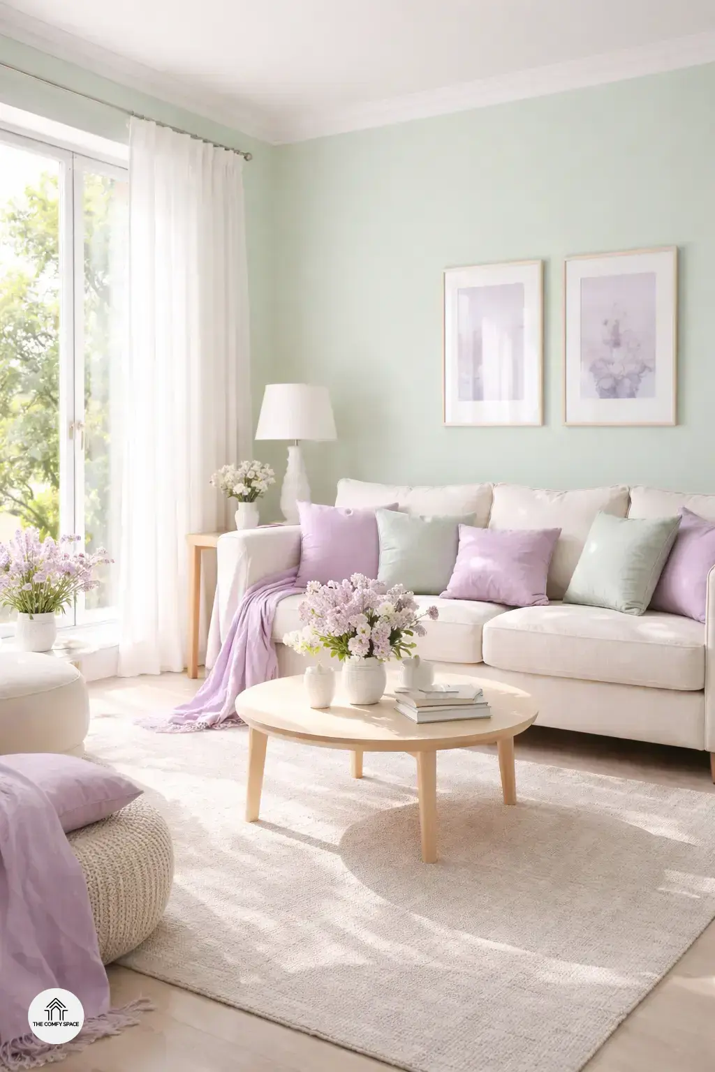
Mint and Lilac: Playful Yet Elegant
Mint breathes fresh life and energy into any space, making it a perfect choice for spring refreshes. Paired with the gentle, subtle charm of lilac, the combination is both playful and elegant—a duo that whispers springtime vibes without overwhelming your senses. I remember trying this combo in my living room, and honestly, finding the right balance was a bit tricky. Too much mint felt like licking a giant mint candy, while too much lilac made the room feel like a lavender field in a dream.
Here’s a practical tip: mix in white accents to give your room a clean, airy finish. White cushions, throws, or even simple white picture frames help balance the mint and lilac, preventing the space from feeling too busy. As designer Laura Kingston wisely puts it,
“Mint and lilac are best friends when they’re given some breathing room.”
So, don’t just dive in—play around, have some fun, and watch your home bloom.