
Earth-inspired colors are having a very friendly takeover in 2026. Think clay, sand, olive, and deep moss tones that make a room feel like it can finally relax.
“Color should feel like a soft exhale, not a loud announcement,” interior designer Mara Ellis says.
I learned that the hard way after bringing home a bold rust paint and somehow making my living room look like a discount café.
- These shades work because they feel calm, cozy, and easy to live with.
- They pair well with wood, linen, and even those random baskets we all keep buying at Target.
- For 2026, the look is less polished, more natural, and happily a little imperfect.
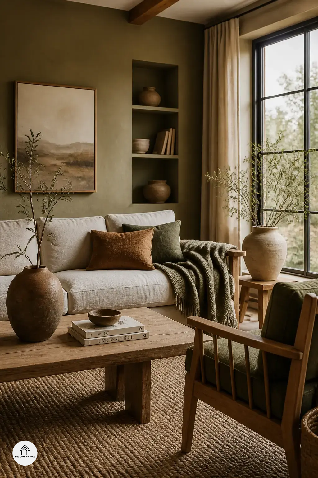
Soft Clay and Terracotta for Everyday Warmth
Soft clay tones are the kind of color that make a room feel hugged. I once painted a tiny entryway in a clay shade and, yes, I worried it would look like a pottery shop explosion. It did not. It felt calm, warm, and oddly expensive.
“Earthy hues work best when they feel lived-in, not staged.”
says interior stylist Mara Ellison.
Terracotta is also a star in living rooms, kitchens, and entryways because it adds warmth without shouting. Try it with oak, rattan, or linen, and keep the rest simple. If you’ve ever wandered through IKEA or Target and grabbed “just one more neutral,” this palette is your fix. It makes mismatched pieces look on purpose.
Moss, Olive, and Sage for a Fresh Organic Look
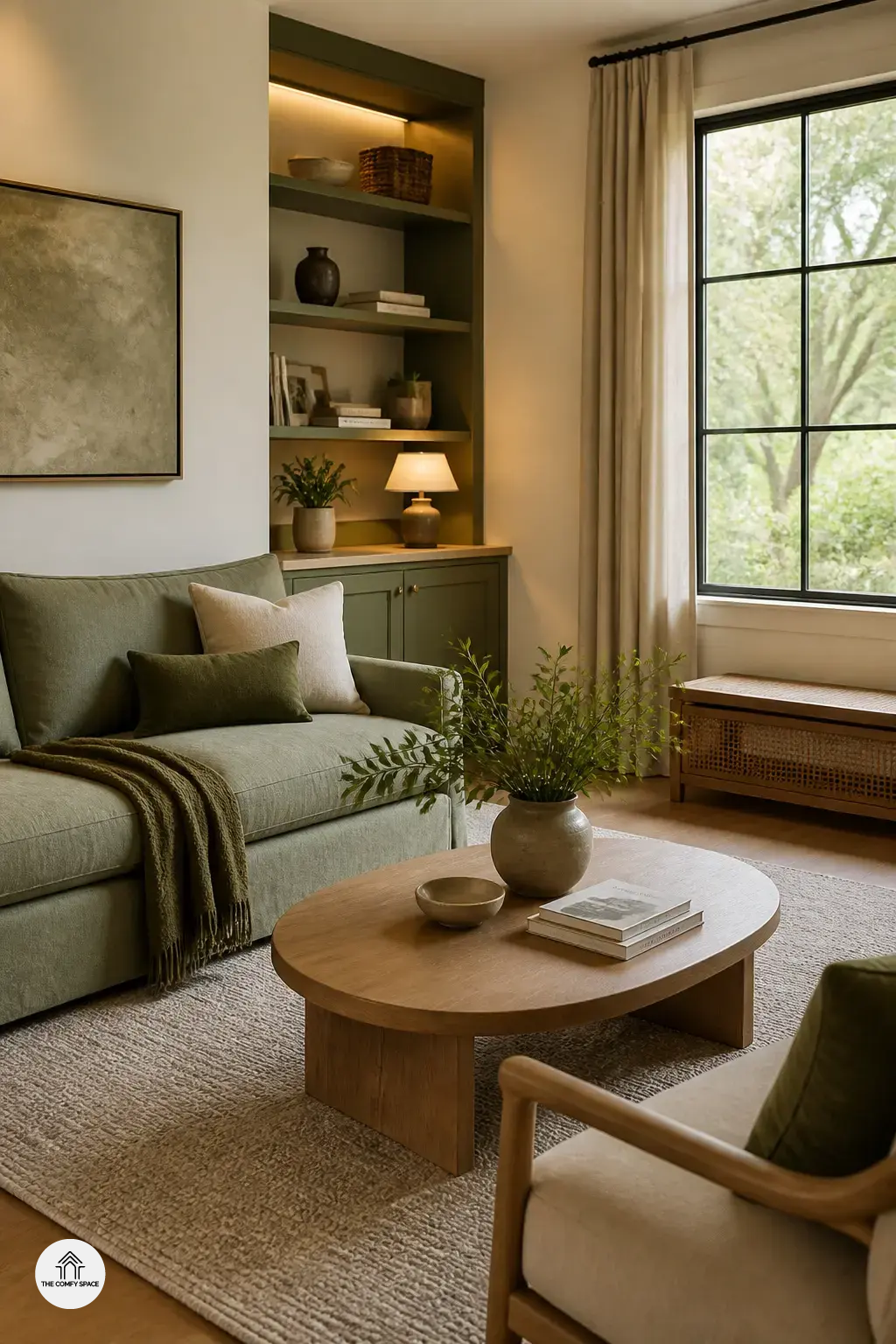
Green earth tones are having a big moment in 2026, and honestly, it makes sense. Moss, olive, and sage bring that calm, lived-in feeling we all want after a long day. “Color should feel like a deep breath, not a shout,” interior stylist Mara Ellison says.
If you have ever bought a paint sample at the hardware store and thought, “why does this look swampy at home?”, you are not alone. I have done that too. The trick is to pair these greens with cream, beige, and stone textures. Try a sage sofa with a warm rug, or olive cabinets with pale walls and wood accents. It keeps the room fresh, not heavy.
Rich Browns and Neutral Layers That Feel Grounded
Rich browns are having a very cozy moment in 2026. Chocolate, caramel, and taupe make a room feel grounded without acting like they own the place. I once grabbed a “safe” brown paint from a big-box store and ended up with a wall that looked a little too like instant coffee. Lesson learned: test swatches in morning and evening light before you commit.
- Mix matte and soft textures so the palette feels warm, not flat.
- Keep one lighter neutral nearby to stop the room from feeling heavy.
- Skip too many dark accents; the brown should breathe.
“Neutral layers work best when they feel collected, not copy-pasted,” interior stylist Mara Ellis says.
That little rule saves a lot of decorating headaches. Try pairing a caramel sofa with taupe curtains and wood tones that echo each other. It is simple, calm, and honestly way easier than overthinking every pillow at the store.
Muted Sun-Baked Shades for a Soft Desert Mood
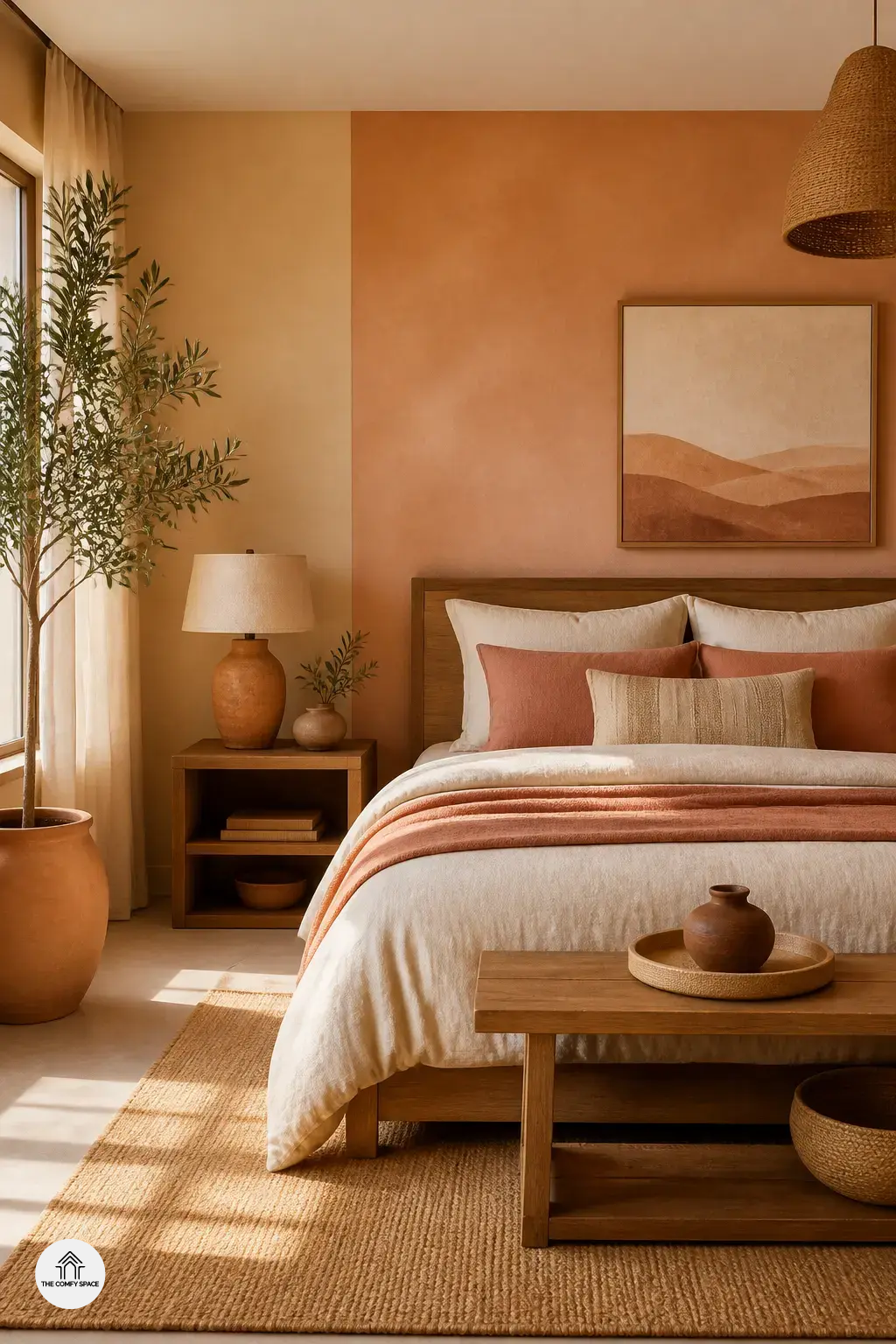
Dusty peach, sandstone, and muted ochre are doing a lot in 2026, but in the nicest way. They bring that warm, sun-baked feeling without shouting at you from across the room. I once painted a reading nook too orange by accident, and let’s just say it felt like living inside a cheese puff. The trick is layering these tones with cream, clay, and a little textured linen.
“A desert palette should feel soft, not sour,” says interior stylist Mara Lee.
These shades work beautifully in bedrooms and dining areas, where calm matters most. Add matte finishes, wood accents, and a few green plants to keep things fresh. If it starts feeling flat, mix in deeper terracotta or soft taupe for balance.
Natural Texture Pairings That Make Earth Tones Shine
Earth tones can feel flat if you stop at paint alone. In real homes, the magic comes from texture. I learned that the hard way after buying a perfect “sage” throw from a big-box store and wondering why the room still looked a bit sleepy. Then I added a jute rug, a rattan chair, and an unfinished wood tray, and suddenly the whole space woke up.
As designer Nina Patel says,
“Texture gives earth colors a place to breathe.”
That’s why rattan, stone, linen, and raw wood are such great partners for 2026’s earthy palettes. Keep one finish a little rough, one soft, and one natural. Too much matching is the classic mistake. It can look tidy, sure, but also like everything came from one aisle at the same store.