
Handcrafted pottery has this lovely way of making a room feel instantly lived in. I once grabbed a lopsided vase from a local market, then almost returned it because it looked “too odd.” Glad I didn’t. It became the piece everyone noticed first. As designer Nate Berkus says,
“Your home should tell the story of who you are.”
And honestly, pottery does that without trying too hard.
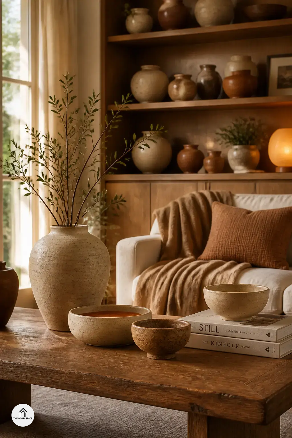
Try one on a shelf, coffee table, or that awkward corner you never know what to do with. Even one imperfect bowl can beat a full set from a big store like IKEA or Target. Mix sizes, shapes, and clay tones for a softer look. It feels personal, warm, and just a little bit proud of itself.
Why Handcrafted Pottery Feels So Special
Handcrafted pottery feels special because no two pieces ever come out exactly the same. Those tiny wobbles, uneven rims, and small glaze surprises are the charm. I once bought a “perfect” vase from a big-box store, and it looked fine until I put it next to a handmade bowl from a local market. Game over. The handmade one had soul.
The texture, glaze, and shape bring a warm, human touch to a room. “The beauty is in the imperfection,” interior stylist Mara Ellis says. That’s why pottery works so well on a shelf, coffee table, or kitchen counter. It tells a story, and honestly, that makes a home feel less staged and more like you actually live there. Which, hopefully, you do.
How to Style Pottery on Shelves and Tables
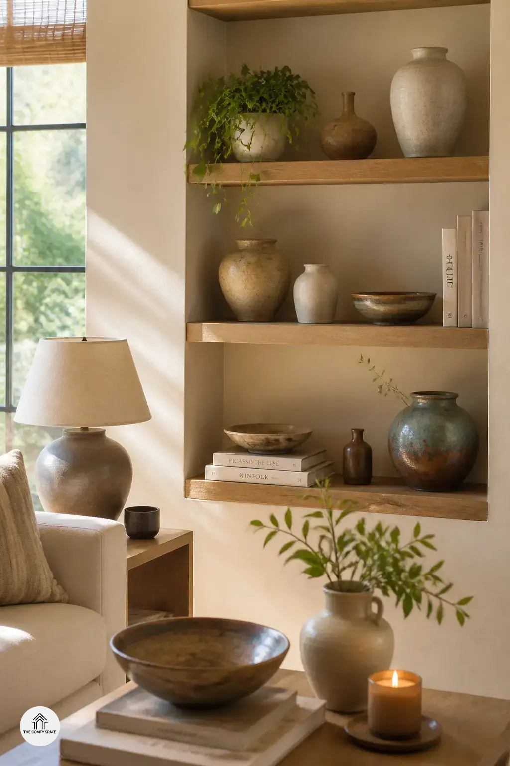
Styling handcrafted pottery on shelves and tables is one of those little home wins that makes a room feel finished without trying too hard. I learned the hard way that lining up every vase like a tiny army just looks stiff. Instead, try this:
- Group pieces in odd numbers for a relaxed, designer look
- Mix heights and shapes so the display feels layered, not flat
- Add books, candles, or simple greenery to keep the arrangement from feeling too stiff
As interior stylist Emily Henderson says,
“A good shelf tells a story, not a checklist.”
That idea really helps when you’re decorating with pottery from a local market or even a favorite home store. Keep adjusting until it feels natural, like it belongs there.
Choosing Colors and Finishes That Work in Your Space
Choosing pottery colors can feel oddly hard. I once brought home a bright teal vase from a weekend market, then realized it fought with my oak shelf like they were in a tiny argument. For a calmer look,
- pick earthy tones for a calm, timeless feel
- use bold glazes as accent pieces when you want a pop of personality
- match pottery finishes with wood, linen, metal, or stone for a balanced look
That mix keeps things warm and lived-in, not staged like a catalog.
As designer Alice Moore says,
“The best pottery finish is the one that lets your room breathe.”
I like that because it’s true. When you shop at familiar stores or small ceramic studios, hold the piece next to your decor in your mind. Matte clay softens shiny surfaces. Glazed pottery adds energy. A little contrast goes a long way, and honestly, it saves you from another “why did I buy this?” moment.
Using Pottery in Everyday Corners People Forget
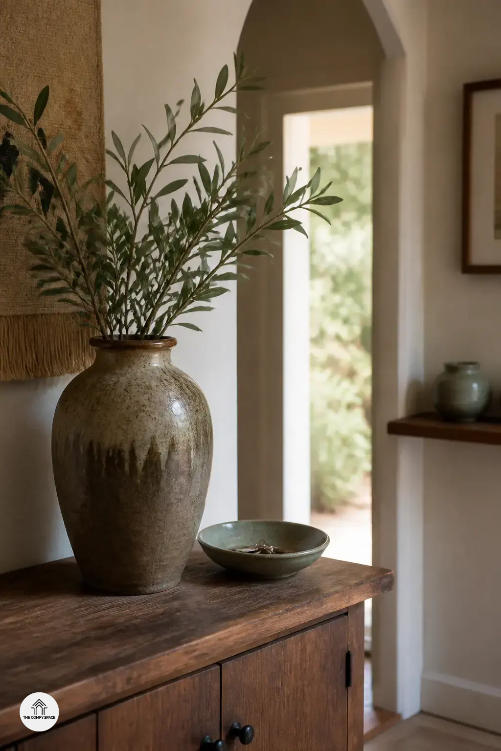
Every home has those tiny spots we forget about. Hallways, entry tables, bathroom shelves. I used to leave mine blank, then wonder why they felt a bit sad, like a waiting room from a budget dentist. A handcrafted vase on a console can fix that fast. As interior stylist Clara James says, “Small corners deserve big personality.”
Try a pottery bowl for keys in the entry or fruit in the kitchen. It looks pretty and actually helps when you’re rushing out the door. In the bathroom, one ceramic piece can make the whole shelf feel calm and finished. I once bought the wrong size at a home store and it looked like a tiny bathtub. Lesson learned: keep it simple, warm, and useful.
Common Styling Mistakes to Avoid
When I first started decorating with handcrafted pottery, I made the classic mistake of loading every shelf and table like I was stocking a tiny museum. Big nope. The room felt busy, not cozy. Keep it simple.
- Choose a few pieces with shape and texture.
- Let one bowl or vase breathe on its own.
“Good design knows when to stop,” interior stylist Claire Bennett says.
Another trap is trying to make pottery match every pillow, curtain, and lamp too perfectly. That usually looks stiff, like it came from one aisle at Target and one very anxious shopping trip. Instead, let the clay tones, glaze, and handmade quirks do the talking. Negative space is your friend here. It gives the eye a break and makes each piece feel intentional, warm, and a little more personal.