
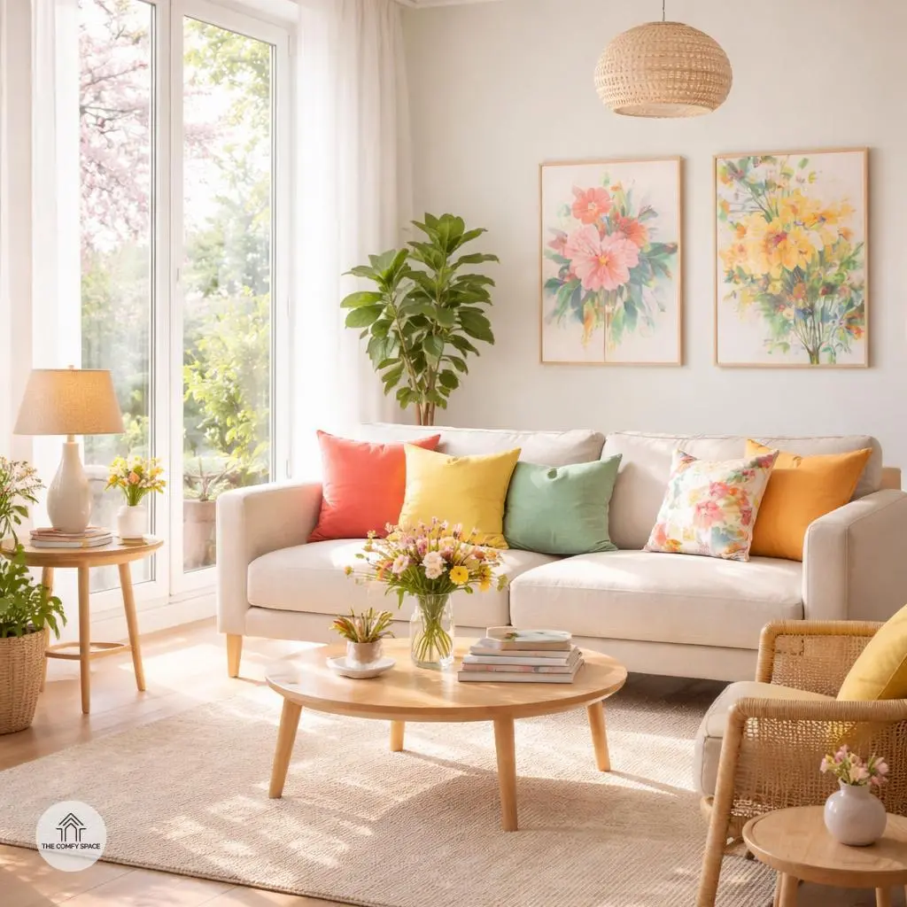
Spring’s arrival feels like a breath of fresh air for your home. After months of dull winter vibes, adding vibrant colors is like giving your place a joyful wake-up call. I’ve made the mistake of going too bold once—think neon green walls—and trust me, less really is more when it comes to spring hues! Using colors inspired by blooming flowers and sunny skies can lift your mood and energize your space in just the right way.
Color psychology tells us that each shade affects us differently—it’s like your home has a secret language! Warm tones like soft yellows or coral can create cozy, welcoming rooms, while cool blues bring a calm, refreshing feel. “Choosing the right color palette is like choosing a mood for your home,” an interior designer once told me, and I couldn’t agree more. Let’s dive into picking spring hues that truly bring happiness into your living spaces.
The Power of Color Psychology in Home Decor
Colors seriously shape how we feel at home, and understanding this can totally change your space for the better. Warm shades like yellows and oranges don’t just brighten a room—they spark happiness and creativity. I remember painting my home office a bold shade of yellow, hoping for a productivity boost. Let’s just say, it worked wonders, except for a few paint splatters that reminded me why I need better prep work next time!
Cool colors, such as greens and blues, come to the rescue when you want tranquility. After a particularly hectic day, stepping into a softly blue bedroom feels like a mini vacation. “Color isn’t just decoration; it’s mood magic,” color psychologist Dr. Eva Lang insists. So next time you’re stuck choosing paint, think about how you want to feel, not just what looks trendy. Your walls are ready to chat in color—they just need you to listen.
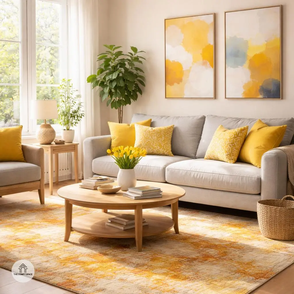
Sunny Yellows to Brighten Your Day
Sunny yellows are like a daily dose of sunshine indoors. This cheerful hue naturally sparks positivity and energy, making it a perfect pick for kitchens and living rooms where families spend quality time. I learned the hard way that too much yellow can feel a bit much—think of a kitchen that’s more ‘warning sign’ than ‘welcome spot.’ So, moderation is key. Try adding pops of yellow through cushions, artwork, or a vibrant rug instead of painting every wall. It keeps the vibe fresh without overwhelming your senses.
Interior designer Sarah Bloom notes,
“Yellow brings warmth and light, but balance is crucial to avoid anxiety.”
Pulling this off means layering yellow with softer neutrals or complementary colors like gray or white. Trust me, after a few trial-and-errors, I found that a lively splash here and there beats the full-on yellow blast every time. Plus, it’s easier to swap out if your taste shifts—because, let’s face it, our moods change faster than our furniture sometimes!
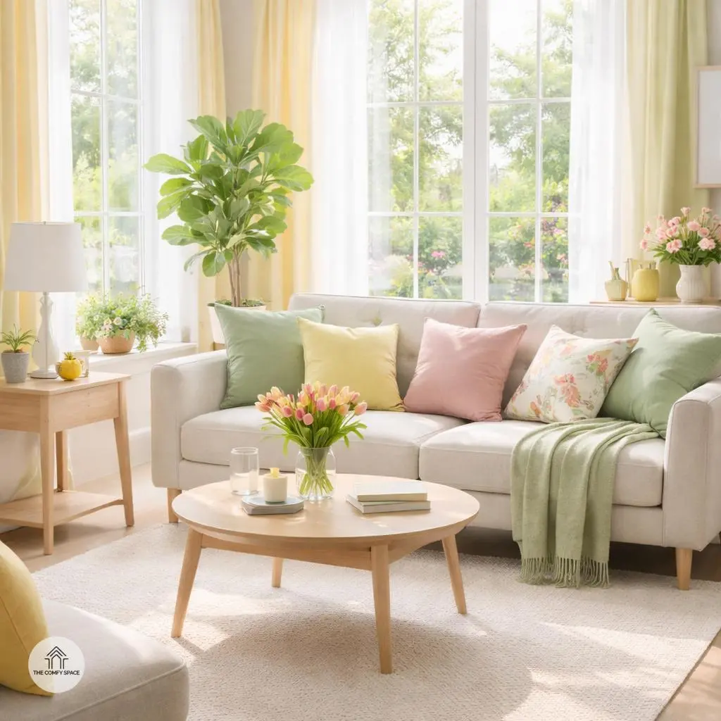
Refreshing Greens to Connect with Nature
There’s nothing quite like surrounding yourself with refreshing greens to feel instantly connected to nature. Green is the color of growth and renewal, making it a perfect choice for spring when everything is waking up. Imagine swapping your dull walls for soft sage or mint shades to create a calming sanctuary in your bedroom. Trust me, after a long day, these gentle tones work wonders to soothe your mind and help you drift into peaceful sleep.
Integrating indoor plants is another game-changer. Not only do they enhance greenery naturally, but they also improve air quality and add life to any room. “Nature indoors isn’t just aesthetic, it nurtures your well-being,” interior designer Emma Brooks says. If you’ve ever battled with fake plants that scream ‘plastic’, investing in easy-care varieties like snake plants or pothos might just be the secret. Plus, shopping for these green goodies at your local nursery feels like a mini adventure every time!
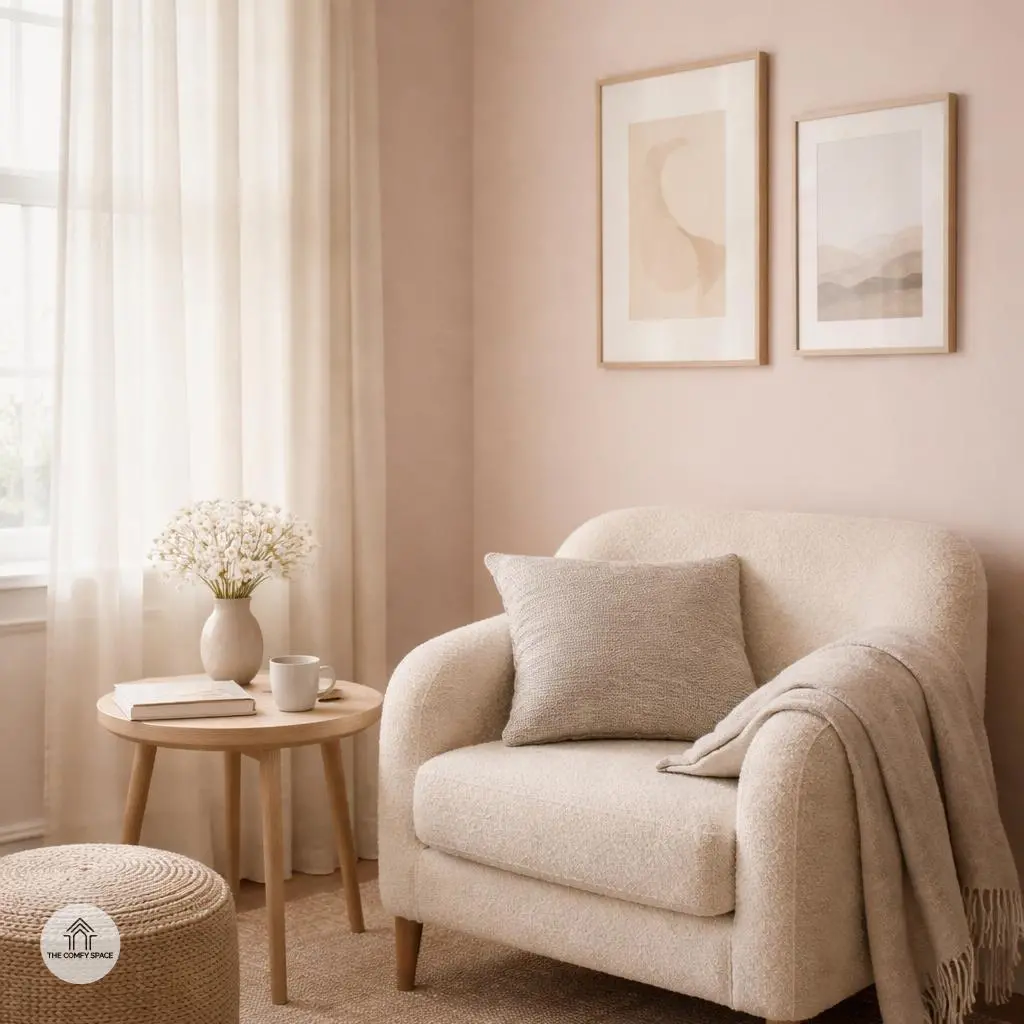
Soft Pinks for a Gentle, Cozy Touch
Soft pinks have this magical way of making a space feel like a warm hug—gentle, cozy, and inviting. Pale pinks, in particular, add just the right amount of warmth without yelling for attention, making them perfect for bedrooms or those quiet reading nooks where you want to unwind. I once painted a small corner of my living room in a blush tone, and it instantly turned into my favorite spot to chill with a book and a cup of tea.
But here’s the catch—pink can get a bit tricky. Too much and your space might start to feel like a cotton candy dream. The key is balance. Interior designer Lisa Bloom says,
“Pair pastel pinks with neutral shades like beige, gray, or soft white to keep things grounded and sophisticated.”
So, keep it subtle and pair soft pinks with neutrals to avoid an overly sweet vibe and get that cozy, chic feel instead.
Crisp Blues to Soothe and Inspire
Blue is like a gentle breeze on a hectic day, perfect for calming the mind and boosting concentration. Whether you’re setting up a home office that needs some serious brainpower vibes or designing a bathroom retreat, blue is your go-to color. It’s been proven to reduce stress, making those tense Zoom calls a bit more bearable. Plus, mixing crisp blues with light neutrals like soft whites or warm beiges creates a fresh, airy space that feels like a mini-vacation indoors.
Real talk: I once tried painting my office a bold navy without the right lighting. Big mistake! It almost swallowed the room whole. But when I balanced it out with creamy tones, it felt like the perfect balance—inviting and serene. As interior designer Linda Pearson says,
“Blue is the color of clarity and calm, a quiet hero in home decor.”
So grab your favorite shade, but remember to keep things light around it—the magic’s in the mix!
Tips for Experimenting with Spring Colors
Spring is the perfect season to breathe new life into your home with fresh, vibrant colors. But diving straight into bold walls or big furniture can feel a little overwhelming. Instead, start small with accents like cushions or artwork. This way, you’re dipping your toes into the color pool without the risk of regretting it later. Plus, it’s easier to switch up cushions or art when your mood or the season changes – a win for the indecisive among us!
And speaking of decisions, testing paint samples at different times of the day is a game-changer. Natural light can totally shift how colors appear, making your ‘bright yellow’ look more like ‘soft mustard’ by noon. A pro once told me,
“Colors reveal their true selves only when the light touches them at different moments.”
So, grab those samples and watch them dance in morning sunshine and evening glow. When mixing and matching colors, take it slow—think of it as blending a playlist; the right combo gets you in the perfect mood. Experiment, have fun, and don’t sweat a few mismatches along the way!
Common Color Mistakes and How to Fix Them
Choosing colors just because they’re trendy often leads to regret. I once painted my living room a bold teal only to realize it clashed with my furniture and made me uncomfortable after a week. Personal comfort is key—your space should feel like a hug, not a shock. Take time to test swatches on your walls, live with them for a few days, and see how they vibe with your lighting and mood.
Another common snafu is piling on too many bold colors, which can turn your serene sanctuary into a chaotic circus. The trick is balance. Pair vibrant hues with neutral shades—think pops of coral against soft gray walls. This combo keeps things lively but grounded. As renowned designer Jane Smith says,
“Color harmony is where your personal style meets thoughtful balance.”
Using this approach, you’ll avoid visual overload and make your home truly inviting.