
Spring decorating is like hitting the refresh button on your home. Imagine walking into a room that bursts with colorful patterns that don’t just sit there but actually tell a story. Patterns bring life, personality, and a dash of excitement to spaces that might have felt a bit too ‘meh’ over winter. Coordinating patterns can feel a bit like a puzzle, but trust me, it’s a fun challenge worth embracing! It’s like mixing and matching your favorite outfits — sometimes you nail it, sometimes you learn what not to do next time.
One thing I’ve learned after countless trips to my favorite home stores (sometimes carrying more fabric samples than a pro designer) is that patterns breathe warmth into any room. Don’t be afraid to layer stripes with florals or sprinkle in some geometric shapes. As interior designer Jenna Smith says,
“Playing with patterns is like giving your home a playful wink.”
So buckle up and get ready to transform your space with these lively, harmonious designs. Your home will thank you, even if your wallet might occasionally throw a tantrum!
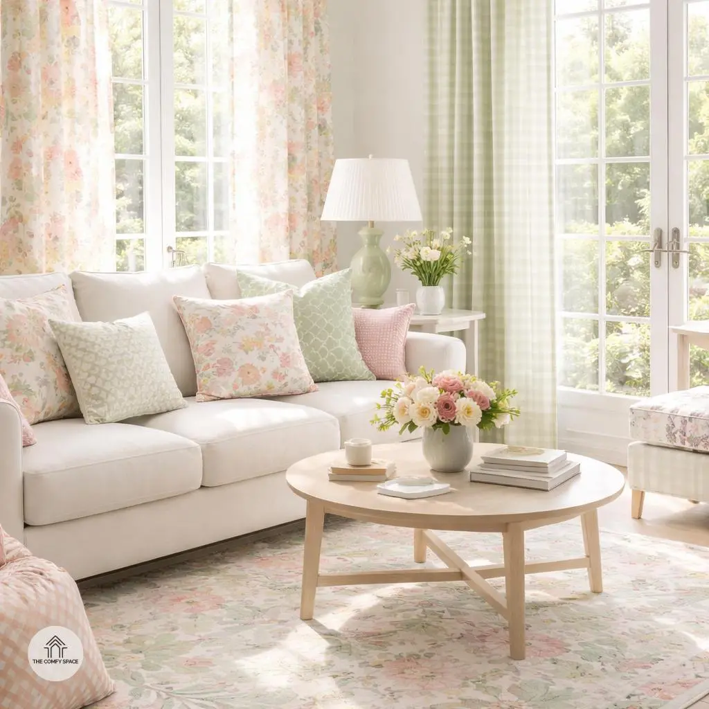
Start With a Neutral Base
Starting your decor journey with a neutral base is like laying the perfect foundation for a masterpiece. Soft, neutral colors like beige, soft gray, or warm off-white provide a calming backdrop that allows your patterned accents to truly pop without overwhelming the senses. It’s a bit like giving your bold, patterned pillows or vibrant rugs their own stage to shine. As interior designer Emily Waters says,
“A neutral base is your best friend—it calms the chaos and brings harmony to your space.”
One common rookie move is going wild with patterns everywhere, leaving the room feeling like a riot. Instead, mix those lively patterns with solid furniture pieces. Think a comfy, solid-colored sofa paired with patterned throw cushions. It balances energy and keeps the vibe fresh and inviting. And trust me—when guests walk in, they’ll admire your boldness but won’t feel visually overwhelmed.
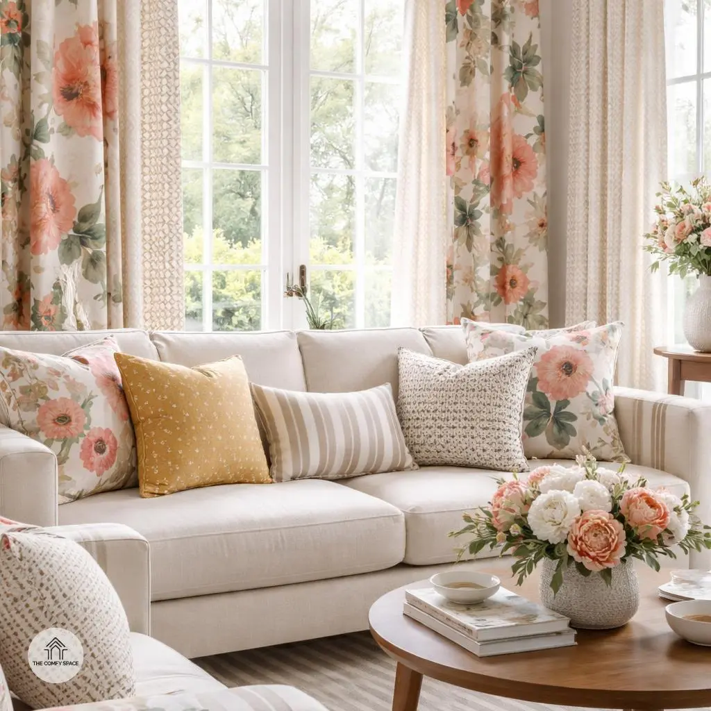
Mix Patterns of Different Scales
Mixing patterns of different scales can totally transform a space, but it’s easy to get overwhelmed. Imagine pairing a giant floral print with tiny geometric shapes – the boldness of the flowers shines, while the smaller shapes add a subtle, interesting contrast. It’s like telling two stories in one room, but without the chaos. Here’s a tip from an experienced designer: “Playing with scale prevents patterns from clashing and adds depth,” says Sarah Kim, an interior stylist with a knack for pattern play. Don’t be afraid to experiment with sizing; you might just discover your new favorite combo!
To keep things on the right side of stylish, try using medium-sized stripes to bring some structure if your patterns feel too wild. This layering technique brings harmony to a room and even helps soft furnishings, like cushions or curtains, pop just the right amount. Remember, shopping at big box stores can make this easier—just compare sizes and scales right in the aisle. One misstep I made? Buying two patterns that were both large and bold—lesson learned: varied scales are your friends!
Stick to a Unified Color Palette
Choosing a unified color palette is like giving your room a little pep talk – it keeps everything working together instead of competing for attention. When you pick just 2–3 colors to repeat across your patterns and surfaces, it’s much easier to create a cohesive, polished look. Trust me, falling into the trap of mixing every color under the sun only leads to visual chaos. It reminds me of my first apartment, where I got carried away with funky pillows gone wild – lesson learned!
Here’s a simple tip: pick your favorite two colors and a neutral to ground it all, then sprinkle these throughout furniture, rugs, and accessories. As interior designer Laura Bennett puts it,
“A consistent color story is the secret weapon for turning mismatched finds into a harmonious home.”
Sticking with this rule turns decorating from an overwhelming puzzle into a fun creative game.
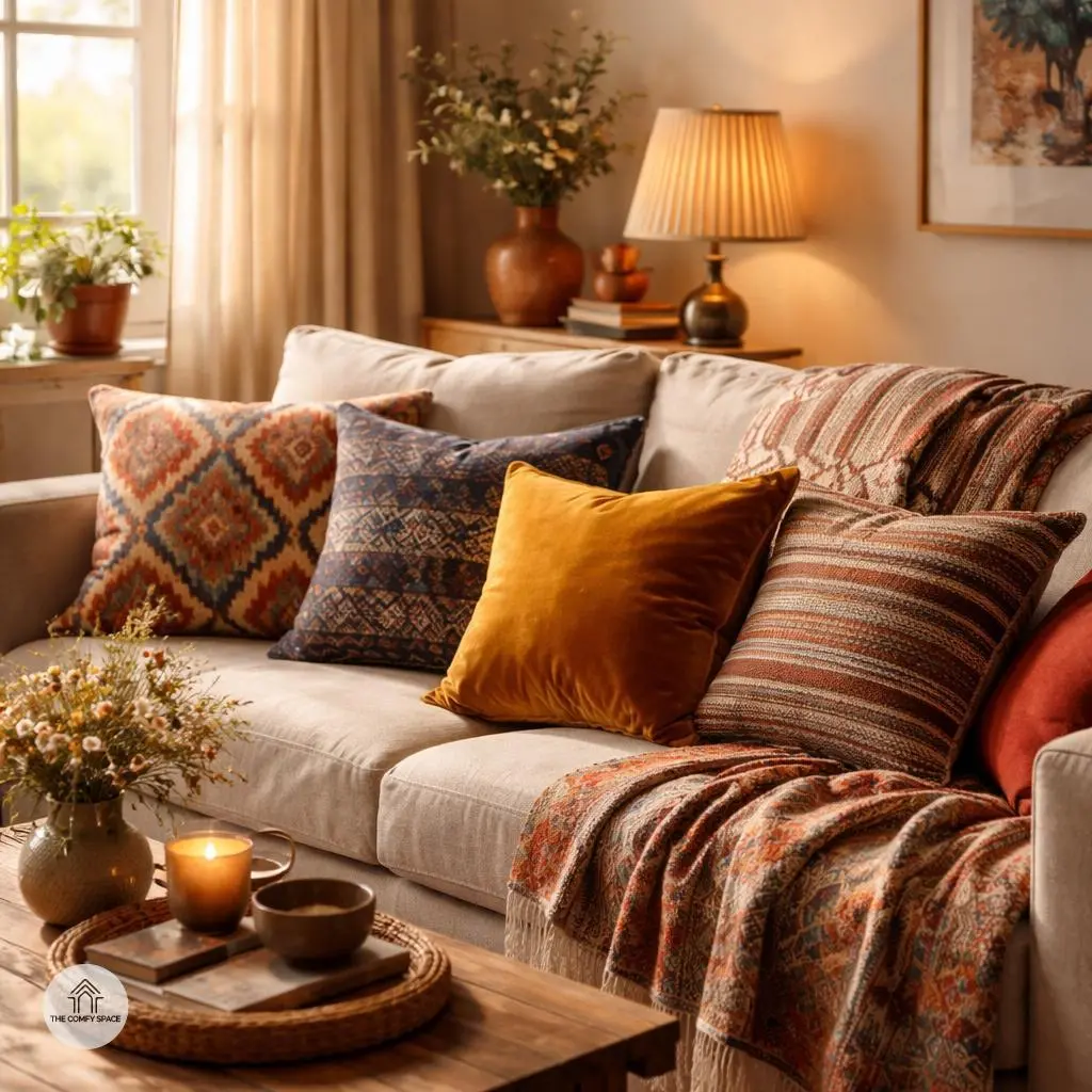
Incorporate Texture to Complement Patterns
Adding texture is a game-changer when you’re working with bold patterns. Think of it as the perfect sidekick that softens those loud prints and invites warmth into your space. For example, layering tactile textiles like linen and velvet can turn a visually busy room into a cozy haven. You might have experienced the dreaded slippery cushions and chilly surfaces—been there, done that! Mixing textures not only fixes that but also creates a tactile experience that makes your home feel lived-in and loved.
When I first started decorating, I learned this the hard way. I bought those sleek silk cushions that looked great but slid off every time I sat down. Since then, I’ve switched to velvet and linen blends—they’re comfy, stylish, and no more slipping! Interior designer Clara Smith wisely says,
“Texture is what turns a house into a home.”
So don’t be shy—layer up different textures to complement your patterns and bring your space to life.
Balance Busy Patterns with Simple Accessories
Ever walked into a room bursting with vibrant patterns everywhere? It’s exciting at first but can quickly feel like your eyes are on a roller coaster. That’s why balancing busy patterns with simple accessories is a game-changer. Plain lamps, cushions, or rugs offer your brain a breather amidst all the visual chatter. I once painted my living room walls with a bold pattern and loaded the space with printed cushions—lesson learned, it was like staring at a kaleidoscope all day!
“Simple accessories are the unsung heroes of visual harmony,” my interior design mentor wisely told me after seeing my chaotic setup.
Incorporate this tip: pick one or two pattern-heavy pieces and anchor them with solid-colored accessories. Not only does this calm the scene, but it also lets those bold patterns shine without screaming for attention.
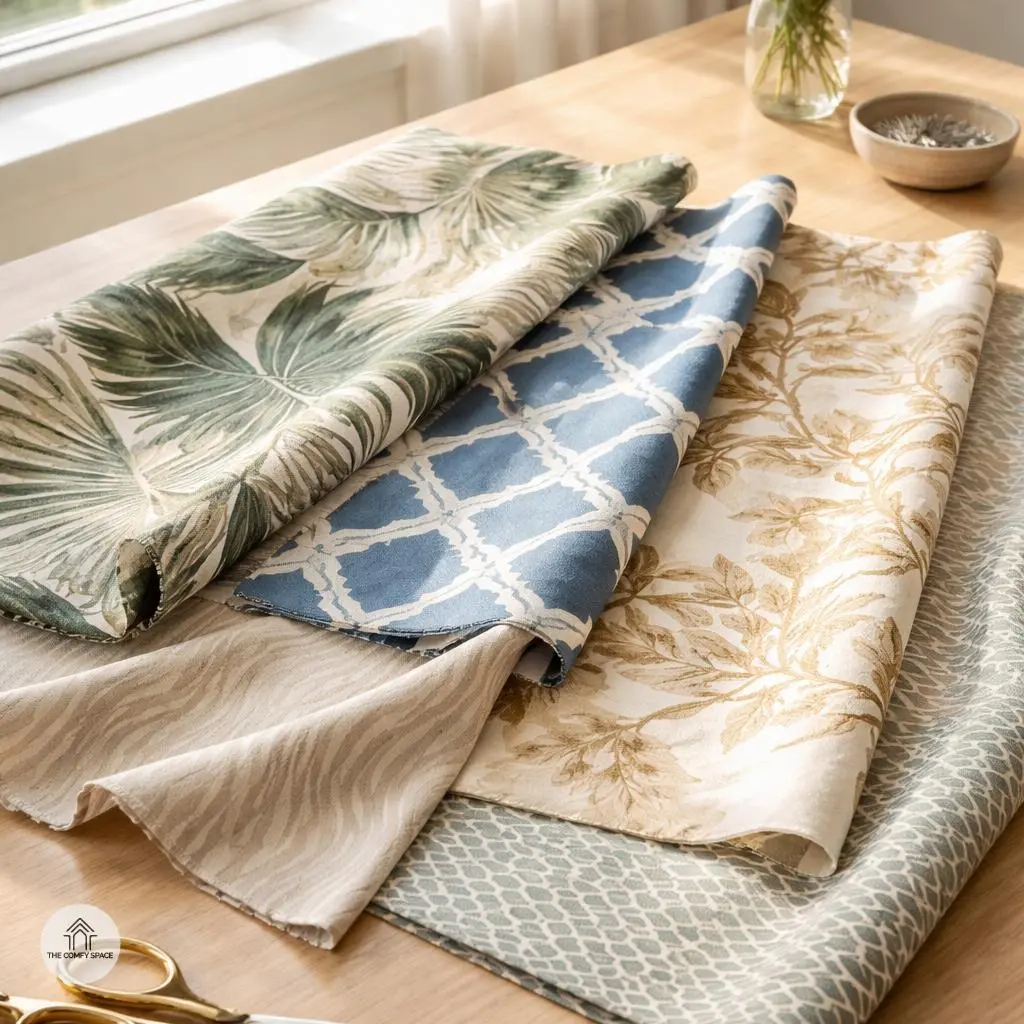
Test Your Pattern Combos Before Committing
Before going full throttle on pattern combos, take a breath and test them out in natural light. Trust me, colors can play tricks indoors, making the boldest prints look a bit blah or clash in ways you never expected. Lay your fabrics on the floor or a table by a sunny window and really study how they dance together. This small step can save you from a splurge that haunts your living room for years.
And here’s a pro tip: snap photos from different angles. Sometimes a pattern that looks perfect from above can be a hot mess at eye level. As designer Emily Clarke says,
“Testing your patterns in real life is the secret sauce no one talks about.”
Plus, nothing beats the honest reality check that real-life testing gives you – it’s the best way to dodge those cringe-worthy decorating regrets we’ve all been guilty of!
Embrace Imperfection and Have Fun
Embracing imperfection in your home decor can be a breath of fresh air. Sometimes, those “wrong” combos—like that quirky lamp paired with a vintage rug—actually create the most unexpected charm. Trust me, I’ve spent hours hunting for the ‘perfect’ throw pillow, only to realize the slightly mismatched ones add character and tell a story. It’s all part of the magic.
Decorating should be fun, not stressful! As renowned designer Anna Smith says,
“The process teaches you what your eye truly loves.”
So throw away the checklist, get playful, and watch your space evolve into something uniquely you.