
Neutral tones have a magical way of making a room feel calm and chic without much effort. Think soft grays, creamy whites, and gentle beiges—colors that just seem to whisper, “relax.” When I first started experimenting with neutrals, I thought it would be boring, but I quickly learned they’re like a blank canvas, inviting creativity while keeping the vibe serene.
Using neutrals well isn’t just about picking pale colors. It’s about balancing textures, light, and accents to make the space cozy and stylish. This guide will walk you through practical tips and clever ideas to transform your home with neutrals without losing personality—because who said timeless has to be dull?
Understanding Neutral Tones and Their Appeal
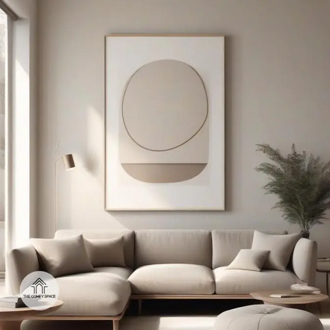
Neutral tones are like that trusty friend who fits in anywhere—think soft beiges, gentle grays, creamy whites, and muted taupes. These colors don’t shout; they whisper, creating a calm backdrop that lets your furniture and accessories steal the show. When I first tried decorating with neutrals, I feared it’d look boring, but I quickly learned neutrals actually open up a room, making spaces feel larger and more serene. Experts often say, “Neutral tones set the stage without stealing it,” a tip that helped me embrace subtlety.
What’s fantastic about neutrals is their mood magic—they soothe and relax but also boost focus, making them perfect for any room, from cozy bedrooms to lively living areas. They’re the chameleons of home décor, blending effortlessly with bold pops of color or sticking to a minimalist palette. The real joy? You can refresh your look simply by swapping out accessories—no repainting required. So, if you want style without stress, neutrals are your best pals in design.
Choosing the Right Neutrals for Your Home
Choosing the right neutrals for your home can feel trickier than it sounds. The first tip: always check how the light changes throughout your day. Natural light in the morning is cooler, so a warm beige might look just right, but in artificial evening light, it could feel off. Mixing warm and cool neutrals like soft taupe with gentle gray keeps your space balanced and interesting. It’s a bit like seasoning in cooking—a pinch of this, a dash of that, and suddenly your room’s personality shines through.
Watch out for the dreaded dull room syndrome! It sneaks in when you match multiple neutrals without texture or contrast. “Neutral doesn’t mean boring,” interior designer Emma Carter says. Layer different materials—think velvet cushions, woven rugs, or matte walls—to bring depth. I once painted my living room a ‘safe’ beige, only to find it looked washed out by noon. Lesson learned: test samples on your walls at different times to avoid a decor fail common in many homes.
Layering Textures and Patterns with Neutrals
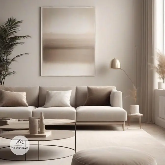
Layering textures and patterns within a neutral palette is like playing with shadows and light—it creates depth without shouting for attention. Mixing fabrics such as a chunky knit throw, soft linen cushions, and a smooth leather chair brings a subtle richness that feels inviting and cozy. The trick is to keep patterns soft and understated, like gentle stripes or tiny geometric shapes, so they add interest but don’t fight each other. “Texture is the unsung hero of design,” says interior designer JamieLou. Trust me, when I revamped my living room with these layered neutrals, it transformed from bland to blissful.
One challenge I faced was avoiding a dull look while sticking to this palette. A good tip is to add layers slowly: start with a textured rug, then a patterned cushion, and finish with a tactile curtain fabric. It’s like building a little symphony of textures that play together beautifully. And if you’re like me, shopping at big-box stores can sometimes overwhelm you with choices—stick to neutrals, but don’t be afraid to touch and feel everything. That tactile experience is half the fun and helps you avoid costly mistakes!
Balancing Neutrals with Statement Pieces
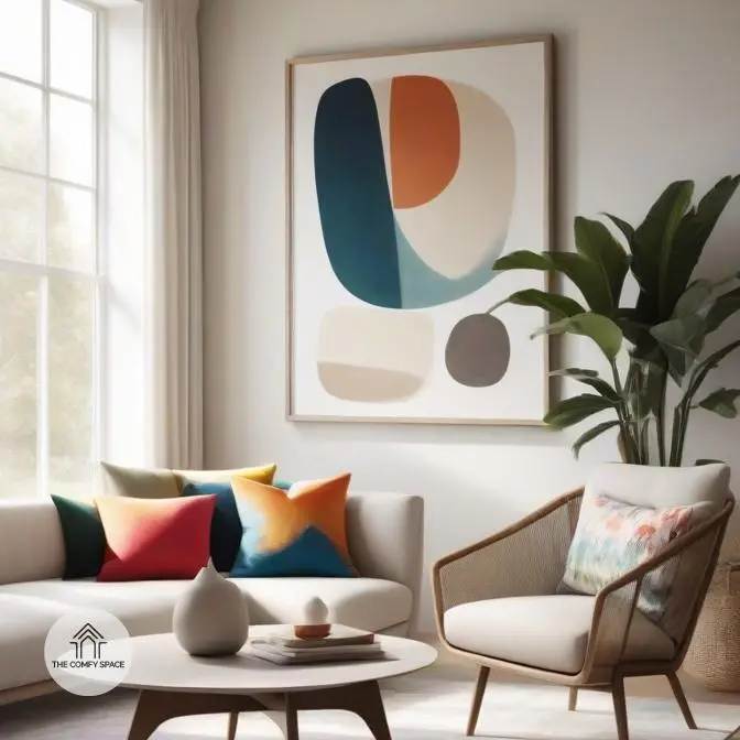
Balancing neutrals with statement pieces is like seasoning a soup — too little, and it’s bland; too much, and you overpower the palate. Adding pops of color through accessories is a fun way to brighten a neutral room without going overboard. Think vibrant throw pillows, quirky lamps, or a bold rug. These items add personality and can be swapped out seasonally, which is perfect for those of us who love mixing things up but dread a full redesign.
Choosing artwork and furniture that complement neutral palettes can truly elevate a space. A colorful painting or a bright chair creates focal points that keep the room interesting. But beware the classic rookie mistake: overdoing it with too many accent colors, turning your serene sanctuary into a chaos party. I’ve learned the hard way that underdoing accents leaves the space feeling cold, while too many can be overwhelming. As interior designer Anna Smith says,
“Balance is key, not just in color but in energy.”
Maintaining a Neutral Palette Over Time
Keeping a neutral palette fresh can feel like walking a tightrope. You want your space to look calm and inviting, not like a showroom or a hospital! One trick is layering different textures—think soft linens, cozy wool throws, and sleek ceramics. It adds depth without shouting for attention. Another practical tip? Switch out small accents seasonally. Changing cushions or artwork is way less scary than repainting but makes a surprisingly big difference.
It’s easy to fall into the stiffness trap where your neutral room feels cold or lifeless. “Neutral doesn’t mean boring,” designer Kate Morris says. “Play with natural elements like wood or plants to breathe life in.” And, hey, if you’re like me, you’ve probably learned the hard way that keeping it too minimal can make your home feel unwelcoming. Remember, it’s about cozy comfort as much as style.