
Spring is a fantastic time to breathe new life into your bedroom, and what better way than with uplifting colors? Embracing the season’s spirit means swapping out dull tones for hues that spark joy and energy. Whether you lean toward soft pastels or vibrant shades, spring colors bring a refreshing vibe that feels like a breath of fresh air. As interior designer Emma Clarke once said,
“Color has the power to transform rooms and moods alike.”
I’ve personally learned that even a small pop of color can lift your spirits first thing in the morning.
Not sure where to start? Try simple palettes like mint green paired with creamy whites or blush pink with soft grays—both easy to mix and match with existing decor. Plus, shopping for touches at favorite local stores adds an extra layer of fun and discovery. Remember, freshening your space isn’t about perfection; it’s about embracing new beginnings and your own unique style with playful enthusiasm.
Why Choose Spring Colors for Your Bedroom?
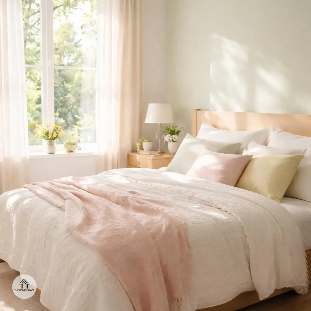
Embracing spring colors in your bedroom is like inviting a breath of fresh air into your personal sanctuary. After months of dull winter tones, these vibrant hues can instantly lift your spirits and inject a fresh vibe into your space. Think soft greens, cheerful yellows, and gentle pinks—colors that naturally brighten the room and make mornings feel a little less like a Monday, even if it’s a Monday.
Pro tip from interior designer Elise Harper:
“Spring colors don’t just refresh your space; they reset your mood.”
I’ve personally learned the hard way that staining your walls with heavy, dark colors can turn a bedroom into a cave. On my last project, switching to pastel blues made a tiny room feel airy and inviting, proving that lighter tones really do work wonders in lifting gloom. Shopping for these hues? Stick to stores that offer a wide palette because not all pastels are created equal—some might end up too stark or too dull!
Popular Spring Color Palettes to Try
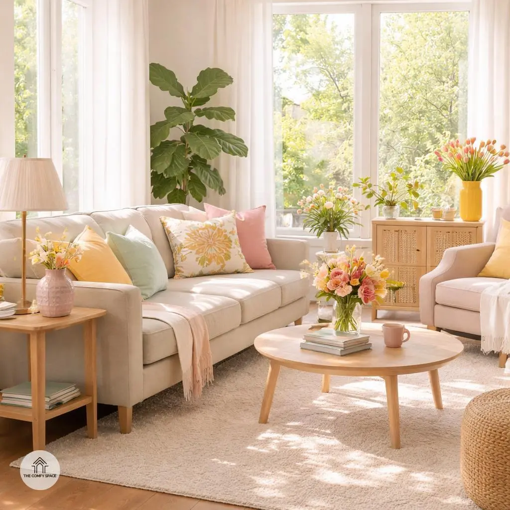
Spring is the perfect time to refresh your space with colors that breathe new life into your home. Soft pastels like mint, blush, and lavender aren’t just pretty—they create a calming vibe that makes your room feel like a gentle hug after a hectic day. I once tried mixing blush and lavender in my living room, and honestly, it felt like stepping into a serene garden every time I walked in. Of course, balancing these shades without making it look too sugary can be a challenge, but layering with neutral tones helps smooth it out.
Looking for a little more pep? Fresh greens and sunny yellows are like a natural boost of energy—think lemon citrus meets garden-fresh herbs. These colors make any nook cheerful and welcoming. Then there’s the crisp white and soft blue combo that brings a clean, airy feel, perfect for spaces where you want clarity and calm. As interior designer Mia Hartley puts it,
“Color isn’t just decoration, it’s mood magic.”
Mixing palettes wisely can turn your home into a spring-inspired sanctuary without overwhelming the senses.

How to Mix and Match Colors Without Overdoing It
Mixing colors can be intimidating, especially when you don’t want your space to look like a circus. The secret? Balance bold hues with neutral tones. Think of neutrals as a calm friend who keeps the peace while bright colors bring the party. Try painting walls a soft gray or beige and then spice things up with colorful pillows, rugs, or art pieces. These accents allow you to experiment without a full commitment – plus, swapping them out is a breeze.
Another tip: avoid the chaos of clashing shades by choosing harmonious palettes. For instance, if you love blue, stick to varying shades within the same family or complementary colors like soft yellows. This way, everything flows nicely. As interior designer Lisa Caldwell says,
“Color is powerful, but harmony is key to a happy home.”
It’s about finding that sweet spot so your space feels lively yet comfy, not like a rainbow exploded.
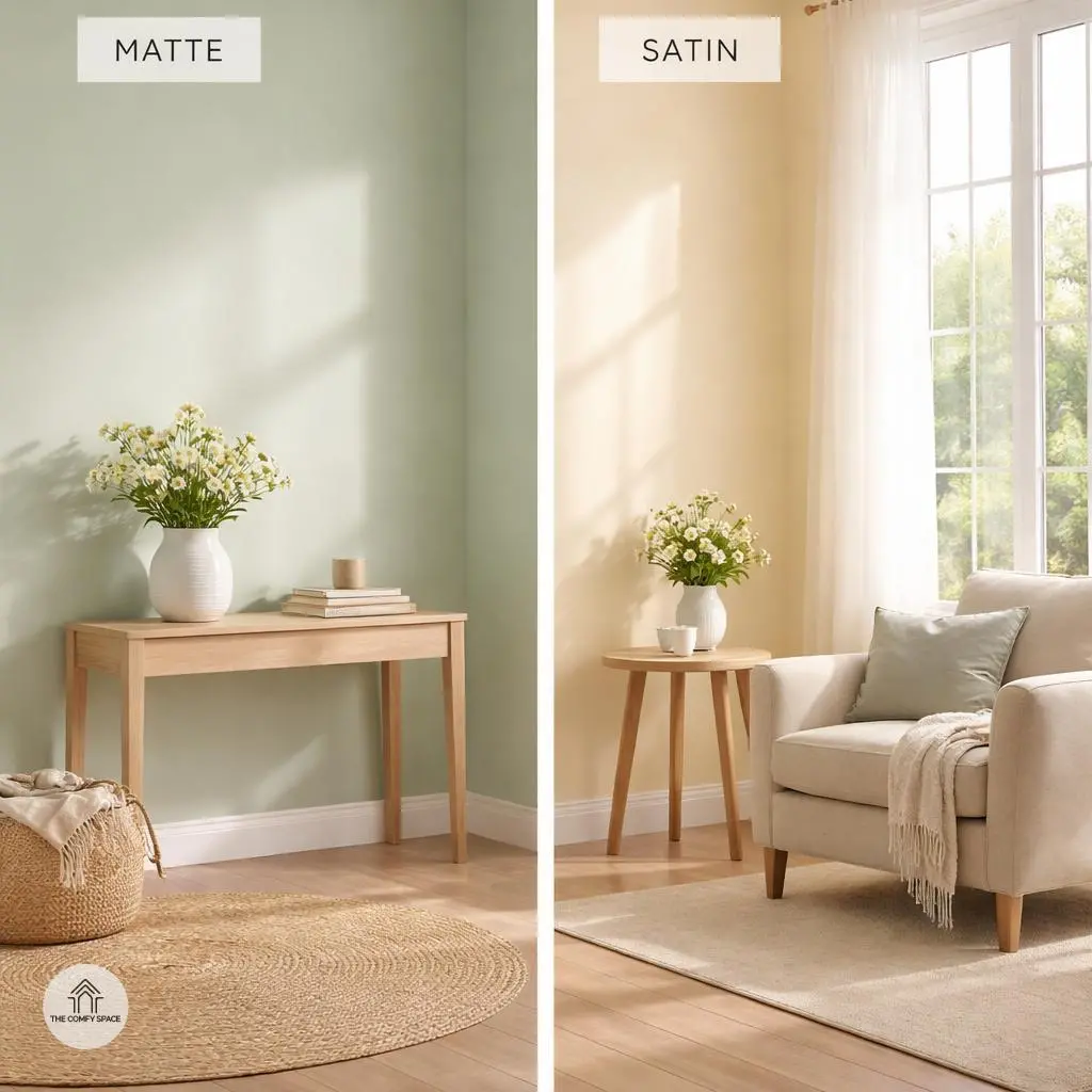
Choosing the Right Paint Finish for Spring Colors
Choosing the right paint finish can feel like navigating a maze, especially when you want those fresh spring colors to pop just right. Matte finishes are like the quiet but supportive friend in your room—they hide imperfections beautifully and create a cozy, inviting vibe. If you’re like me, tired of that one wall glaring back with every little flaw, matte is your BFF.
Then there’s satin or eggshell, the charming middle ground. They offer a gentle sheen that catches light just enough without shouting for attention, perfect for moderate-traffic bedrooms. Pro tip: avoid overly glossy finishes in restful spaces unless you want your walls to feel like a nightclub! As Jane Doe, a paint specialist, wisely says,
“The right finish sets the mood before you even pick the color.”
Tips for Decorating on a Budget
Decorating on a budget can feel like a daunting task, especially when you’re tempted by all those chic Pinterest boards. But hey, I’ve been there – staring at empty shelves and a tight wallet, wondering how to make it all work. One of my favorite tricks? Upcycling old furniture with a fresh coat of spring paint. Not only does it breathe new life into tired pieces, but it also adds a splash of personality to your space. Trust me, nothing beats the thrill of transforming something worn out into a statement piece!
Another game-changer is scouting seasonal sales at local stores or flea markets. I once snagged a gorgeous lamp for half price, and it completely changed my living room vibe. Also, don’t overlook DIY décor projects—simple floral wall art or throw pillow covers can make a surprisingly big impact without draining your budget. As decorator Jane Smith says,
“Budget decorating isn’t about spending less; it’s about getting creative and finding joy in the process.”
So, roll up your sleeves and have fun making your home uniquely yours!
Common Mistakes to Avoid When Using Spring Colors
Spring colors are vibrant and cheerful, but it’s easy to go overboard and make the room look chaotic. Resist the urge to toss every pastel and bright shade into one space—it’s like mixing every candy flavor in one bowl. Instead, focus on a few key colors that complement each other. Think of it as creating a playlist instead of a noise festival. “Using too many bright colors can overwhelm a space,” interior designer Lisa Grant says.
Another common trap is painting small rooms in super light pastels that can wash out the space, making it feel even smaller and a bit sad. Pay attention to your natural light! A north-facing room needs warmer tones, while southern light loves cooler shades. When I first tried a pale mint in my tiny bathroom, it felt like a hospital room—lesson learned! Always test colors in your actual room at different times of the day.
Bringing the Outdoors In for a Complete Spring Feel
Want that perfect spring vibe inside your home? Start by bringing in fresh flowers or leafy plants—they’re like little bursts of life and color that instantly boost your mood. I once thought fake plants were easier, but nothing beats the real thing. Plus, arranging them near windows really lets their colors pop!
Next up, play with natural textures. Wicker baskets and linen cushions mix beautifully with spring palettes and add coziness without overwhelming your space. “Natural materials bring warmth and authenticity to interiors,” design expert Lisa Morgan says. Don’t forget to let sunlight do its magic; open curtains wide for a bright, uplifting atmosphere that screams spring energy.