
Spring is like nature’s way of reminding us to shake things up a bit—especially in our bedrooms. After enduring months of dull winter vibes, it’s time to let lively prints take center stage. These bursts of color and patterns bring instant energy, turning a bland room into your personal happy place. I remember my attempt last spring; I grabbed a floral duvet from a popular store, only to realize it clashed with my stubborn beige walls. Lesson learned: coordinate first, shop later!
To get started, think about mixing bold prints with simpler designs to avoid overwhelming your space. Try playful throw pillows or a funky rug to introduce those cheerful elements without a full overhaul. “Lively prints can transform moods and spark joy,” interior designer Mia Thomson says. So, don’t hesitate to experiment and inject some sunshine into your bedroom setup!
Choosing the Right Prints for Your Personality
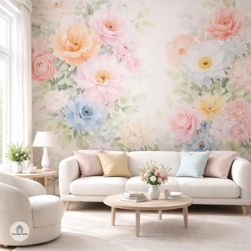
Choosing prints that reflect your personality can turn a dull room into a vibrant, welcoming space. Start by asking yourself which colors make you smile every day. Maybe it’s the sunny yellows that brighten your morning or the calm blues that chill you out after work. Here’s a tip from a seasoned designer: “Color sets the mood instantly, so pick what genuinely lifts your spirits,” she says. This way, your space feels authentically ‘you’ without trying too hard.
Mixing patterns can be tricky—too much, and it quickly becomes a visual circus. I’ve learned this the hard way: my first attempt ended with my living room looking like a fabric store exploded. The rule? Use your favorite prints as a jumping-off point, but balance them with solids or subtle textures to keep the vibe harmonious. It’s a bit like a dance—let one pattern lead, and the others follow gracefully.
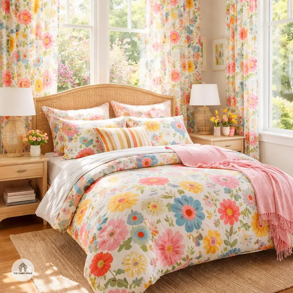
Floral Patterns: Classic Yet Fresh
Floral patterns are like that trusty old friend who never goes out of style but always knows how to surprise you. If you’re in the mood for a statement, go big with oversized florals—they bring drama and charm to any room without being overwhelming. Think of it as turning your walls into a blooming canvas. Pair these bold blooms with light-colored furniture to keep the space airy and balanced. I once tried this combo in my living room, and despite my initial fear of going overboard, it felt fresh and inviting.
Don’t be afraid to shake things up by mixing unexpected colors with floral prints. Pastels with pops of brighter shades can modernize the classic floral look and even rescue a stale room. “Experimenting with color combos breathes new life into traditional patterns,” design expert Jane Carlisle says. Just remember, florals don’t have to be predictable—they can be as unique as you are!
Geometric Prints for a Contemporary Feel
Geometric prints are a fantastic way to inject a contemporary vibe into your space. Sharp shapes like triangles and hexagons bring a sense of order and modern flair that feels fresh but not overwhelming. Trust me, trying to mix weird patterns without a game plan can lead to a decorating nightmare—I’ve been there! Stick to clean lines, and you’ll find it easier to balance your room without turning it into chaos.
One pro tip is to pair classic black and white geometric prints with bursts of bright color. It adds energy and keeps the look lively. Think a crisp black and white rug with neon cushions or a hexagon-patterned wallpaper paired with vibrant art pieces. This approach works especially well if you love tidy and structured decor but don’t want your space to feel cold or boring. As interior designer Jamie Smith says,
“Geometry in interiors isn’t just about shapes—it’s about creating harmony through structure.”
Animal and Nature-Inspired Prints
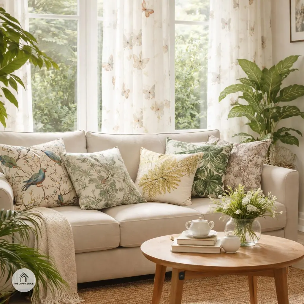
Bringing animal and nature-inspired prints into your home is like inviting a bit of wild charm indoors. Imagine feathered friends fluttering around your cushions or butterflies perched on your curtains—these playful motifs add a lighthearted touch that’s impossible to resist. Nature lovers, trust me, it’s like having your own cozy retreat without leaving the city. These prints don’t just decorate; they tell a story of calm mornings and fresh air. As interior expert Jane Smith puts it,
“Nature prints reconnect us with the outdoors in the most delightful way.”
For a fresh vibe, try leafy or tropical designs—they work wonders to bring that outdoor freshness inside your space. Plus, shopping for these prints can be quite the adventure. I once bought a bird-patterned pillow from a quirky local shop, only to discover it clashed horribly with my sofa! But that’s part of the fun. Both trial and error help create a space that’s genuinely yours. To keep things balanced, pair bold prints with neutral backgrounds and avoid overloading the room—less is usually more when it comes to wild patterns.
Mixing Prints Without Overwhelming Your Space
Mixing prints can feel like walking a tightrope, but when done right, it brings a lively energy to your space. A pro tip? Ground bold prints with solid colors or neutrals—it’s like giving your eyes a comfortable place to rest. For example, if you’re sporting a busy floral sofa, why not offset it with some plain off-white cushions? It works wonders! I learned this the hard way after buying a wild zebra print rug and matching it with leopard curtains… let’s just say my living room screamed for help.
Play with scale by pairing small patterns with larger ones to keep things balanced. Think tiny polka dots meeting broad stripes. If jumping straight to a full room of patterns sounds scary, start small with pillows or curtains to test the waters. As interior designer Laura Fisher says,
“Start simple. A little daring, a little safe—that’s the sweet spot.”
It’s a fun challenge and a great way to spruce up everyday spaces without feeling overwhelmed.
Accessorizing Your Printed Bedroom
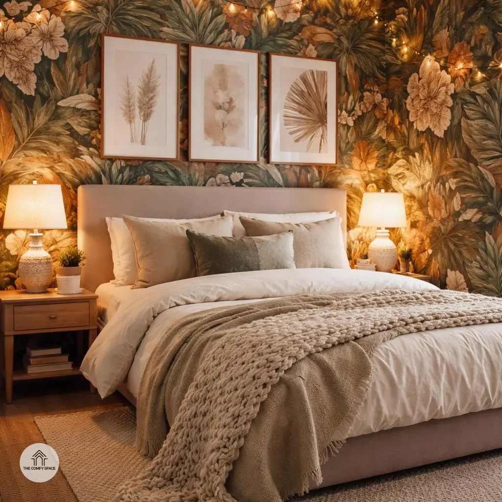
Accessorizing a printed bedroom can feel like walking a tightrope. You want to complement those bold prints, not totally clash or compete with them. The trick? Opt for accessories that harmonize with your patterns without shouting over them. Think calming hues or subtle accents that gently echo the colors in your prints. It’s like giving your walls a supportive cheer squad rather than a noisy rival.
Adding texture is a game changer here. Rugs and throws aren’t just cozy—they add depth and warmth that make the space inviting. Weave in chunky knits or soft, lush fabrics in neutral colors to balance out vibrant prints. And don’t forget lighting and simple frames—they can be your best friends. Highlight your prints by keeping frames minimal and letting a soft bedside lamp or fairy lights pop your art without overpowering it. As interior designer Lara Smith says,
“Good lighting can turn a good print into a great focal point.”
This is a classic that’s saved many from accessorizing disasters!
Common Mistakes and How to Avoid Them
Ever walked into a room and felt like your eyes were playing a chaotic game of ‘spot the color’? That’s the result of too many clashing colors. Trust me, I once painted half my living room with colors that screamed for attention—only to realize it was a headache-inducing mistake. The trick is to pick a dominant color and let others play supporting roles. This keeps your space harmonious and relaxing. “Simplicity in color choice leads to elegance,” says interior designer Emma Collins.
Then, there’s the trap of cramming small rooms with too many busy prints. Been there, done that, when I covered a guest bedroom with wild wallpapers and bold cushions—it felt more like a circus tent than a cozy nook! The secret is balance: use prints sparingly and on larger surfaces to keep things light. When shopping, take a moment to visualize before buying; it’s saved me from many impulsive ‘bold print’ disasters at my local home store.