
Mixing bold patterns in the living room can feel like a brave little gamble. I once bought three “perfect” prints at a big-box store and then wondered why the sofa looked like it was wearing a party costume. The easiest fix? Start with one pattern you truly love and let it lead the room. As designer Nina Campbell says,
“Pattern works best when it has a clear point of view.”
Then keep the mood calm with a shared color palette so the mix feels connected, not chaotic. If you are still nervous, start small with pillows or a throw rug. That way, you can test the waters without committing your whole living room to the bold-pattern circus. Little by little, it gets easier and much more fun.
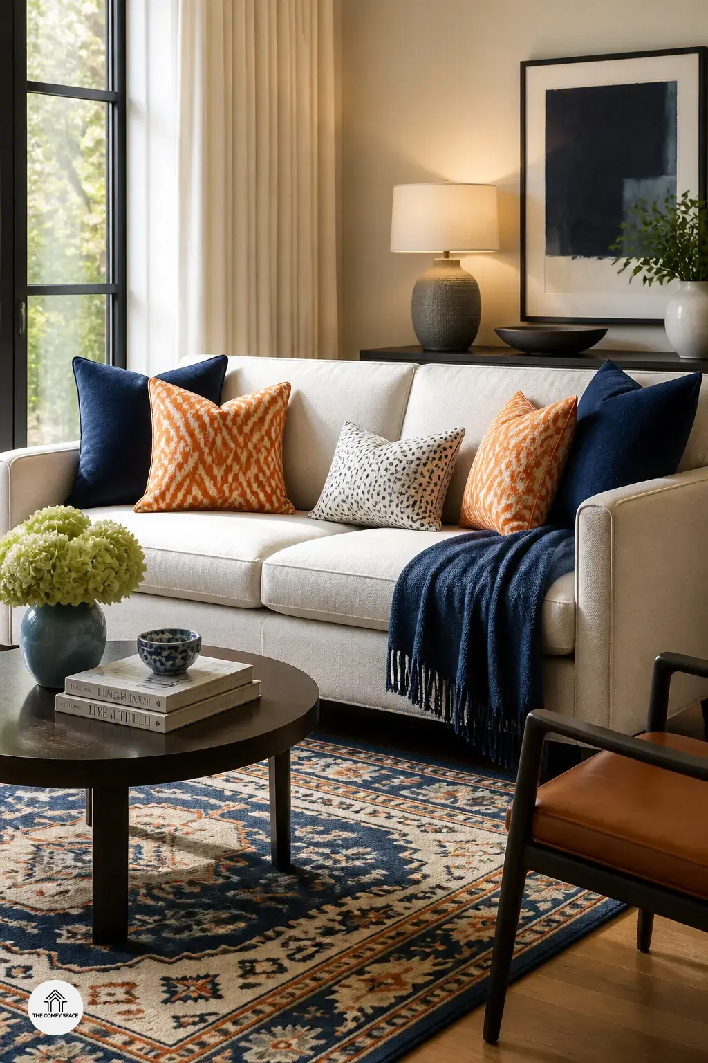
How to Balance Pattern Scale Like a Pro
Balancing pattern scale is the secret sauce in a lively living room. I learned that the hard way after buying two loud cushions at Target and wondering why the sofa looked like it was arguing with itself. The trick is simple: mix large, medium, and small patterns so they do not fight each other. Use one standout print and let the others play support. “A room needs rhythm, not a shouting match,” says interior designer Mara Ellis.
Try this: pair a big floral rug with a small geometric pillow and a medium stripe on the curtains. Avoid repeating the same size pattern everywhere because it can feel flat.
- Pick one hero print
- Repeat its colors in smaller doses
- Step back and check the room from the doorway
If it feels a little busy, edit one piece. Trust me, that small tweak can save the whole room.
Smart Color Rules That Keep the Room Calm
Bold patterns can absolutely live together in one room, but they need a little color discipline or things start looking like a clearance aisle exploded. I learned that the hard way after mixing a loud floral pillow with a striped rug and wondering why my sofa suddenly felt stressed. Stick to two or three main colors to keep the look cohesive, and pull shades from artwork, curtains, or a rug for easy coordination.
Add neutral furniture or solids so your eyes have somewhere to rest. That simple pause makes the patterns feel stylish, not chaotic. “A calm base lets the print story shine,” interior stylist Maya Reed says. If you are shopping at Target or HomeGoods and everything looks cute at once, this rule saves you from bringing home five things that argue with each other. Trust me, your living room will thank you.
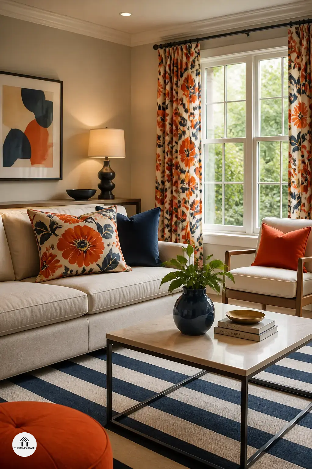
Where to Use Bold Patterns Without Overdoing It
Bold patterns are fun, but the trick is not turning your living room into a visual marathon. I learned that the hard way after buying a loud rug on a random Saturday trip to IKEA, then wondering why my sofa suddenly looked nervous. Start small:
- Try patterned accent chairs, cushions, or lampshades for easy impact
- Use one bold feature wall or rug instead of patterning everything
- Let plain surfaces, like a sofa or coffee table, help the room breathe
“A room needs pauses as much as patterns,” designer Mara Lewis says.
That little bit of calm makes the whole space feel thoughtful, not chaotic. It is a simple win for living room decor that feels stylish and lived-in.
Common Pattern-Mixing Mistakes to Avoid
Mixing bold patterns in the living room can feel exciting right up until it looks like your sofa and curtains are arguing. I’ve made that mistake before, standing in a room with one too many stripes and a rug that screamed for attention. The trick is to keep one color story calm so the patterns can play nicely.
“A room needs rhythm, not chaos,” says interior designer Maya Reed.
Also, don’t choose prints that are all loud and no quiet. Give the eye a rest with solids or softer textures. And yes, that cute sale find from Target can work, but only if it fits the room instead of forcing a whole new personality. A few smart layers will always look better than a basket full of random “deals.”
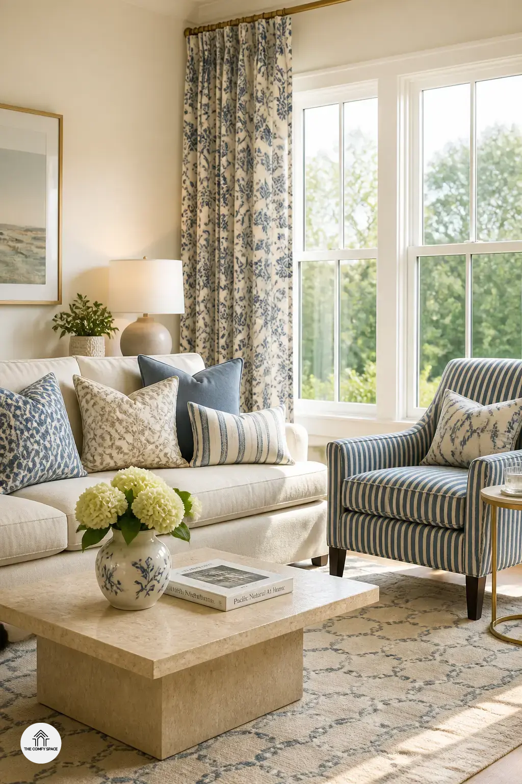
Designer Tricks for Making Bold Patterns Feel Intentional
Bold patterns can look fearless, but they need a little choreography. I once mixed stripes and florals after a too-confident trip to a home store, and yes, it looked like my sofa was arguing with the rug. The fix was simple: repeat one color in the pillows and art, and suddenly the room exhaled. “Pattern works best when it has a friend,” interior stylist Mara Ellis says.
- Repeat a color or motif in at least two places around the room
- Use symmetry or balanced placement to make the mix feel planned
- Layer textures with patterns so the space feels rich, not cluttered
If you’re unsure, start small. A patterned throw, then a lamp shade, then maybe the brave wallpaper moment. Balance helps the eye relax, and texture keeps everything from feeling busy. That’s the sweet spot for a living room that feels collected, not chaotic.