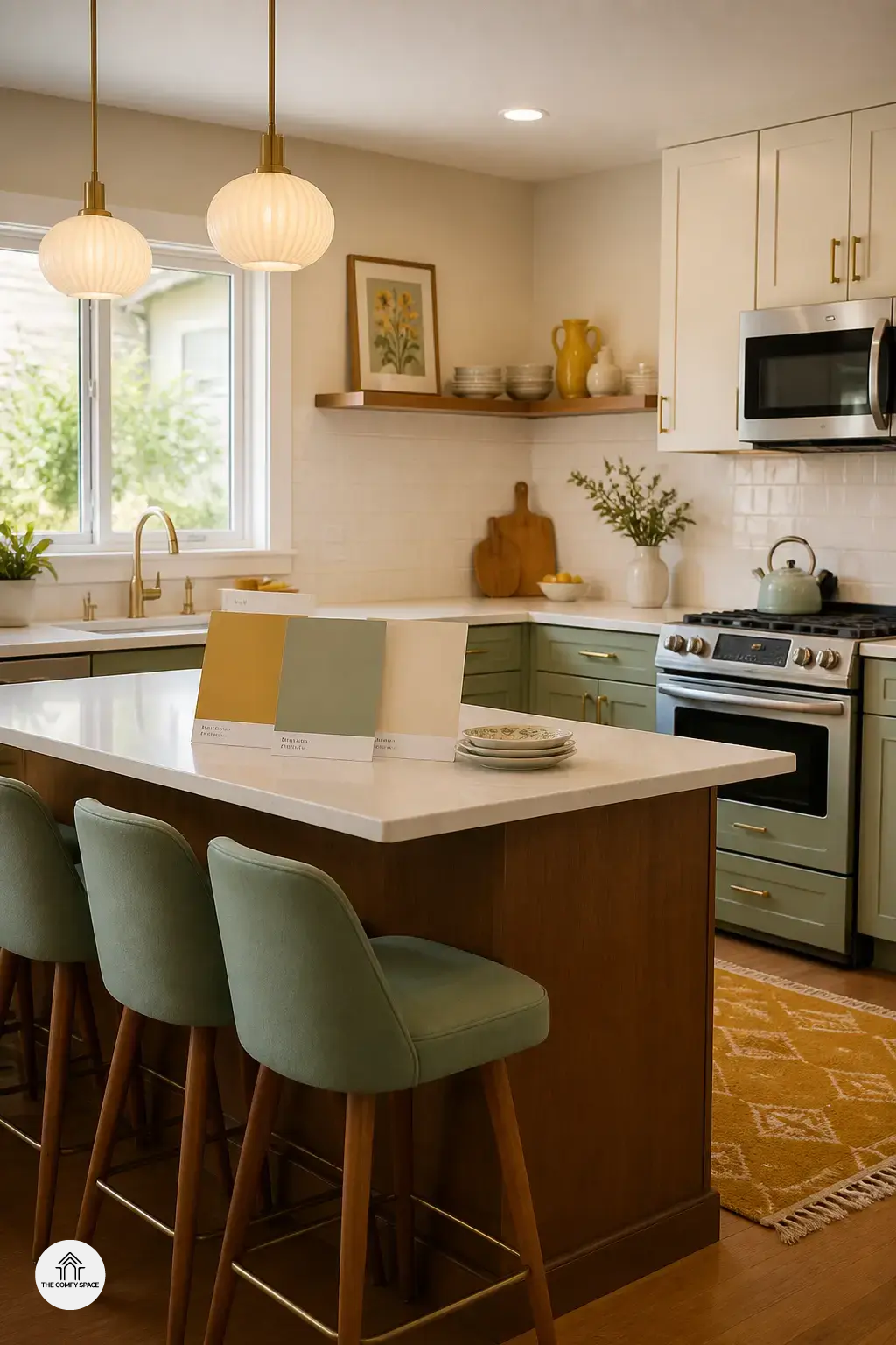
Retro kitchen colors are having a real moment, and honestly, it makes sense. After years of staring at safe white cabinets and beige everything, people want a kitchen that feels warm and a little bit cheeky. A soft avocado green or sunny mustard can instantly add charm, even if you learned the hard way that choosing paint at the hardware store is weirdly stressful.
“Color is the easiest way to give a kitchen a soul,” interior designer Mara Ellis says.
If your space feels flat, try mixing one bold retro shade with creamy walls or wood tones. That balance keeps the look cozy, not chaotic. Vintage-inspired palettes work because they feel lived-in, like a kitchen where real coffee spills happen and nobody panics. That’s the magic: personality, warmth, and a little nostalgia.
Soft Pastels That Make the Kitchen Feel Light and Cheerful
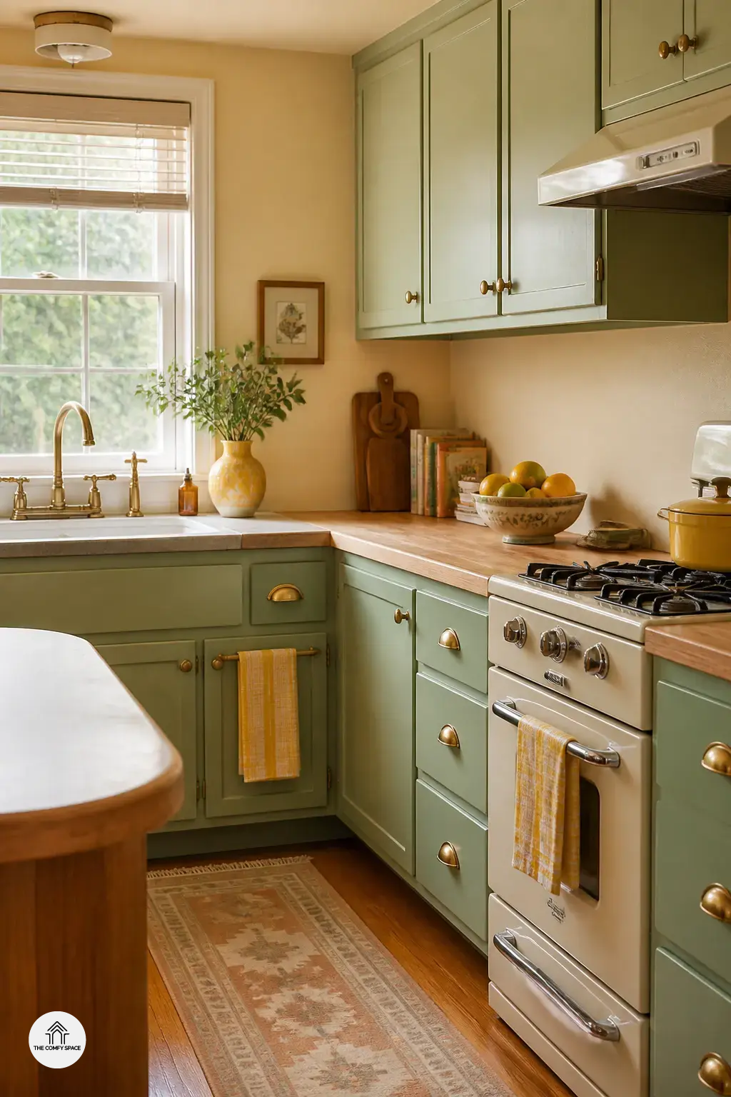
Soft pastels are having a lovely little comeback, and honestly, they make a kitchen feel like a sunny morning. Mint green, butter yellow, and powder blue bring that sweet nostalgic vibe without trying too hard. I once grabbed a paint chip at a familiar home store and thought, “This looks cute,” only to realize it was basically baby food on the wall. Lesson learned: test first. As designer Sarah Lin says,
“Pastels work best when they feel fresh, not sugary.”
These shades are perfect for small kitchens because they feel airy and bright, which is a lifesaver when the room is tight and the coffee machine already owns half the counter. Try a pastel cabinet, backsplash, or even just open shelving accents. It adds charm without overwhelming the space, and you can still keep your everyday chaos hidden in plain sight.
Bold Mid-Century Colors That Still Feel Fresh
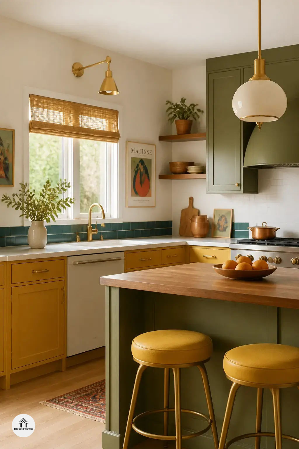
Bold Mid-Century Colors That Still Feel Fresh can give your kitchen that fun vintage mood without making it feel like a time capsule. Olive green, mustard, teal, and burnt orange still work beautifully because they bring warmth and personality. I once painted a tiny kitchen mustard and, honestly, it looked amazing for about ten minutes before I realized balance is everything. Try keeping the walls soft and using these shades on cabinets, stools, or a backsplash instead.
- Mix them with wood tones for a cozy feel.
- Add brass accents for a polished retro touch.
- Keep tile patterns simple so the colors can shine.
“Retro color works best when it feels lived-in, not loud,” says interior designer Mara Ellis.
Classic Two-Tone Kitchen Combinations
Classic two-tone kitchen combinations are such an easy win when you want retro charm without turning your kitchen into a time capsule. I once painted the upper cabinets a soft cream and the lowers sage, and honestly, it instantly felt calmer and more styled. If you’ve ever stood in a home store holding three paint swatches and questioning all your life choices, you’re not alone.
Pair a bold shade with a neutral to keep things playful but grounded. Think white and aqua, charcoal and warm peach, or cream and mint. As designer Nina Campbell says,
“Color works best when it has room to breathe.”
This look is perfect if you want that vintage vibe without splashing one loud color everywhere. It’s cheerful, practical, and surprisingly forgiving when daily kitchen messes happen.
Retro Colors for Cabinets, Walls, and Appliances
Retro colors work best when you let each surface do a little different job. Cabinets are the easiest place to introduce a vintage-inspired color, especially if you want a bold look without repainting the whole kitchen. I once tried a soft mint on lower cabinets and, honestly, it saved the room from feeling too serious. As designer Nina Campbell says, “Color should feel lived in, not forced.”
Walls can soften the palette, while colorful appliances add a fun focal point. If that feels like too much, start small. A painted pantry door, a retro-style mixer, or even one cheerful toaster can shift the mood fast. I learned that the hard way after buying three “maybe beige” samples at the hardware store. None were right. Vintage charm usually looks best when it feels a little playful, not perfect.
How to Mix Retro Shades Without Making the Space Feel Stuck in the Past
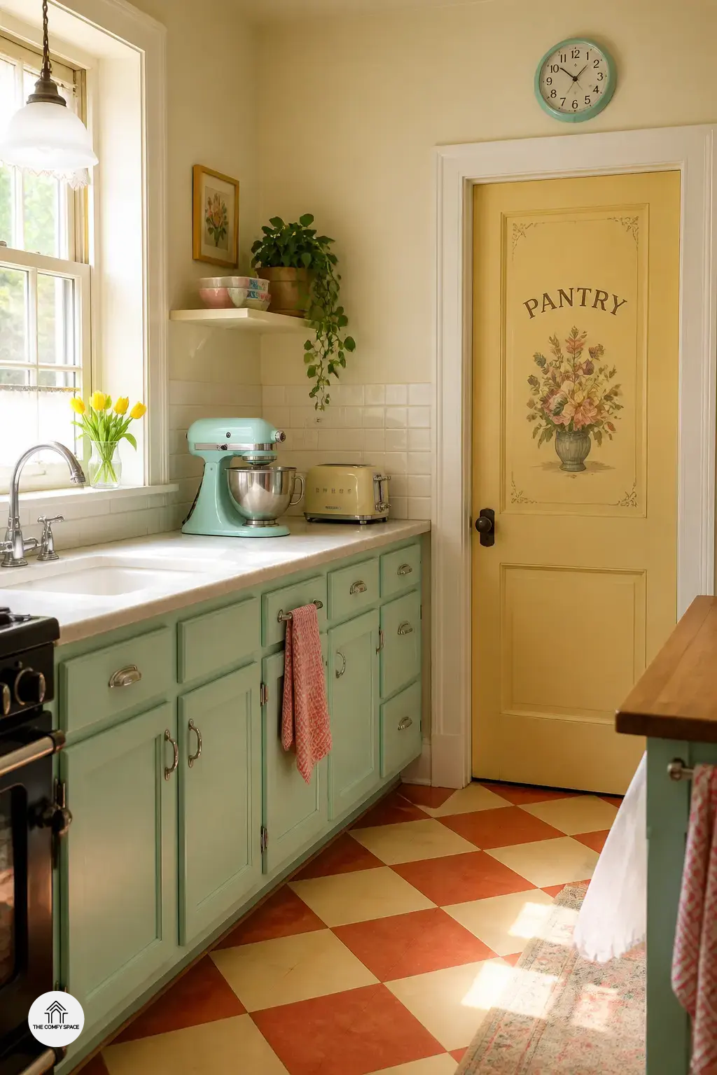
Mixing retro shades in the kitchen can feel a little risky. I once loved a mustard-and-avocado combo in theory, then saw it in a tiny room and thought, nope, we are not living in a time capsule. The trick is to keep the colors nostalgic, but let the finishes do the modern work.
Try pairing old-school tones with quartz, matte tile, or smooth wood. Clean cabinet lines help too, so the space feels practical, not like a set from your grandma’s first TV ad. “Color should flirt with the past, not marry it,” says designer Lena Hart. And yes, budget hunts at IKEA or Home Depot can save the day when you want style without the drama.
Easy Ways to Try the Look Before You Commit
Easy Ways to Try the look before you commit? That is the smartest move when you are testing retro-inspired kitchen color palettes. I once grabbed a bold mustard rug from a big-box store and thought I had nailed it. Spoiler: under my kitchen lights, it looked a little too “banana gone rogue.” Start small with bar stools, dishware, or pendant lights in vintage shades, and let the room ease into the vibe.
- Paint sample boards first because colors can look wildly different under kitchen lighting.
- Mix in a few retro pieces before repainting anything major.
“A little trial and error saves you from the classic ‘why does this look perfect online but weird in my house?’ moment,” says interior designer Mara Ellis.
That kind of test run keeps the process fun, not stressful. And honestly, it is nicer than repainting the whole kitchen twice.