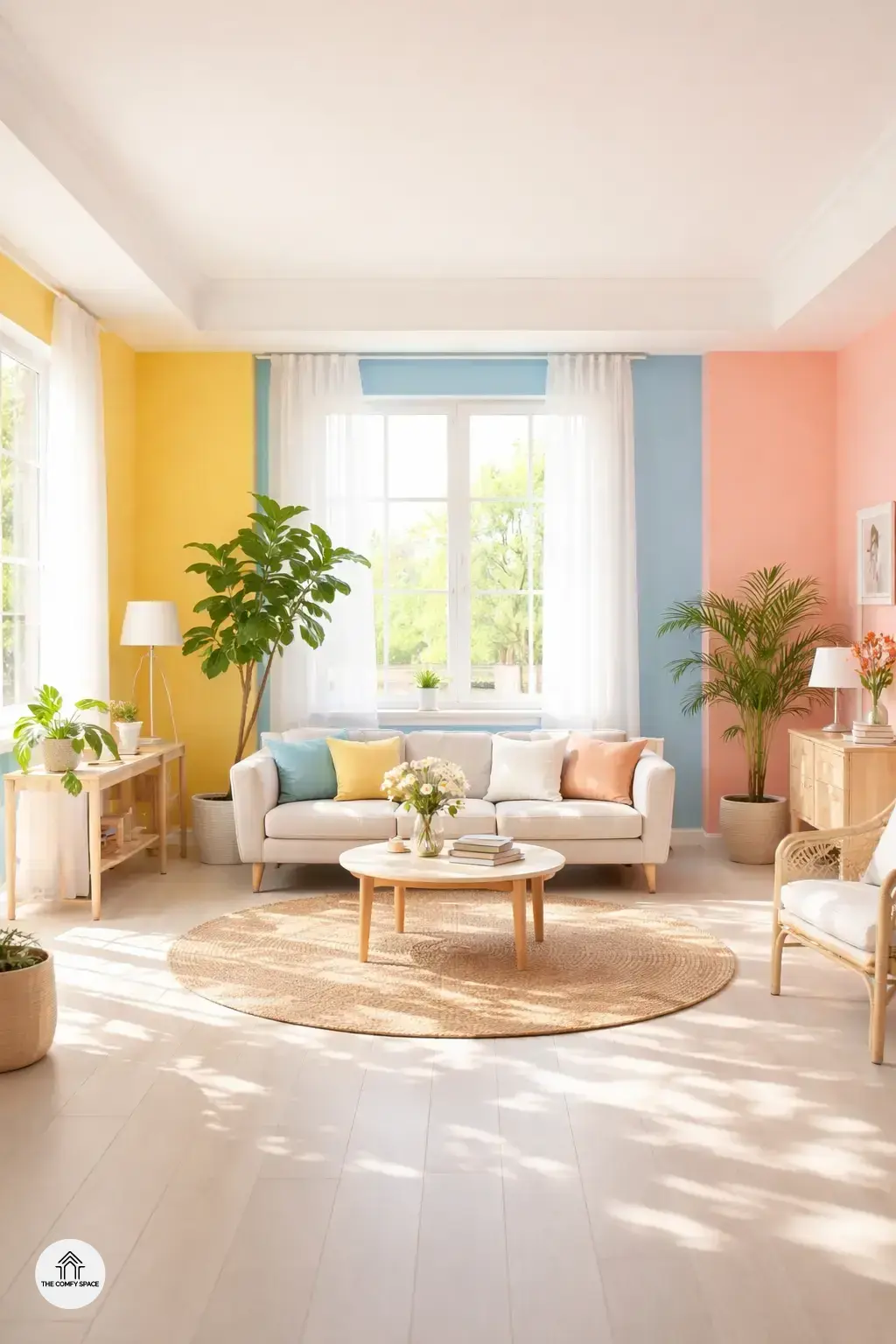
Summer has a way of nudging us to freshen things up, and what better place to start than your walls? Why summer calls for fresh paint colors is simple: bright, lively hues can instantly lift your mood and bring in that vibrant energy we all crave after months of dull, winter tones. I learned this the hard way when I painted my living room a cheerful yellow last June—talk about a mood booster! Just watching the sunlight bounce off the walls made me feel like I was on a mini-vacation every day.
Choosing colors for different rooms can be tricky, but here’s a handy tip: think about how you want each space to feel. For example, cool blues or greens are perfect for bedrooms to keep things calm and fresh, while sunny oranges or corals wake up living areas with energy. Remember, “Color is not just a visual experience; it’s a psychological one,” interior designer Emily Hart says. So, pick your palette thoughtfully and let those colors do the work for your summer vibe.
Sun-Kissed Yellows to Radiate Warmth
Sun-kissed yellows are a fantastic choice to infuse your rooms with a cozy, sunny vibe. Soft yellows can instantly brighten up living spaces, creating a welcoming atmosphere that’s perfect for summer. One common struggle I faced was choosing the right shade—I learned the hard way that overly bright yellows can feel overwhelming. “Soft yellows in living spaces encourage positivity and comfort,” interior designer Emma Green says.
To make the most of these sunny tones, pair yellows with natural light. This combo enhances the paint’s warmth without it feeling too intense. Popular shades like buttercup, mellow gold, and pastel daffodil are trending now and work well in different rooms. Just a quick tip: try sampling a patch first, especially near windows. It’s a playful but powerful way to see how yellow adapts throughout the day.
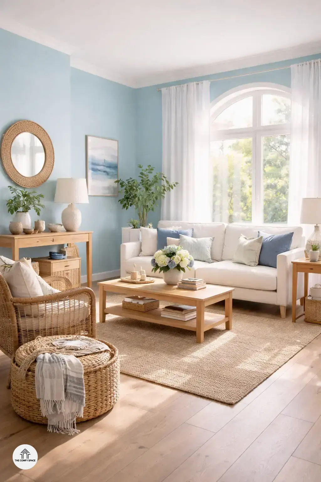
Cool Blues for a Refreshing Ambiance
Cool blues are like a breath of fresh air for any summer interior. Blues naturally evoke a sense of calm and relaxation, making them the perfect choice for those hot days when you just want to kick back and unwind. “Blue hues have a unique power to create peaceful spaces that invite you to relax and recharge,” interior designer Jane Smith says. Whether it’s a soft sky blue or a deep navy, these shades bring a soothing vibe that instantly refreshes your room.
When picking your perfect blue, consider shades like powder blue, teal, or classic cobalt. Pairing blues with crisp whites and natural textures—think wooden furniture or rattan baskets—creates a gorgeous contrast that keeps the room feeling light and airy. Just a head’s up though: I learned the hard way that pairing the wrong shade of blue with overly bright whites can feel cold, so test your combos in natural light first!
Refreshing Greens that Bring Nature Inside
Bringing the outdoors in with refreshing greens is a fantastic way to brighten your summer interior. Incorporating green to create a soothing environment can make your space feel calm and inviting. Think of soft sage or muted olive tones—they’re perfect for living rooms or bedrooms looking for that gentle touch of nature. “Green is the color of balance and harmony in the home,” interior designer Lisa Grant says, reminding us why this color works so well for summer.
Popular green tones for walls easily match with natural elements like wood and plants. Pair a rich emerald wall with wooden furniture to add warmth and depth, or use lighter minty greens to complement your indoor jungle of houseplants. Just a heads-up: I once went a little overboard trying to match too many shades of green and ended up with a confusing mishmash. So, keep it simple and trust nature’s palette—you’ll nail that fresh summer vibe every time!
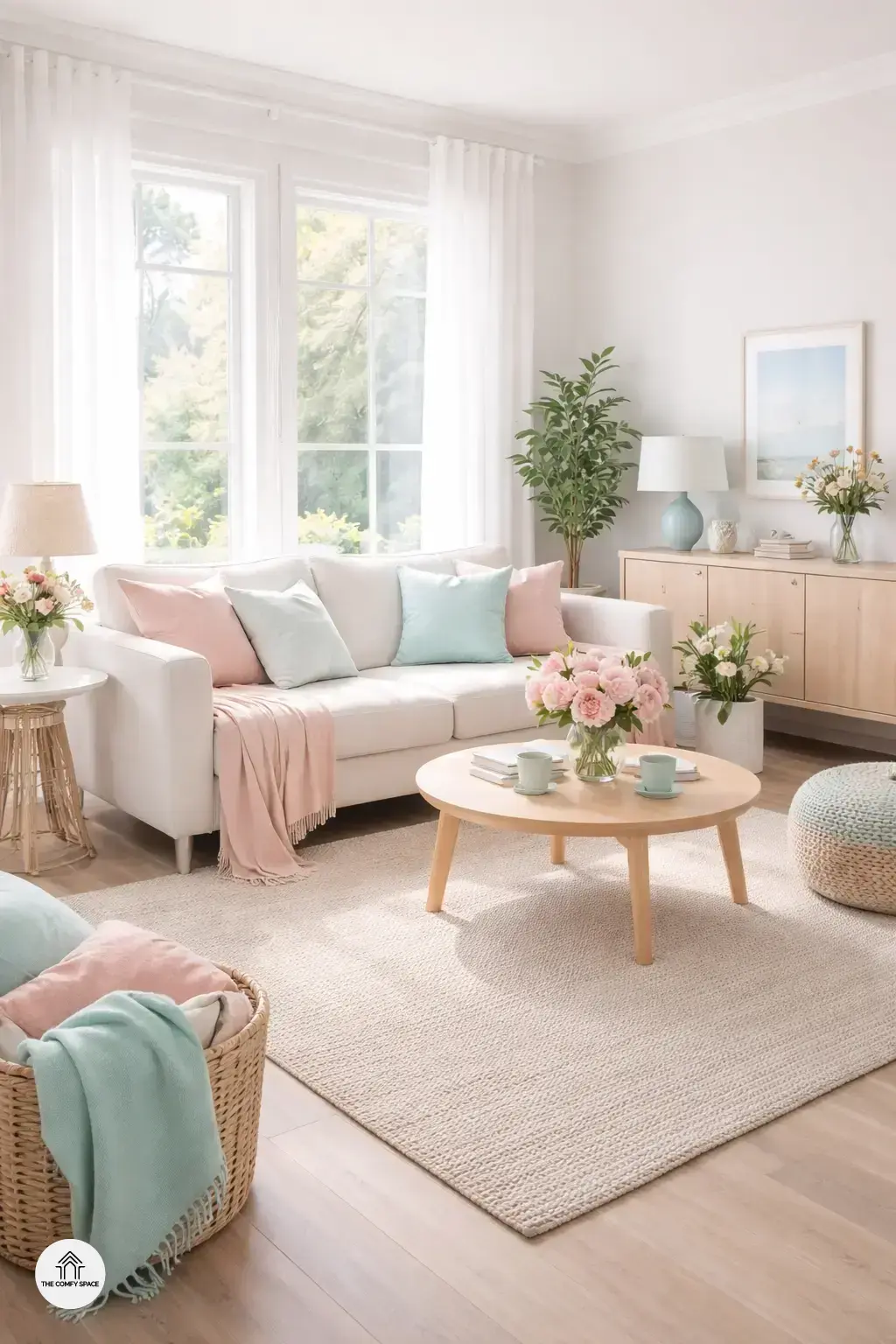
Soft Pastels for an Airy, Light Feel
Soft pastels are the unsung heroes of summer interiors. They bring in a light, airy vibe that instantly refreshes any room. Why do they work so well? Well, pastels evoke calmness and coolness, making your space feel like a gentle summer breeze on a hot day—perfect for those sluggish afternoons. Interior designer Lisa Gomez shares,
“Pastels create a soothing backdrop without screaming for attention, making your home feel relaxed yet chic.”
Plus, these colors reflect natural light beautifully, brightening up even the gloomiest corners.
When it comes to picks, think soft mint greens, blush pinks, and sky blues—these are trending big time in 2024! But here’s a little nugget I learned the hard way: mixing too many pastels can make a room look like a candy store explosion. My tip? Stick to 2-3 pastel shades max. Try pairing blush pink with soft gray or mint green with crisp white for balance. Remember to add texture, like cozy throws or woven baskets, to keep things grounded and not wash out your space. Happens to the best of us!