Two-tone kitchens are all about mixing and matching cabinet colors to create a fresh, dynamic look. Instead of sticking to one color, you play with contrasts—maybe soft whites on top and a deep navy below. It’s no wonder these kitchens are trending; they bring a breath of fresh air and instantly uplift the vibe of your cooking space. “Adding color contrast in kitchens is like giving your space a personality check,” designer Emily Banks says, “it’s bold but welcoming.”
Let’s be honest, standard monotone kitchens can feel a bit, well, bland. Two-tone cabinets add that dose of charm and character we all crave. Plus, they’re perfect for anyone who’s been stuck staring at the same old beige cabinets at the local big box store, searching for inspiration. If you want your kitchen to feel unique and inviting, this color dance might just be your secret weapon.
Choosing the Perfect Color Combos
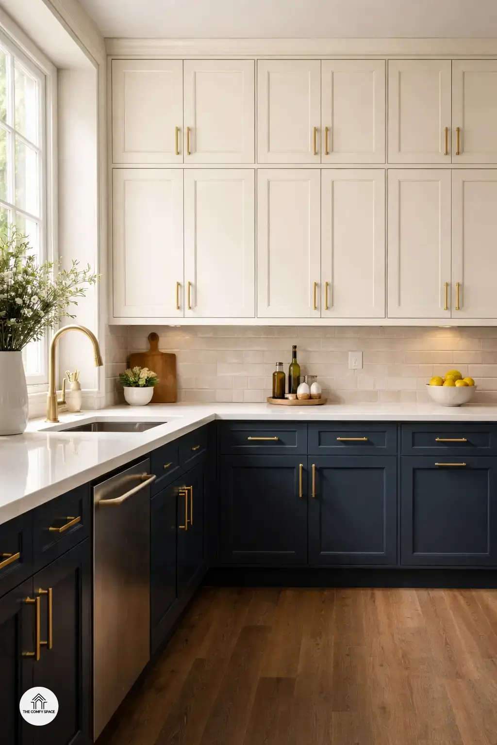
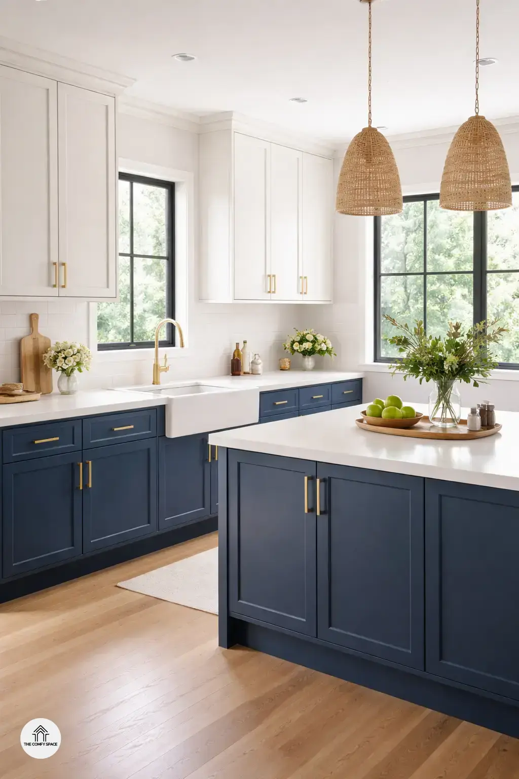
Choosing the perfect color combos for your two-tone kitchen can feel like a thrilling adventure—or a total color catastrophe. Popular pairings like navy and white are timeless, offering a classic yet fresh vibe that works wonders in almost any kitchen. “Navy adds depth, while white keeps things bright and airy,” interior designer Emma Clark says, emphasizing the balance these shades bring.
To avoid a clash, try balancing bold and neutral shades carefully. For example, pairing a deep hue on lower cabinets with a soft, neutral tone up top creates harmony. Also, consider your home’s overall style—if your space leans rustic, warm earthy tones might be your best bet. Remember, it’s all about creating a cozy yet stylish space that feels just like home.
Placement Tips: Where to Use Each Color
When working with two-tone kitchens, placement is everything. A popular tip is using dark tones on lower cabinets to ground the space. It adds a sense of stability and hides scuffs and dirt better—a real lifesaver for busy kitchens. Then, light colors on upper cabinets open up the space, making your kitchen feel more airy and bright. I learned this the hard way when I tried dark cabinets on top and felt like I was cooking in a cave!
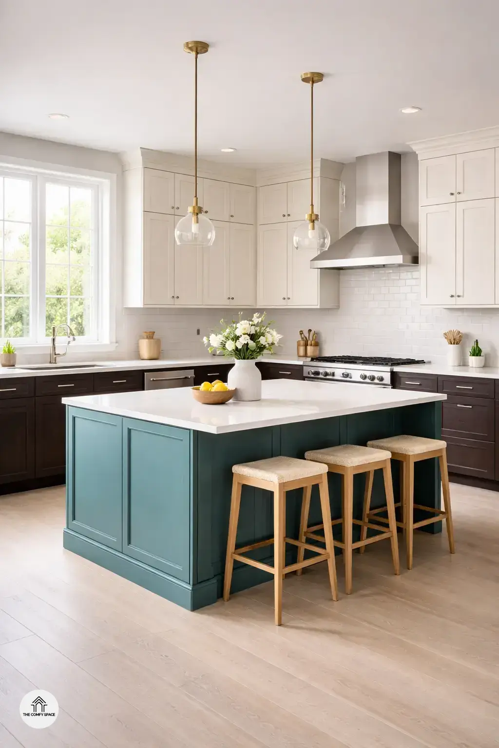
Don’t be shy about experimenting with your island color. It’s a great way to create a focal point that pops and attracts attention. One of my friends chose a vibrant teal island while keeping soft grey cabinets elsewhere. “Your kitchen doesn’t have to be all matchy-matchy,” interior designer Lisa Monroe says. Play around with colors, but keep balance and flow in mind to avoid a jarring contrast.
Common Mistakes and How to Avoid Them
One of the biggest pitfalls in designing a two-tone kitchen is choosing colors that clash and overwhelm the space. It’s tempting to go bold, but if the hues don’t play nicely together, your kitchen might feel chaotic instead of fresh. A pro tip? Start with a neutral base and add a pop of color on either the cabinets or the island. “Balancing tones is key; too much contrast can be visually tiring,” interior designer Jane Smith says. Also, don’t forget to consider your kitchen’s natural light—ignoring it can turn a vibrant palate into something dull or overly aggressive.
Another common blunder is focusing on aesthetics alone and sidelining functionality, a trap many of us fall into during DIY renovations straight out of Pinterest. Remember, your kitchen has to work for you. Consider where you store items, your cooking habits, and how colors may affect mood and usability. For example, darker shades on lower cabinets can mask scuffs and stains. Next time you’re shopping for paint or cabinets at your local Home Depot, keep this balance in mind to avoid common headaches and ensure a kitchen that’s as practical as it is pretty.
Real-Life Experiences and Final Touches
Let me tell you, my own kitchen makeover was quite the rollercoaster. I learned that choosing two-tone colors isn’t just about picking pretty shades; it’s about balance. One time, I went a bit too bold with dark navy on the bottom cabinets and almost regretted it—until I added brass handles that brought everything together. Designer Anna Lee says,
“Hardware is the secret weapon in uniting contrasting colors.”
This really hit home for me. Small details like handles and accessories can make your kitchen feel cohesive and intentional.
If you’re on a budget (trust me, who isn’t?), there’s no need to overspend. Incorporating your unique style doesn’t have to break the bank. Thrift stores and DIY hacks are goldmines for quirky finds. Remember, it’s all about those personal touches that reflect you. So, shop smart, have fun, and don’t sweat the splatters of paint—this journey is about creativity and joy!